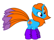
I was paid to draw this
/sp/ - Football
Yea, for the Denver Broncos are Football Now and Forever
Archived thread
>>9986
This rating, exactly. The colors are bad and the tail is too long, plus the way it fans out makes her look like a peacock. Your rendering of the character is good.
This rating, exactly. The colors are bad and the tail is too long, plus the way it fans out makes her look like a peacock. Your rendering of the character is good.
>>9985
The eyes are simultaneously yellow and purple... but you managed to do it in a way that wasn't that bad.
The eyes are simultaneously yellow and purple... but you managed to do it in a way that wasn't that bad.
>>9986
ok
>>9989
Edgy? How so?
>>9990
How would you inprove it?
>>9991
I'm a good artist and I could always use more money.
>>10006
The peacock tail is an intentional design choice, her seven tails are supposed to look that way.
Also, thank you.
>>10009
Well, how would you improve her design?
>>10012
Thank you! I'm very proud of those eyes.
Anonymous
No.10022
>>10014
The tail is a bit much. I would tone it down to a more natural size. I'm not sure I would keep the hearts and diamonds at the end of it, either. When it comes to designing OCs, less is more.
The fuzzy hooves draw all of the attention of the eyes away from the rest of the pony, and the color clashes with the pony's coat color. Purple is a really bad choice to go with blue. When picking colors, avoid picking colors that are right next to each other on a color wheel.
The eyes aren't too bad, I suppose, but if you were going for multi-colored eyes, I would have gone for heterochromatic irises. The purple in them is still a bit of an issue.
9 replies | 1 files | 9 UUIDs | Archived

 Ex: Type :littlepip: to add Littlepip
  Ex: Type :eqg-rarity: to add EqG Rarity