MLPOL Anon is Orange.
I suggest that we change the color from the namefield and the greentext to orange as well.
/qa/ - Questions and Answers
Keeping the community together by giving you a voice
Archived thread
Anonymous
No.3615
I like the idea and the spirit, but orange is too close to the background color of the main board imo.
Anonymous
No.3666
I think we've talked about this before, and most wanted to keep greentext.
However I'm with the idea of making orange text optional.
I think we could get some new board writing style memes out of it.
Like being able to greentext with two speakers more easily, or having greentext be "wrong think" while orangetext isn't, etc.
However I'm with the idea of making orange text optional.
I think we could get some new board writing style memes out of it.
Like being able to greentext with two speakers more easily, or having greentext be "wrong think" while orangetext isn't, etc.
Anonymous
No.3724
Orange on light red? Really?
>>3810
I have heard your cries and did a thing
>>3804 →
Now with namefield and exact shade of orange as in the OP here
Just post this in the User CSS box under options
span.quote {
color: #DB7A18;
}
p.intro span.name {
color: #DB7A18;
}
Make sure to use a darker theme or it will probably look like shit
You can change the Hex value to any color that pleases you if you tire of orange
>>3811
Missed a few things
Add these as well to Get a majority of all post quotes and links
a:link, a:visited, p.intro a.email span.name {
color: #DB7A18;
}
div.post.reply div.body a {
color: #DB7A18;
}
Missed a few things
Add these as well to Get a majority of all post quotes and links
a:link, a:visited, p.intro a.email span.name {
color: #DB7A18;
}
div.post.reply div.body a {
color: #DB7A18;
}
>>3607
Added option to select "Orange colored quotes" from Options menu.
>you might need to do hard reload Ctrl+F5 for it to show up
Added option to select "Orange colored quotes" from Options menu.
>you might need to do hard reload Ctrl+F5 for it to show up
>>3814
Nice
>>3812
And just because orange is starting to grow on me and I dislike the default orange theme available in options because of how hard it is to read things in the catalog when hovering with it here is another piece to paste into the CSS options to get the header and thread titles
You should end up with something like in my image using the tomorrow theme
div.boardlist a {
color: #DB7A18;
}
p.intro span.subject {
color: #DB7A18;
}
Anonymous
No.3817
Anonymous
No.3818
I want to cum inside Pupper.
Anonymous
No.3837
>>3831
Green really goes better with the YotsubaB theme, which is the default.
If you bother changing the theme then it's no trouble checking one extra box while you're at it for the orange text
Green really goes better with the YotsubaB theme, which is the default.
If you bother changing the theme then it's no trouble checking one extra box while you're at it for the orange text
1513227507_1.png (106.2 KB, 1280x1024, Tomorrow theme dropdown menu default.png)
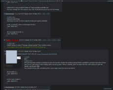
1513227507_2.png (87.1 KB, 1280x1024, Tomorrow theme dropdown menu fixed black and orange.png)
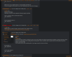
>>3816
I don't want to keep fagging the place up but I found a few faults with what I had if anybody cares.
I can't figure out how to change the thread watcher menu in with the PonyX script so it looks awful, maybe somebody smarter than me can help out
There was also a problem with the menu for reporting/deleting/hiding posts but that wasn't a fault of mine, it just seems to be terrible by default in the Tomorrow theme but I was able to correct that at least
.post-menu {
color: #DB7A18;
}
.post-menu ul {
background-color: #1D1F21;
}
Should fix it up like in picture if you're going with orange, or you can simply change the hex values to any other color if you choose to do something different but are using Tomorrow theme anyway
Obviously the first code is the text and the second one is the color of the box itself/background
>>3841
Thanks will add your fix to the Tomorrow and Dark themes.
>there is probably more themes that need some fixing here and there
Thanks will add your fix to the Tomorrow and Dark themes.
>there is probably more themes that need some fixing here and there
>>3844
Awesome, I only recently decided to start learning about editing css so I'm still learning but I'm glad it's of some value
.post-menu li:hover {
background-color: #282A2E;
}
And for hovering your mouse over the selections
I went with gray like the post bubble/box background
I also just noticed the completely default theme now seems to simply have orange text in it and I would recommend it probably just be a good ol' black
like
.post-menu {
color: #000000;
}
>>3848
Not sure if this is what you refer to, but you have to reload the page before the correct bg and text color appears in the menu after you have switched theme via Options.
Not sure if this is what you refer to, but you have to reload the page before the correct bg and text color appears in the menu after you have switched theme via Options.
>>3849
Odd it fixed it when I reset the cache just now
But it was orange when I had everything turned off on my side completely.
I actually don't input anything into the options pane here and just throw them into my stylish addon so I can turn them on and off willy nilly and simple refreshes the orange test persisted
Maybe I'm going crazy or maybe I just need to go to bed
I captured an image of it anyway, even if it's just my mistake.
lol
It threw me off pretty hard for a good minute
>>3851
No wait, I fuged up again, I had thrown the black text fix into the options pane for some reason when I did that
It is still like in the screenshot by default
It should be something like this I feel
No wait, I fuged up again, I had thrown the black text fix into the options pane for some reason when I did that
It is still like in the screenshot by default
It should be something like this I feel
>>3851
I have the same problem. Not sure what does it, but I guess after you have settled for a theme it will work itself out in the end. But it makes editing and testing harder....
I have the same problem. Not sure what does it, but I guess after you have settled for a theme it will work itself out in the end. But it makes editing and testing harder....
Anonymous
No.3854
>tfw been using the orange theme the whole time and associate /mlpol/ with orange anyway
Yatsuba is too 4chunk for me.
Yatsuba is too 4chunk for me.
>>3853
I'm just a lone humble anon doing things just because
>>3851
Is now the default, I blame admin abuse. shame, shame. :P
>>3852
Is how it should be, if you can't wait and are using the default Tomorrow or dark theme throw
.post-menu {
color: #000000;
}
into the custom CSS settings
This pic is Tomorrow theme with all my orange shit thrown on
>>3858
Just happy to help
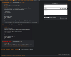
This last one for tonight is just for the search button at the top of the catalogue if people want it to be orange instead of purple
a, a:visited {
text-decoration: underline;
color: #DB7A22;
}
It seems to effect other things as well that were already made orange by something else I had done so I guess there is a conflict somewhere and I'm too tired to figure out which one is overwriting which right now and bed is calling me.
Shown from first to last is default, second is all my orange rice and last is all my orange rice but changing search to white which effects other elements a previous thing I had done/will effect on the default theme
Not sure if it hits anything else, it probably does. I'll play with it more tomorrow
I'll also try to make more comprehensive changes or observations as needed so I don't have to spam the thread over and over
Anonymous
No.3860
>>3859
Well one last thing
I went ahead and made an account on userstyles and threw my work on there if people would rather try out my orange shit that way instead of copying and pasting everything into the custom CSS box in options
Requires Stylish or something similar
Made on Firefox but tested it on Chrome real quick and it seems to work fine on there as well if that's the browser you use
https://userstyles.org/styles/152856/mlpol-tomorrow-theme-orange
30 replies | 11 files | 15 UUIDs | Archived




 Ex: Type :littlepip: to add Littlepip
  Ex: Type :eqg-rarity: to add EqG Rarity