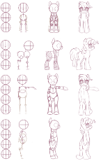
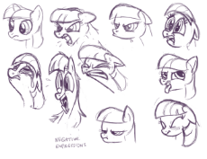
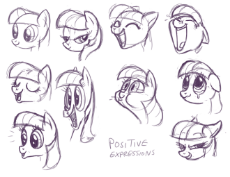
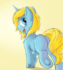
>1st Mint Condition Edition (plus rhyming)
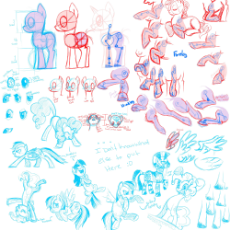
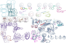
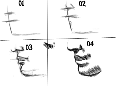
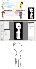
Lately, there has been a call to properly the means to create our memes and art as well. Many of our artists are wet behind the ears with the need to improve. So, a thread is in order to solve that. This is the thread for the learners that yearn for artistic earns. This is the art thread.
/mlpol/ - My Little Politics
Archived thread
>Pony -
http://imgur.com/a/m7zQ2
http://mlpg.co/art/res/23.html
>Human -
https://sites.google.com/site/4chanic/training-tutorials
https://design.tutsplus.com/tutorials/human-anatomy-fundamentals-how-to-draw-hands--cms-21440
>Drawing Books & Videos -
https://mega.co.nz/#F!2RARFaLA!VTiQb6eRXfV4V6mYQ6FJTA
>Inking and Coloring in Photoshop -
https://drive.google.com/file/d/0B1ntQiBTLz1nc3praE1Pb2VzNzg/edit?usp=sharing
>/ic/ Drawing Guide -
http://www.squidoo.com/how-to-draw-learn
>/ic/ Resources -
https://sites.google.com/site/ourwici/
PROGRAMS
>GIMP (open source Photoshop or Sai alternative) -
http://www.gimp.org/
>FireAlpaca (Paint Tool SAI alternative) -
http://firealpaca.com/en
>Krita (Multi platform open source alternative) -
https://krita.org/
>MediBang
https://medibangpaint.com/en/
Windows/ Mac/ iPad/ iPhone/ Android
Draw or make comics on practically any device!!
>ArtRage
https://www.artrage.com/
ArtRage gives you real world painting tools on your computer in a stylish, easy to use environment.
>>50955
Sun and moon bless you, Leaf. Might work tomorrow on that EqG version of Syriana I had in mind...
Sun and moon bless you, Leaf. Might work tomorrow on that EqG version of Syriana I had in mind...
>>50955
checkd
Great idea, we should have a small art challenge. I'm thinking we take a reference image and all try to sketch it as best we can. Then we can compare the different styles of crap we fresh artists shit out. I think it would fun as a group of newfag drawfags, so no one person gets discouraged by their art not being very good. I know I suck at proportions, eyes, and especially hair right now.
Any suggestions on a simple reference image to start with, or thoughts about this idea?
>>50955
my art boner has returned after about 2 months of complete flacidity but I still can't really into perspective. I'll see what I can do tomorrow I guess.
my art boner has returned after about 2 months of complete flacidity but I still can't really into perspective. I'll see what I can do tomorrow I guess.
>>51003
Nice choice! I'll share the sketch when I finish it.
Here's something to entertain in the meantime. It made my sides go so far into hyperbolic orbit that it passed both Voyager probes.
https://www.youtube.com/watch?v=KY9OxcRDohg
Nice choice! I'll share the sketch when I finish it.
Here's something to entertain in the meantime. It made my sides go so far into hyperbolic orbit that it passed both Voyager probes.
https://www.youtube.com/watch?v=KY9OxcRDohg
>>51003
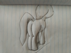
2 hours of ms paint autism later...
Well lads what do you think?
I'd give myself a 7/10 needs improvement on proportions and I'm not even going to rate the coloring.
Still first time ever drawing something pony related.
2 hours of ms paint autism later...
Well lads what do you think?
I'd give myself a 7/10 needs improvement on proportions and I'm not even going to rate the coloring.
Still first time ever drawing something pony related.
>>51202
her right arm is too thin compared to the other appendages, also could use more roundness to her lower face part and knees, lastly the ear could be a little bigger.
drawing is difficult anon. if you stick with it and study it, you will get better. heres a video from a semi-professional artist/animator with a basic video about drawing. consider a look.
https://www.youtube.com/watch?v=RkNeZDRuqWs
>>51244
very nice, if you smooth up the back of he knee on the background leg and give it a transparent background, you are fit to make your own pictures Anon!
very nice, if you smooth up the back of he knee on the background leg and give it a transparent background, you are fit to make your own pictures Anon!
>>51284
I thinks its salvageable. put some more attention to the proportions of the legs and body, hair length and face placement. consider drawing a circle on the head for easier placements.
I thinks its salvageable. put some more attention to the proportions of the legs and body, hair length and face placement. consider drawing a circle on the head for easier placements.
>>51284
>>51301
Not bad anon. What I did after my initial sketch in >>51226 to clean her up was I moved over to paint.net and used the lines function. I made a new layer and then just traced over all the lines to smooth them out. I then made an all white layer afterwords and deleted my original picture's layer and filled everything that needed to be and ended up with >>51244.
Your proportions look much closer to the actual thing then mine I'm sure if you clean her up a little like I recommended she will look even better then my attempt.
>>51502
There's been great artists who use Medibang. It's feasible, and most phones nowadays have a stylus. How big is your tablet? Sensitivity?
Although, never feel like a drawing tablet is out your price range. Drawing tablets are cheap.
There's been great artists who use Medibang. It's feasible, and most phones nowadays have a stylus. How big is your tablet? Sensitivity?
Although, never feel like a drawing tablet is out your price range. Drawing tablets are cheap.
>>51579
Yes and no
If you are good on papper you will take some time to get used to the tablet and it may never feel the same as drawing on papper but you will still get some good results.
Outside of that drawing on tablet it's an excellent thing, you don't waste papper when drawing on a tablet and you have an unlimited supply of colors and tools.
Just don't fall for the burn tool shadows meme, it just looks bad.
Ah also be really careful when choosing, you need a sensitive tablet; a tablet with some good pressure sensitivity and some nice pixel depth.
Personally I used to draw with a Wacom bamboo and got some pretty results.
>>51697
Just keep fucking around with the tools you have until you start having fun with one of them. Once you find something you enjoy, keep doing it and try to expand your horizons. I prefer to do one kind of project at a time to try out everything I'm capable of.
Also, if you're too new to create anything original (like me), just recolor/edit other existing pics as you try to produce good content for the site.
I've only been at this for a couple of weeks, but I'd say I've made at least a little bit of progress.
>>51700
Appreciated. My company has been running 6x10hr days/week for the past 3 months, and since we're (finally) starting to die down I'm looking to invest. I'm totally green at image edits, but I'm also autistic so I'm sure I'll get it squared.
Appreciated. My company has been running 6x10hr days/week for the past 3 months, and since we're (finally) starting to die down I'm looking to invest. I'm totally green at image edits, but I'm also autistic so I'm sure I'll get it squared.
I'm trying to produce reaction images for RPing purposes, memes and development of /mlpol/ OCs. Can anyone point me to any free online engines for making .gifs that I could use to add effects to images I've produced (i.e. flashing, shaking, slideshows.. etc)?
>>51907
I would recommend Photoshop, I do all my stuff in Photoshop and the degree of freedom it gives you it's really something.
Also if you don't have the money just pirate it, you will just edit little ponies nothing serious.
I would recommend Photoshop, I do all my stuff in Photoshop and the degree of freedom it gives you it's really something.
Also if you don't have the money just pirate it, you will just edit little ponies nothing serious.
>>51919
>just pirate it
Any tips? The last time I tried to pirate something, I fucked-up my computer...
>just pirate it
Any tips? The last time I tried to pirate something, I fucked-up my computer...
>>51921
Well truly these are harder times for a pirate.
Just be careful where you get your files, I usually download from skydrow-cracked if he got the thing I want
If that doesn't work I just look around some torrent sites and shady sites.
It's all about being careful and having an antivirus just in case.
Well truly these are harder times for a pirate.
Just be careful where you get your files, I usually download from skydrow-cracked if he got the thing I want
If that doesn't work I just look around some torrent sites and shady sites.
It's all about being careful and having an antivirus just in case.
>>51836
Nope. No one knows I'm a horsefucker, and my sketches aren't good enough that I'm gonna leave clues yet.
Nope. No one knows I'm a horsefucker, and my sketches aren't good enough that I'm gonna leave clues yet.
>>51970
We need more unique /mlpol/ content. I'd say the best way to do that is blend /mlp/ and /pol/ memes. Maybe a doom Discord for happenings?
We need more unique /mlpol/ content. I'd say the best way to do that is blend /mlp/ and /pol/ memes. Maybe a doom Discord for happenings?
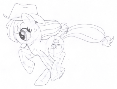
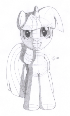
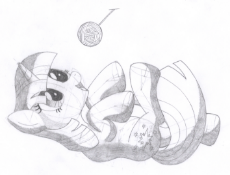
1500712260_1.png (1.8 MB, 1416x1078, 1463399__safe_artist-colon-aafh_twilight sparkle_behaving like a cat_grayscale_monochrome_on back_pony_simple background_smiling_solo_traditional art_u.png)
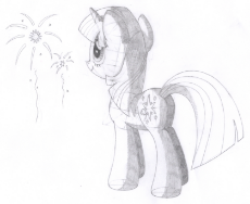
1500712260_2.png (2.1 MB, 1678x1373, 1478827__safe_artist-colon-aafh_twilight sparkle_fireworks_monochrome_solo_traditional art_unicorn.png)
1500712260_3.png (1.2 MB, 1436x1402, 1405430__safe_artist-colon-aafh_twilight sparkle_monochrome_pony_solo_traditional art_unicorn.png)
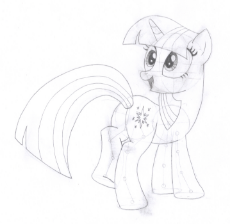
I happened to come across this happy coincedence. If you are going to study any artist, study this one. He draws ponies like a science.
https://derpibooru.org/tags/artist-colon-aafh
https://derpibooru.org/tags/artist-colon-aafh
>>51202
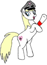
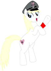
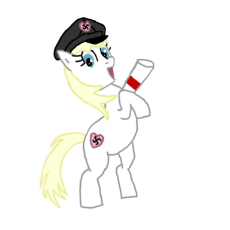
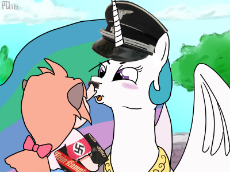
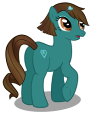
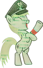
Version 2, might fill in color later. I left the swastika off for now since it's in the sketchbook I take with me places
Version 2, might fill in color later. I left the swastika off for now since it's in the sketchbook I take with me places
I've been thinking about issuing weekly drawing challenges here. Does anyone have recommendations on how or what to start with?
>>52360
We seem to have a lot of OCs without much art/content. Maybe pick some characters from the mascot thelread that is up, and see who can draw them the best?
I loved the Reckless thread, some great art got listed in there
We seem to have a lot of OCs without much art/content. Maybe pick some characters from the mascot thelread that is up, and see who can draw them the best?
I loved the Reckless thread, some great art got listed in there
>>52361
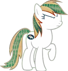
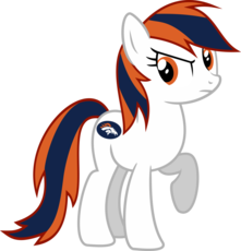
Alright, that sounds like a plan. I think we'll start with Reckless since you mentioned her. Can anyone redtext it in caps, so it's noticeable? Sketches are welcomed.
Alright, that sounds like a plan. I think we'll start with Reckless since you mentioned her. Can anyone redtext it in caps, so it's noticeable? Sketches are welcomed.
Yeah, I'd start with a particular OC. Possibly a particular OC in a certain context
>>52362
What do you mean by redtext?
>>52362
What do you mean by redtext?
>>52375
The idea is simple. Just draw a picture of Reckless. Whether it be a short sketch or anything else, it will do. Of course inventiveness is welcomed.
But, if you anybody wants to try out a pose, I suggest one like is. If any help is needed, I will be there to redline.
The idea is simple. Just draw a picture of Reckless. Whether it be a short sketch or anything else, it will do. Of course inventiveness is welcomed.
But, if you anybody wants to try out a pose, I suggest one like is. If any help is needed, I will be there to redline.
>>52381
I think we ought to have had this conversation /qa/, but nonetheless we are having it here. I think before I have seen redtext being used. Most of which were by mods.
I think we ought to have had this conversation /qa/, but nonetheless we are having it here. I think before I have seen redtext being used. Most of which were by mods.
>>52388
Well, I went and searched, and I can find no examples of it being used either by users or staff. I don't think I've ever seen red text like what is available on 8chan here, though I think I might have seen something like it (in a dark brown color) in Admin edits. Those would likely be made through edits to the database rather than any sort of generally available function. And of course the ban message feature leaves a red text
Well, I went and searched, and I can find no examples of it being used either by users or staff. I don't think I've ever seen red text like what is available on 8chan here, though I think I might have seen something like it (in a dark brown color) in Admin edits. Those would likely be made through edits to the database rather than any sort of generally available function. And of course the ban message feature leaves a red text
I found a post on pol the other day and it made me laugh so i did a thing
I've been getting pretty good at copy+paste edits. I'm getting to the point where I take vector-images of ponies and replace them with entirely different characters without the edit being noticeable or awkward.
No example, because I'm saving these edits for something else.
No example, because I'm saving these edits for something else.
Bump
/r/equesting moar exploitable image I can crop for memes.
/r/equesting moar exploitable image I can crop for memes.
I'm going to start bumping with horrible pictures if I sense that nobody else is committed to learning to produce OC/memes in this thread...
Did anybody else only start trying to learn to draw here?
Did anybody else only start trying to learn to draw here?
>>56367
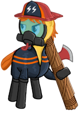
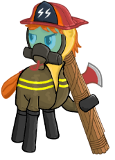
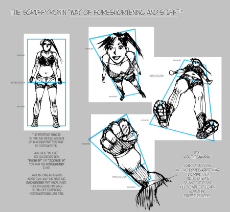
I've been making some attempts but I haven't liked anything I've been working on enough to post. I've been looking into the sorta wire frame pics my problem is I am having a problem visualizing what I want to draw. I'd like to make some more Fireaxe's since we don't have a lot of her but I don't know what pose to put her in or anything along those lines.
I've been making some attempts but I haven't liked anything I've been working on enough to post. I've been looking into the sorta wire frame pics my problem is I am having a problem visualizing what I want to draw. I'd like to make some more Fireaxe's since we don't have a lot of her but I don't know what pose to put her in or anything along those lines.
1501290703_3.jpg (209.6 KB, 962x1283, 33484DF500000578-3545058-image-a-27_1460943978390.jpg)
1501290703_4.jpg (22.3 KB, 300x246, female-australian-firefighter-calendar-shoot-video-300x2461.jpg)
>>56428
>I'd like to make some more Fireaxe's since we don't have a lot of her but I don't know what pose to put her in or anything along those lines.
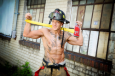
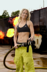
Draw some firefighter calendars, like the kinds that married women rub themselves off to.
It'd be nice to see the crew topless(even without bewbs) or with tank-tops, with all of their heavy gear and coats around their waists.
There's no shortage of firefighter poses on Jewgle (Some are basically just porn).
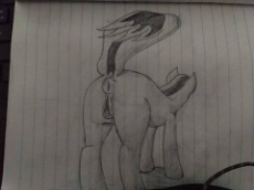
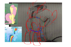
This was meant to be a shitty drawing for a shitpost, but I ended up taking it somewhat seriously partway through.
>>57017
Pretty bold with the perspective there. You've certainly got the confidence and vision for it.
You could be pretty great at this, once you master the proportions.
Pretty bold with the perspective there. You've certainly got the confidence and vision for it.
You could be pretty great at this, once you master the proportions.
>>57091
Seconding for information crucial to board culture.
I didn't check yet, but perhaps something could be found on Deviantart?
http://milky-way-fanclub.deviantart.com/
Seconding for information crucial to board culture.
I didn't check yet, but perhaps something could be found on Deviantart?
http://milky-way-fanclub.deviantart.com/
>>57095
They need to be a tad small, oval like, and a few centimetres separate from the vagina. I suggest looking at real life examples from horses, and judge from there. Type "horse teats".
They need to be a tad small, oval like, and a few centimetres separate from the vagina. I suggest looking at real life examples from horses, and judge from there. Type "horse teats".
>>57101
>Type "horse teats"
the things that come up in everyday conversation on mlpol lmfao
But on the real let's learn how to draw them...f-for science of course
>Type "horse teats"
the things that come up in everyday conversation on mlpol lmfao
But on the real let's learn how to draw them...f-for science of course
1501510390_1.jpg (118.5 KB, 800x800, fire_pegasus_by_johngiannis27_d4icbk3_by_makiathepokemonlover-d9s8yq4.jpg)
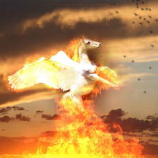
I tried to edit someone else's pic into Happy Enning. It didn't go so well, and I gave up halfway, but I thought I'd post it anyway.
Feel free to edit it if you'd like.
Feel free to edit it if you'd like.
>>57925
Hmmmm…the torso seems quite massive for a female character compared to the legs. the overall picture looks blurry to me and the way the joints in the left frontleg bend looks like it has been broken. I see a lot of potential here though if you iron some of the anatomic flaws out.
Hmmmm…the torso seems quite massive for a female character compared to the legs. the overall picture looks blurry to me and the way the joints in the left frontleg bend looks like it has been broken. I see a lot of potential here though if you iron some of the anatomic flaws out.
>>57939
Fireaxe is a bit of a beefy gal. She has to haul screaming faggots out of burning buildings every day.
Fireaxe is a bit of a beefy gal. She has to haul screaming faggots out of burning buildings every day.
1501688214_2.jpg (131.5 KB, 736x1137, 7744af824dd396ad8aeebc7e9b….jpg)
1501688214_3.jpg (372.0 KB, 796x686, comic-art-reference-human-….jpg)
>>57950
>>57925
While drawing a strong character always get a reference, it's important.
Some people don't want to use references ( I am one of these people) but believe me, it makes everything easier and it also teaches you how to draw right.
Another thing is, draw with your eyes, not your brain. When you see something let's say, an eye, we tend to make a circle and stick a ball inside it, because our brain interpretation of an eye is just a symbol.
Instead if we look at every line and detail of an eye and then draw it we can get to actually draw eyes that look real.
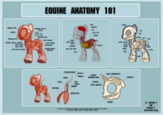
But thats just for learning, afther you learn how to draw well you can pretty much draw whatever and it will look good if you want it to do so.
>>57925
Can you show us another one of your drawings or a different pose you have drawn. I might be able to tell what some of your more formal faults.
Can you show us another one of your drawings or a different pose you have drawn. I might be able to tell what some of your more formal faults.
Hey I was wondering if anyone would know about the artfriend who drew the /mlpol/-tan story? In was in the same style of pic related and detailed /mlpol/-tan's journey through creation, deletion, and beyond. I lost touch after /qa/ got frozen and would hope he swung by here to complete his little story.
>>58134
Hello friend, yes, I am still making the thing. In fact, this is the thread that I've been in, so enjoy!
https://mlpol.net/mlpol/res/37804.html
Hello friend, yes, I am still making the thing. In fact, this is the thread that I've been in, so enjoy!
https://mlpol.net/mlpol/res/37804.html
>>58068
Like I said second time drawing something. I was trying to account for what I messed up last time so I think I over compensated.
>>51260
My last drawing. Sorry I change VPN's a lot.
>>57939
Thanks I'll took into it and iron it out for my next drawing. Also I messed up on size by making it a tinny pic. So I increased it size at the last second when I noticed how small it was which is why it looks blurry.
Posting something they may be related. This was my first time going a bit (too) realistic with the pony bits. How does it look?
1501827285.jpg (443.6 KB, 2048x1536, mlpoleague-sketch-process-….jpg)
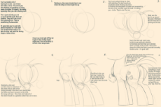
Part 1/5
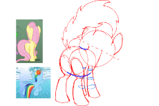
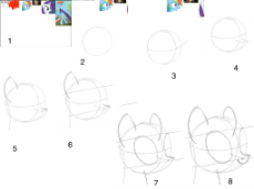
In this guide I will walk you through the typical process for drawing show accurate ponies at the ¾ perspective, which is the most important angle. I do not use a deviated style because every artist should start by learning the core techniques of observational drawing, and once comfortable, develop their own brand by themselves if they so choose.
Keep in mind this guide only applies to this specific ¾ view—just use common sense to make the proper adjustments with foreshortening when switching to a different angle. Also the beginning stages, known as construction drawing or mapping, are the most important so I go in depth with those.
I will refer to each step and describe the process.
1. Here is how I lay out my page on my tablet (I use adobe) when beginning a new drawing. If you are new to drawing a particular thing (as I am with MLP), you should always use as many references as you need. I choose a pose in my head, and flip through MLP episodes until I find positions that are close to that pose and screenshot them. Feel free to separate the required images of facial expressions/body poses as needed because there is a 99% chance the character will have the correct pose but not facial expression. You can Frankenstein them so that they portray the desired pose with the proper facial expression. This is why I have so many references.
***As a side note, I tend to use Rarity for facial expressions because her hair covers up her face the least out of all the MLP characters. ***
2. Obviously just make a circle for the head. The head is the only difficult part to draw so you might as well get that out of the way first.
3. I draw a spherical X to help guide where I place certain facial features and indicate the direction the pon is facing.
4. This is the most critical part of drawing the head and takes a lot of practice to get right. This changes drastically with every angle the horse faces, so it takes a lot of adjustment to get right at the specific pose you are going for. Draw a 3-dimensional snout starting roughly 1/16th down from the center of the head (always think of the head as divided into quadrants, then 8ths, then 16ths for reference). For the width of the snout, just eyeball it because the bridge of the nose (space in between the eyes) is roughly 1/6th of the head wide. I use the vertical line of the X guide to space the base of the nose evenly on each side
***the fore-bridge of the nose is a hair wider than the background bridge due to foreshortening, but only a minor detail and can be ignored unless you are obsessive***
The two lines signifying the top of the snout erect perpendicularly, and point slightly down. I usually find myself editing this step later on once I draw more of the head and am able to see how all the elements look relative to each other. The background corner of the snout is connected to the chin, which extends to the bottom of the head where the vertical X guideline meets the bottom. Take care to make this line perfectly round.
>>58380
It was made on the fly for a friend of mine, but I see your point. When I can, I'm going to clean it up.
It was made on the fly for a friend of mine, but I see your point. When I can, I'm going to clean it up.
1501827355.png (828.5 KB, 1924x1442, Screen Shot 2017-08-03 at ….png)

5. Next, draw the ear and the back of the neck. The base of the ear starts slightly above the center line, about 1/16th and cuts inward because of the ¾ perspective. Remember that at the ¾ perspective the fore-ear isn’t perfectly at the edge of the circle, but somewhat angled towards you. Thus, you can see the back of the neck behind the ear. The neck actually cuts into the circle overlay a little bit to connect with the back of the ear, past its base. The ear itself is a little more than half a head tall, and its base is a little less than 1/8th of the head circle arc.
6. The eyes are the 2nd hardest part of drawing the head, and you should start by laying down these guides. Put 1 line equidistantly above and below the center. The head can be partitioned into 4 equal sections from top to bottom, and the top of the eye is 1/4th above the center, and the bottom of the eye is 1/4th bellow the center. Remember this is 3D, so the bottom line will appear that it is slightly closer to the middle than the top line, due to perspective—again, a minor note which is only necessary if you are overly concerned with accuracy.
***After drawing a few pons I realized that the bottom part of the eye actually ends a smidge lower than the lower 1/4th guide, although it’s difficult to see at the ¾ angle. This applies more so to frontal views so you can ignore this for the purposes of this guide. ***
It may be confusing laying down the guides at the ¾ angle but just eyeball it and it should turn out alright. Focus on where the vertical axis intercepts the horizontal. Also, note how the guides are at a slight diagonal angle ascending from left to right. This is because I drew those guide 2D instead of 3D (sorry for the confusion). Imagine them as ellipses and they would be perfectly parallel with the centerline.
7. Then just draw the ellipses for the eyes. At this angle the eyes are ever so slightly angling away from each other in a V shape (only slightly!!!). The fore-eye is a little less than half the head wide, while the background eye is much narrower due to the perspective and is foreshortened about 60%. I also added the front of the neck which I use the fore-eye as a reference, and it starts about in the middle of that.
8. Draw the mouth and the nostrils. The nostril will be just below the corner of the underlay box you drew for the snout.
1501827406.jpg (624.5 KB, 2048x1536, mlpoleague-sketch-process-….jpg)
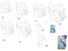
9. The 3rd most important part of the head is actually the jaw, which I see most people get wrong. It is critical and requires a lot of eyeballing, and I even end up changing it one or two times in my sketch process. The reason I always start my sketches with drawing the mouth in its normal position is because this gives me a reference. The mouth being in the normal position means the jaw is not lowered, therefore it doesn’t extend past the original circle underlay of the head. In this pose, Natalie’s mouth is open, and her jaw will be extended. To illustrate this, you must draw her jaw at a lower position to compensate for her open mouth. Pick a point on her head where her jaw will hinge (right where her jawline ends on her neck, which ends exactly below the left side of the fore-eye) and lower the bottom part of her mouth from that point towards her lips.
Always use the distance between the bottom of the fore-eye to the top of the chin to reference how fat the chin is. The chin to the bottom of the eye is about twice as thin as the top of the eye to the top of the skull. You will notice how I shrink the chin fatness in step 14, compared to this step.
I also decided to draw the pupils in this step, just to help visualize how the pon is looking. They should roughly line up with the center line.
10. Then draw the inner ears which are parallel to the outer ears.
11. I added her facial features like a smiling snarl by just chipping away at the base I already laid out, lowering her eyelids in anger. Also added lashes.
12. Just further refined the eyelashes and small details.
13. Again refined details
14. Adjusted the chin because it looked a bit stalky and chubby. I made it closer to the bottom of the eye.
15. Now start the body by basically drawing a Venn-diagram for the butt and chest. The two body circles are about ½ the size of the head and always overlap each other. They chest should be situated slightly below the head so that there is room for the neck.
16. Connect the front of the neck from the head to be flush with the front of the chest. Connect the back of the neck to the back to be flush with the back of the chest. The back of the chest should be connected to the back of the butt with a slightly concave arched line. The front of the chest should connect to the front of the butt (they horse pussy) with a convex belly.
1501827435.jpg (645.4 KB, 2048x1536, mlpoleague-sketch-process-….jpg)
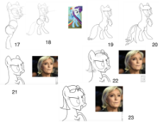
17. Just use references to start drawing appendages, which are easy. Both front and back legs are basically the length of the head, not the body. Include the hocks (joints in the back of the hind legs) in the rear legs which only show from the side, ¾, and rear perspectives. The legs always start out small where they connect to the butt or the chest, and taper out to be about twice as wide towards the hooves.
18. Draw the rest of the legs. I just used my reference.
***Notice how I put Rarity’s head on Rainbow Dash’s body in order to construct the Frankenstein pose reference I wanted. ***
19. Here, outline the sketch with a darker thicker line.
20. Add proper line weight to the graphic, with thicker lines on the outside, and thinner lines to highlight details.
21. Begin the hair, use a reference.
22. Sketch a gesture of the hair on a layer above the pon. Capture the flow of the hair and the positioning of the roots on the head.
23. Trace/outline the gesture.
1501827458.png (659.3 KB, 3277x2458, mlpoleague-sketch-process-….png)
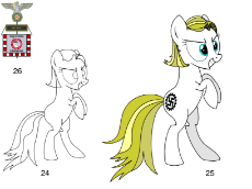
24. Mostly outlined, but missing detail.
25. Finish required detail. Add visual weight to places missing it (added thickness to tail because it looked unbalanced), hair lines, color, and markings.
26. Just the accessory for holding, which the pose is designed for.
25. Finish required detail. Add visual weight to places missing it (added thickness to tail because it looked unbalanced), hair lines, color, and markings.
26. Just the accessory for holding, which the pose is designed for.
1501863877_1.png (25.0 KB, 217x385, 552004__safe_solo_oc_oc on….png)
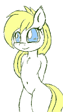
1501863877_2.png (81.6 KB, 288x369, 607843__safe_solo_oc_cute_….png)

1501863877_3.jpg (23.8 KB, 402x533, 673642__safe_solo_oc_blush….jpg)
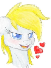
1501863877_4.png (24.5 KB, 140x250, 1238763__oc_blushing_sugge….png)

http://flockmod.com/roomlist
If you are an aspiring artist, interested in art being made live or just want to practice drawing a little, consider taking a look at this.
You can join existing communities like Hentai or Flockpony or make your own rooms if you wish.
If you are an aspiring artist, interested in art being made live or just want to practice drawing a little, consider taking a look at this.
You can join existing communities like Hentai or Flockpony or make your own rooms if you wish.
1501976059_1.png (149.3 KB, 837x955, imperial_army_uniform_by_s….png)
1501976059_2.png (188.5 KB, 760x1052, imperial_naval_officer_by_….png)

1501976059_3.png (215.8 KB, 745x1073, imperial_war_navy_sailor_b….png)

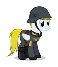
Some new art for german pony uniform designs I found on DA today, Inspired by Wehrmacht, Luftwaffe and Kriegsmarine. I figured You may find this useful for your own drawings or just as a regular sample for clothing.
The Kriegsmarine one has no pants or shoes, i am unsure if this was intentional or a mistake from the artist.
The Kriegsmarine one has no pants or shoes, i am unsure if this was intentional or a mistake from the artist.
>tfw just discovered that we have an oekaki
Say.. Could we have a weekly challenge, of some sort, where all users are encouraged to make a low-effort attempt at an assigned topic, regardless of how good they are? I think it could be fun.
Say.. Could we have a weekly challenge, of some sort, where all users are encouraged to make a low-effort attempt at an assigned topic, regardless of how good they are? I think it could be fun.
>>59347
I'd be down but I would probably throw all my autism behind it. Call out a day and I'd might be able to do it dependent on work.
I'd be down but I would probably throw all my autism behind it. Call out a day and I'd might be able to do it dependent on work.
>>59369
Hmmm… one minute seems very quick. Are you sure you're not lying?
Next challenge: 1.5 hours max
Hmmm… one minute seems very quick. Are you sure you're not lying?
Next challenge: 1.5 hours max
>>59425
>Leslie fair playing video games?
could include:
>lighting
>sitting
>perspective
>Earth pony holding object
>room
>furniture
>OC
Sounds like a good challenge.
Here's what I could do for now, before I head off to work.
>Leslie fair playing video games?
could include:
>lighting
>sitting
>perspective
>Earth pony holding object
>room
>furniture
>OC
Sounds like a good challenge.
Here's what I could do for now, before I head off to work.
>>59421
This is really good anon. 10 minutes is also fast, although not faster than 1 minute. You passed the first stage. Onto 2 you go!
This is really good anon. 10 minutes is also fast, although not faster than 1 minute. You passed the first stage. Onto 2 you go!
>>59421
Wait a minute I just realized this looks like it has been traced. Anon! Taking the easy way around something isn't how you get better!
Wait a minute I just realized this looks like it has been traced. Anon! Taking the easy way around something isn't how you get better!
>>59464
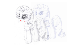
Good. Only thing you forgot is the watermark which I red lined for you here. You're on your way; keep it up!
Good. Only thing you forgot is the watermark which I red lined for you here. You're on your way; keep it up!
1502320242.webm (4.1 MB, Resolution:536x720 Length:00:00:34, 2017-08-09_09.08.10(2).webm) [play once] [loop]
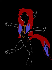
Mai Gaia sketch and color vid
1502323612.mp4 (5.1 MB, Resolution:536x720 Length:00:00:34, 1502313040909_6908.mp4) [play once] [loop]
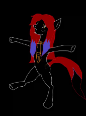
Now wib mubisk
1502344563.mp4 (5.5 MB, Resolution:1060x720 Length:00:00:30, PicsArt_08-09-09.48.17_273….mp4) [play once] [loop]
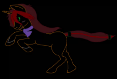
Rem Move as a filly
>>60406
Seemed fitting along with a few others. I can never decide on music for videos so I end up making 3 to 4 ones instead
Seemed fitting along with a few others. I can never decide on music for videos so I end up making 3 to 4 ones instead
We need to learn vectors. As I use GIMP for 95% of the rest of my image editing, I've gotten accustomed to the paths tool in it. I've found it easier for simple vectors than Inkscape.
Here's a tutorial for using some of the basic functions of the paths tool in GIMP:
https://www.youtube.com/watch?v=BWZvCtuisqA
This speedpaint illustrates the power of GIMP paths for a skilled user:
https://www.youtube.com/watch?v=dMa4r_kFHls
Attached is what I was working on earlier today in GIMP using the vector paths tool. The pone gf template was too small and pixulated, so I zoomed it up and drew a vector over the body outline. The beauty of saving the vector instead of just a painted edit (the proper term is a raster image) is this: you can scale the vector image up or down to any image size without losing definition and without pixulation.
If anyone wants to learn how to do this for basic pone vectors, slap me a (You). I'll post detailed pics of GIMP menus, options, and setings, as well as detail my personal techniques if need be.
Still waiting for the other anons to finish stage two of Oekaki exercise.
>>60680
It's a tad hard to follow, but what I got from was the simple challenge of drawing a pony. Leslie related I believe as well.
It's a tad hard to follow, but what I got from was the simple challenge of drawing a pony. Leslie related I believe as well.
>>60683
>nopony else ever stepped up to offer an art drawing challenge
Your lack of awareness and condescension is a meme, fam. Draw the fucking horse emoji; It's your obligation.
>nopony else ever stepped up to offer an art drawing challenge
Your lack of awareness and condescension is a meme, fam. Draw the fucking horse emoji; It's your obligation.
>>60697
>he doesn't want to learn how to draw so he can present his pony fantasies on paper
Anon, I am dissapointed.
>he doesn't want to learn how to draw so he can present his pony fantasies on paper
Anon, I am dissapointed.
>>60702
vectors allow for much easier manipulations later, whether it's to change the character or to alter it for memes
vectors allow for much easier manipulations later, whether it's to change the character or to alter it for memes
>>60702
Vectors are still drawing. There are plenty of vector drawing programs.
It's just not nearly as accurate with strokes as raster.
Vectors are still drawing. There are plenty of vector drawing programs.
It's just not nearly as accurate with strokes as raster.
>>60705
You don't draw using vector lines. You trace vector lines over a raster image to make it scale-able.
You don't draw using vector lines. You trace vector lines over a raster image to make it scale-able.
https://www.youtube.com/watch?v=eP1CVHiRvXk
It's not the same as normal drawing, and you won't actually learn to draw with it, but you can do it.
It's not the same as normal drawing, and you won't actually learn to draw with it, but you can do it.
>>60718
Let me refer you to the >>59505 edit. Countless anons before you have completed this task, gone through peer review, and learned from their mistakes. You, being oblivious to anything that's related, have not only ignored the mistakes of other anons, but also the expectations set forth by the challenge issuer. Even with all of the previous examples provided you are still a day late and a dollar short.
Better luck next time.
>>60719
>>60782
I guess this would be a good opportunity to open-up the lesson on how to BLEACH/recolor vectors without getting those ugly, discolored rims, markings, and stray pixels. I've tried upping the tolerance on my tools, denoising the pics, and just trying to paint over the discolorations, but there's always that little bit that evades me…
1502479277.png (213.0 KB, 1800x1500, 558214__safe_artist-colon-….png)

>>60800
I recorded how to do it quickly and nice but i realized my program recorded the canvas only and none of the settings windows..
I recorded how to do it quickly and nice but i realized my program recorded the canvas only and none of the settings windows..
>>60887
the eye color is off, but other than that it looks really nice and clean, you even altered the hair line! Nice work Uruguay Anon!
the eye color is off, but other than that it looks really nice and clean, you even altered the hair line! Nice work Uruguay Anon!
>>60887
if you would still upload the drawing process as a video or webm i would not mind regardless if more than the canvas is visible or not
if you would still upload the drawing process as a video or webm i would not mind regardless if more than the canvas is visible or not
>>60891
Thanks anon..I indeed painted the eyes just a random blue, nice catch
>>60893
Thing is i didn't draw any of this, at most i use vectors when i need something drawn and because of that the settings are really, really important or else stuff is just magically happening.
Id upload it but i rather record everything from the start, so im going to do just that with another picture
>>60892
Magic wand for body color with some refine edge settings, polygonal lazo for some details like the eyes, mouth and clothes, Hue/saturation to change the colors as to not screw up the lineart itself, brush tool, eraser tool and single column marquee tool to edit some minor troubles with the colors, and some cut and paste for the hair with resize tool.
Ok i did it all from the start as quick as possible and uploaded it, pic related is the final result.
https://youtu.be/U96hpSRgJmA
https://youtu.be/U96hpSRgJmA
>>60939
Oh you shouldnt have! Thank You Anon! Both for the picture and the tutorial. I am sure this will turn out helpful!
Oh you shouldnt have! Thank You Anon! Both for the picture and the tutorial. I am sure this will turn out helpful!
>>60791
Thanks I actually prefer papper and pen than digital, but I mostly just draw random stuff as I'm still improving.
Thanks I actually prefer papper and pen than digital, but I mostly just draw random stuff as I'm still improving.
>>61217
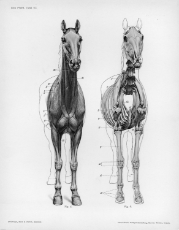
Very good sense of reference. I suggest learning a sense of anatomy. Look at bone structures and do some gesture drawing.
Very good sense of reference. I suggest learning a sense of anatomy. Look at bone structures and do some gesture drawing.
1502574937.jpg (696.8 KB, 1267x742, __kahili_pokemon_pokemon_g….jpg)
>>61062
is a breddy gud meme Anon, it looks like the pony is eating her (and then they are going to eat me.)
oh my god.
*fly*
is a breddy gud meme Anon, it looks like the pony is eating her (and then they are going to eat me.)
oh my god.
*fly*
>>61451
Ah thanks anon, i will give it a read.
Just went here to post this thing i was working on, it was supposed to be a quick sketch but i ended up working it a little
Ah thanks anon, i will give it a read.
Just went here to post this thing i was working on, it was supposed to be a quick sketch but i ended up working it a little
>>61449
Wow this is quite really helpful, i will go deep into this.
This should be pinned at op's post or something, it has been quite a while since i have seen such a good explanation on drawings.
Wow this is quite really helpful, i will go deep into this.
This should be pinned at op's post or something, it has been quite a while since i have seen such a good explanation on drawings.
>>61519
its not like this is based on real animals. MLP ponies are effectively a sentient equine xeno species. they have about as much to do with real horses as a human with a gorilla.
its not like this is based on real animals. MLP ponies are effectively a sentient equine xeno species. they have about as much to do with real horses as a human with a gorilla.
is it okay if I draw stuff by hand? I have a drawing tablet and different programs but I've always preferred pencil/pen and paper for the linework
1502909078.jpg (640.7 KB, 2048x1152, 1119961__safe_oc_smiling_t….jpg)
>>63252
most artists theses days work on digital art exclusively. if you have no intentions to go professional it is completely fine to draw on paper. If you want to show your art around, a good scanner helps.
most artists theses days work on digital art exclusively. if you have no intentions to go professional it is completely fine to draw on paper. If you want to show your art around, a good scanner helps.
1502909353.mp4 (4.8 MB, Resolution:536x720 Length:00:00:34, 2017-08-09_09.08.10(2)_481….mp4) [play once] [loop]

>>63292
That's a cute. I take a photo with my phone after I draw it then digital color since I'm out of physical art supplies
That's a cute. I take a photo with my phone after I draw it then digital color since I'm out of physical art supplies
1502909649.jpg (631.7 KB, 2048x1152, 1111675__safe_oc_smiling_c….jpg)
>>63296
This artist was very active for a short time on /pone/ early last year. Acocrding to himself some amateur artist from canada, all selftaught and without prior experience. He was trying to adapt to a disney style of ponydrawing like dennybutt does it. If you put this picture in DB reverse image search, you should find most if not all of his works. I dont think he has a blog, though.
This artist was very active for a short time on /pone/ early last year. Acocrding to himself some amateur artist from canada, all selftaught and without prior experience. He was trying to adapt to a disney style of ponydrawing like dennybutt does it. If you put this picture in DB reverse image search, you should find most if not all of his works. I dont think he has a blog, though.
1502917199_3.mp4 (5.9 MB, Resolution:720x720 Length:00:00:29, PicsArt_08-16-01.46.34_224….mp4) [play once] [loop]
I colored in someone's cute drawing
>>63358
not bad, if your straighten up the linework and improve she shading you could be onto something.
consider taking a look here
https://mlpol.net/mlpol/archive/res/52100.html
not bad, if your straighten up the linework and improve she shading you could be onto something.
consider taking a look here
https://mlpol.net/mlpol/archive/res/52100.html
1502920008.mp4 (531.2 KB, Resolution:640x360 Length:00:00:05, Duce Duce Duce.mp4) [play once] [loop]
>>63382
I can only play webm and mp4 on chrome with my phone, even my laptop refuses to play them on any browser
I can only play webm and mp4 on chrome with my phone, even my laptop refuses to play them on any browser
>>63382
This one worked fine but I sometimes get errors with other video format. I think its called "Fime" or something.
This one worked fine but I sometimes get errors with other video format. I think its called "Fime" or something.
Testing, rate my characters, i know that they are not the best
This are old draws for some fanfic that i never wrote kek
Maybe later i will draw an Aryane
This are old draws for some fanfic that i never wrote kek
Maybe later i will draw an Aryane
>>63470
>>63504
not bad. I have yet to see a finished full body picture to judge it fully. I like the detail on the clothes and the design of the heads and faces here particulary (gives a good FIM-ish vibe), the lower part of the bodies could use some enhancements in regards to anatomy though. Those models looked either too athletic or too pudgy.
>>63378
Don't. That only hinders you later on in your development as an artist. You'll start to endear stray marks and other mistakes because it's a habit.
>>63504
Decent I'd might say. How oftent do you draw?
Speaking of which, it's really fascinating looking at this artist progress in the link here >>52050. Within seven months, he went from symbol drawing to a full understanding of the equine figure.
>>63642
I can into crisp and clean but find it boring and tend to stop for some time while I find sketchy fun. Not to mention I just do not have any supplies or money for em, or a tablet so I use my phone. The app kills the quality once it is saved so trying to do a clean style dose not work to well.
In due time I will be able to make them better but it is not worth the effort right now. We have plenty of good artist already and this thread has helped many new artfags produce some good stuff
>>63299
Damn, that is really nice, that style, those clean lines, the ammount of knowledge he has both on details and anatomy.
I wish to be this great one day
Damn, that is really nice, that style, those clean lines, the ammount of knowledge he has both on details and anatomy.
I wish to be this great one day
>>63642
He definitely has his shortcomings.
Takes too long, too technical, lack of pose diversity, and has significantly improper proportions.
Still a good reference I guess. His clean style makes it easy to follow and see what he did.
He definitely has his shortcomings.
Takes too long, too technical, lack of pose diversity, and has significantly improper proportions.
Still a good reference I guess. His clean style makes it easy to follow and see what he did.
>>64341
That is really nice anon, you got proportions, anatomy really well drawn, the perspective is also really nicely done, i would say some shadows would perfect it.
Focus on the quality of the lines tho, they are pretty rough but thats a detail, well done anon!
That is really nice anon, you got proportions, anatomy really well drawn, the perspective is also really nicely done, i would say some shadows would perfect it.
Focus on the quality of the lines tho, they are pretty rough but thats a detail, well done anon!
>>64346
thanks I used to be something of a draw fag when I was younger so I can do stuff like that alright, as for color and shading I could do that by hand too but I find I get smoother results by doing that in photoshop which I'll get around to. Mostly I'm just happen I got around to doing this I haven't really drawn anything in a while but I want to start drawing at least one full drawing per day and I got to start somewhere
thanks I used to be something of a draw fag when I was younger so I can do stuff like that alright, as for color and shading I could do that by hand too but I find I get smoother results by doing that in photoshop which I'll get around to. Mostly I'm just happen I got around to doing this I haven't really drawn anything in a while but I want to start drawing at least one full drawing per day and I got to start somewhere
>>64341
Highly fuckable, anon. Great for the first try. Just need work on the eyes. I suggest Gookwaffles tutorial >>58381.
>>64345
I admire his technicality. His models go deep within the details, which is something you won't see often and definitely not coming from an artist who has less than a year under his belt. Also, his sketches remind me of Da Vinci's Vitruvian Man.
>>64348
Can't wait.
>>64345
Also, I agree with this. His poses come off as stiff and lack fluidity, along with dynamicism. Another thing I noticed is that his hooves are too rounded. Need to be more flat.
Also, I agree with this. His poses come off as stiff and lack fluidity, along with dynamicism. Another thing I noticed is that his hooves are too rounded. Need to be more flat.
>>64341
I'd say that's above average for a 1st attempt.
Neck is too long, hocks aren't pronounced enough, Legs don't taper larger towards the hooves enough, eyes are a little too small and too high on head, ears are too small, front legs are too long compared to back legs, and all legs are a tad too long in general but not as big a deal. Tail looks a little skinny and doesn't flare out enough towards the end. Torso is a little too long. I'd like to see your construction drawing for the head because it almost doesn' look round enough underneath the hair.
Perr goo overall 69/90
>>64353
This is some hardcore judgement…
Please judge mein scheiBe, ich worked verry hard for the perspective but the head looks kinda fucked up
This is some hardcore judgement…
Please judge mein scheiBe, ich worked verry hard for the perspective but the head looks kinda fucked up
>>64353
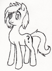
it's certainly not the first time I've ever drawn anything by a long shot, but first for pony as I only recently got into mlp. Thanks for all the actionable criticism that really helps alot, what are hocks? I'd show you it but I erased the construction details after going over the lines in pen, I'll scan it at that stage next time to give a clearer view of my drawing process.
it's certainly not the first time I've ever drawn anything by a long shot, but first for pony as I only recently got into mlp. Thanks for all the actionable criticism that really helps alot, what are hocks? I'd show you it but I erased the construction details after going over the lines in pen, I'll scan it at that stage next time to give a clearer view of my drawing process.
>>64354
Hopefully you weren't going for MLP FIM style.
The head is too small; you foreshortened it too much. I dunno if you're going for show style accuracy but the torso needs to connect from circle to circle with a smooth convex curve. the back also is concave. The legs aren't important for this I just put them there for reference.
This was a weird angle so look at these show references to get an idea of how the back of the neck connects to the head. The show rarely if ever shows ponies at this angle because it isn't quite three quarters; it's kind of in between.
>>64426
There's a word this. It's called foreshortening. Learn when to use it. tfw all the good foreshortening tutorials are on pininterest
There's a word this. It's called foreshortening. Learn when to use it. tfw all the good foreshortening tutorials are on pininterest
>>64426
I tried again!
This time I took some more references and tried to follow your advice, i had a lot of trouble with the front hooves
I tried again!
This time I took some more references and tried to follow your advice, i had a lot of trouble with the front hooves
Great GIMP tutorial; the OP there made this pone
http://www.mmocentralforums.com/forums/showthread.php?t=320930
http://www.mmocentralforums.com/forums/showthread.php?t=320930
I made this pony on Pony Town and think I want to draw it, probably going to be porn because of the nature of the pone, but horsepussy looks kinda weird to me, and i've never drawn pony porn before (though I have drawn 2 ponies). I think i want to avoid drawing the horsepussy this time, how can I make it lewd without nudity?
Any tips or suggestions to make my first time as enjoyable as possible?
Any tips or suggestions to make my first time as enjoyable as possible?
>>64804
It's a matter of many combination of things. The first being the contrast between the revealing, yet hidden nature of the content. Never go too grossly sexual unless you hooked someone in. This is allure. It shows the right parts; the hips, the waist, the long full hair, etc… All in a, as I said, revealing setting. When it comes to still settings, a low light, relaxed envrionment is key. The female as always is in a submissive position.
>but horsepussy looks kinda weird to me
Fag
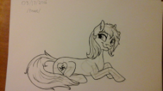
yesterday I had to move furniture for a family member and it kept me busy from 9 am til 4 pm at which point I had work, but here's today's pone drawing I might color and shade this later
>>64859
antro is generally for pinko commie scum, i.e. commie cat, but I might consider it if it was pony anthro
antro is generally for pinko commie scum, i.e. commie cat, but I might consider it if it was pony anthro
1503261072_2.webm (235.0 KB, Resolution:320x240 Length:00:00:05, simpsons horsefucker.webm) [play once] [loop]
>>64871
reminds me a little of a silent hill character, but appearances sometimes can be deceiving. If shes nice to talk to i may end up taking her out for steak dinner.
reminds me a little of a silent hill character, but appearances sometimes can be deceiving. If shes nice to talk to i may end up taking her out for steak dinner.
>>64875
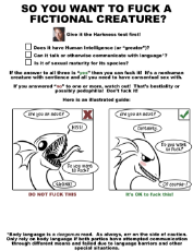
Alright, I know this is quite a bit off topic and away from the conversation, but I want to bitch about the Harmins test.
First off, it's fictional characters. They by definition do it exist, nor do they even belong to species that exist. Who cares?
Second, why is bestiality a sacred unifrigable moral right, but paedophilia is a line that they won't cross? They are different, but not by a large margin
Finally, every fictional character is necessarily going to fail the test
>is it of human intelligence?
No. It doesn't exist
>can it communicate with language?
No. It doesn't exist
>Is it sexually mature for its species
No. It doesn't exist, and neither does its fictional not-human-but-human-level-intelligence species
>>64880
people have too much time on their hands to think about hypethetical scenarios that are not real. like lawmakers in cucknada thinking loli porn violates human rights
people have too much time on their hands to think about hypethetical scenarios that are not real. like lawmakers in cucknada thinking loli porn violates human rights
>>64859
Have you been drawing all these pictures of animu all along, or a you just posting them? Because, a lot of them seem to range in style.
Have you been drawing all these pictures of animu all along, or a you just posting them? Because, a lot of them seem to range in style.
>>64904
I can draw a little but not to that degree. I found that cat picture just today when someone was asking about catgirls in warhammer.
I can draw a little but not to that degree. I found that cat picture just today when someone was asking about catgirls in warhammer.
Here's a thing I made, thought you guys might like it.
>>65529
nah just wanted to post here once and see what happened I'll probably fuck off again after this.
nah just wanted to post here once and see what happened I'll probably fuck off again after this.
>>65535
I'll probably just keep to /pone/ as usual, like I said this was mostly for shits and giggles.
I'll probably just keep to /pone/ as usual, like I said this was mostly for shits and giggles.
>>65616
I left them out because they are for a project where I need characters without eyes.
The other two I finished, not OC. I didn't have one of Leslie so I made one instead and chose to post it. I might make one of Fireaxe and Syriana as well. Depends if their pr-existing pics work well enough.
Feel free to add eyes if you want.
Oh wait someone already is on it…
1503431793.png (229.3 KB, 1486x1080, 940971__oc_smiling_semi-da….png)
>>65513
>>65516
>>65530
>>65553
Does not look bad ADF. Im not much of a fan of pink ponuts, but you came to be a decent animator. You came a long way since your beginnings in 2014.
I can understand when you want to stick with /pone/. its a personal choice one must make what community one wants to be a part of. Personally, i grew to distant from 8chan for a long time. But it is how it is i guess. Should you ever change your mind, pay us a visit.
yesterday and today's anon filly drawings I based them on pics of apple bloom to get the filly proportions. Anyone have a tutorial for the hair?
>>65838
Looking good anon! I'd say the only thing that needs work is a bit of the leg and neck proportions on the first drawing and the backleg on the second. Otherwise it looks cute.
Looking good anon! I'd say the only thing that needs work is a bit of the leg and neck proportions on the first drawing and the backleg on the second. Otherwise it looks cute.
>>65739
Oh no not my old art! Also I switched to pink because I found out that truly white horses have pink skin, and considering Aryan poners would really be white I did it that way.
Also we'll see in about a month or so, the quality slide of the show is hitting /pone/ hard sadly, we're nearly dead and classes haven't even started yet. I'll never leave /pone/ but I might start posting here if activity drops anymore over there.
>>65844
Not only is Starlight Glimmer best pony, she forces new posters to migrate over from /pone/! My goodness she's perfect.
Not only is Starlight Glimmer best pony, she forces new posters to migrate over from /pone/! My goodness she's perfect.
>>65844
This whole post makes me sad
>truly white horses have pink skin
Aww. I was hoping she'd have that beautiful and sexy grey/black color most horses have
>the quality slide of the show
It's not that bad… is it? Sure, the last two episodes leave something to be desired, but wasn't the first half of the season good?
>/pone/ is nearly dead and classes haven't even started yet
That's just tragic
>>65860
She's sitting cross legged.
That was one of the three-minute oekakis I sharted out during the raid
She's sitting cross legged.
That was one of the three-minute oekakis I sharted out during the raid
>>65862
I've hated this season honestly, only episode I've really like was the one with RD's parents, seems /pone/ posters feels the same as activity has fallen off greatly even from a month ago.
I've hated this season honestly, only episode I've really like was the one with RD's parents, seems /pone/ posters feels the same as activity has fallen off greatly even from a month ago.
>>65883
This season has been mixed. No where near as bad as six but still a lot of meh eps and the recent 2 have been terrible. Still holding out for some good ones but I'm not sure after the last 2. Still I have my hopes high.
This season has been mixed. No where near as bad as six but still a lot of meh eps and the recent 2 have been terrible. Still holding out for some good ones but I'm not sure after the last 2. Still I have my hopes high.
351 replies | 240 files | 34 UUIDs | Archived
