I had a thread going on endchan for this, decided to resurrect it here now that the community is starting to look a little livelier. I’ll probably have concurrent threads going on mlpol.net and 8ch so everyone can join in if they want.
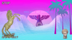
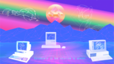
One of the more interesting (I think so anyway) projects /pol/ had going more recently were the fashwave / W E S T H E T I C threads. The aim was to combine classical and fascist/nationalist themes with vaporwave-style art to create visually appealing images that promote right-wing ideals.
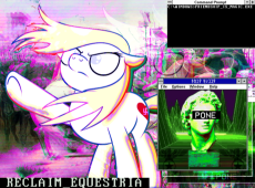
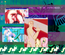
Initially as a joke, I started playing around with creating fashwave-style images featuring MLP characters for /mlpol/. However, after a bit of experimentation I’ve begun to feel that the style may have legitimate potential for expressing more serious themes and could very well be an evolution of fashwave in much the same way that /mlpol/ itself is an evolution of both /pol/ and /mlp/.
The fashwave art I’ve collected, while occasionally humorous, has a tendency to be overly grim and dark, which is probably the intention; however since I’ve been experimenting with different ways of adding the ponies to the mix (the art style of MLP does not lend itself naturally to vaporware and its been somewhat challenging figuring out how to do it) I’ve found that the ponies add an element of hope and warmth to the images. The effect is really much the same as the effect that merging the two boards in the first place had for many anons, particularly disillusioned blackpilled anons.
/mlpol/ - My Little Politics
Archived thread
>>2579
For this reason I think this art style would be a good tool towards convincing /pol/ anons who may not have been around for April Fools, or who thought the idea was cringy or stupid or whatever, to take the ponypill and join us. My personal experience has been that MLP works wonders for the blackpill, and adds a lot of warmth and wholesomeness to life that reminds us why we’re fighting to save Western civilization in the first place.
tl;dr
Post mlp and fascist themed vaporwave art.
Also feel free to bump with existing fashwave pics as many of our ponyfriends may not be familiar with the style.
>Original FASHWAVE guide - worth reading if you’ve got the time, plus includes step-by-step instructions for basic image creation techniques
https://docs.google.com/document/d/1DIeovVhwprNb9z4x9Pxiyr84nhouf3mxz3uzDOlARdo/edit#
I don’t know as much about the music, but I remember the old threads had some links to fashwave music some anons had composed, so if anyone wants to post a list of those tracks that would be super.
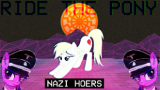
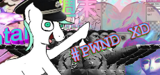
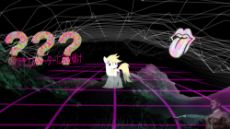
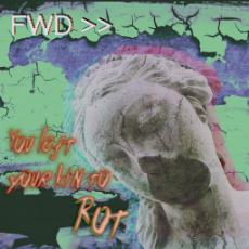
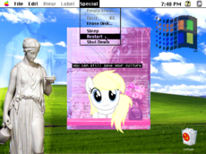
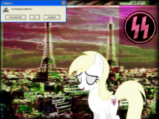
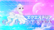
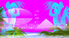
These are the earliest ones I did and I think they are more in the joke image category, however I like them and I'm posting them because why not.
>>2579
I've seen your work floating around, you're pretty good. I'm somewhat competent in GIMP, I'll take a look at that google doc.
I've seen your work floating around, you're pretty good. I'm somewhat competent in GIMP, I'll take a look at that google doc.
>>2584
I like 'em
I made this when we still had /qa/
I will make some more serious ones when I get to my pc
I like 'em
I made this when we still had /qa/
I will make some more serious ones when I get to my pc
>>2580
I definitely agree with you on the blackpill matter.
Blackpill is the only thing that could stop red pill.
Have we found the cure?
I definitely agree with you on the blackpill matter.
Blackpill is the only thing that could stop red pill.
Have we found the cure?
>>2579
Think you can dump some of your resources? Or maybe there's a dropbox or something with this stuff. The palm tress, grid landscapes, Windows graphics, that sort of thing. I'm gonna try and make something decent with this basic concept, but I'm not sure what to fill all the negative space with.
Think you can dump some of your resources? Or maybe there's a dropbox or something with this stuff. The palm tress, grid landscapes, Windows graphics, that sort of thing. I'm gonna try and make something decent with this basic concept, but I'm not sure what to fill all the negative space with.
>>2618
Yeah, it might take me a bit but I can get that stuff gathered together and put a zip of it up. Probably will have to be tomorrow since I'm about to go to sleep, but I'll make sure to do it.
In the meantime if you do an image search for "vaporwave landscape" it usually brings up some useful images.
Yeah, it might take me a bit but I can get that stuff gathered together and put a zip of it up. Probably will have to be tomorrow since I'm about to go to sleep, but I'll make sure to do it.
In the meantime if you do an image search for "vaporwave landscape" it usually brings up some useful images.
>>2624
Yeah, I can also use a photo of a pastoral homeland-invoking landscape to fill most of the background. Thanks and goodnight!
Yeah, I can also use a photo of a pastoral homeland-invoking landscape to fill most of the background. Thanks and goodnight!
>>2618
Here it is. My first attempt at A E S T H E T I C S. I've been tweaking and poking at it for so long I can't tell if it's any good.
Here it is. My first attempt at A E S T H E T I C S. I've been tweaking and poking at it for so long I can't tell if it's any good.
>>2651
I like it. I would add the <<REW video rewind fonting to it as the theme is about returning to the better recent past.
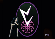
I like the font as it is reminiscent of the Vril icon. See pic.
Also it strays a lot from the green/blue/purple/dark background I am familiar with but then that's because of so much sky shifted to red which I understand.
Redpill me on fashwave? What is it; where did it come from; and why is it so popular on /pol/?
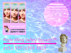
Also, could I get a nice one for /rwss/? The thread is losing energy, and we need OC to get moar safety inspectors on board.
Also, could I get a nice one for /rwss/? The thread is losing energy, and we need OC to get moar safety inspectors on board.
>>3154
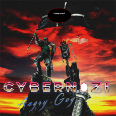
I just recently discovered this myself. you probably already know Cybernazi. Never really listened to Vaporwave before.
I just recently discovered this myself. you probably already know Cybernazi. Never really listened to Vaporwave before.
>>2618
As promised, here is a collection of resources I've found for creating the images that I've done. This collection is just what I've found since 4/1, some of it I've used and some of it is just stuff I saved that I think would be useful. I think I've got more somewhere but I'd have to search around for it.
Bear in mind you might have to do a little bit of work on some of these, such as selecting specific parts of the image you want, removing watermarks on a couple of them, adjusting colors, etc.
I also included a few fonts that I like.
http://www.mediafire.com/file/ooyc84iksjx3qkh/resources.zip
>>3154
If you're referring to the art style, I would recommend giving the guide I linked to earlier in the thread a quick read. The music style I know less about, other than that it's similar to vaporwave music in general but often employs fascist themes or samples.
If you're referring to the art style, I would recommend giving the guide I linked to earlier in the thread a quick read. The music style I know less about, other than that it's similar to vaporwave music in general but often employs fascist themes or samples.
>>2627
>>3256
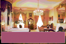
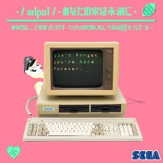
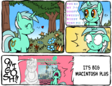
lol I made that one for the /qa/ raid, figured it might trigger/amuse some /jp/ anons considering that board's visual novel obsession. Didn't end up getting to upload it since the file size was too large for 4chan and I never got around to making a compressed version, especially since by then I'd already been banned like 4 times anyway.
It's since occurred to me that it might be funny to make an actual game based on that gif or a similar concept, especially since I've been working on a simple VN engine as part of a school project anyway. …Stay tuned I guess, it may or may not happen.
Tried to do something "cleaner", "softer". Feel free to suggest little changes in the composition or placement of things, I want to improve my sense for this stuff.
>>4930
I like the sci-fi-looking color scheme and the arrangement of objects is well balanced. That's the kind of thing you can't really explain how to do, you just have to either have or develop a sense for it, and I would say you have a pretty good sense for it already. The main thing is to use negative space to your advantage and not have too many unrelated objects competing for the viewer's attention. In this case you have 4 different "main" objects arranged more or less as compass points, and they are all conceptually interconnected so in terms of balance this image looks pretty good and communicates its message effectively.
I particularly like the way the rectangles around Aryanne's eyes are arranged, with the varying blending levels, that was very well done. The way "shy" is the only word not in shadow was a good choice. I would probably bring up the brightness on the rectangle with the eyes in it so the whiteness contrasts more with the shadow.
The main negative thing I notice about this one is that the grid looks very dirty. There's a lot of "gunk" in the corners of the squares and the lines aren't straight. It also becomes basically solid at the point where "Catch the Lightning" starts, which is a little off-putting. You might want to just leave the squares of the grid filled in as that kind of dark purple ground looks good against that sky color, like an alien landscape or something. If you want a transparent grid you should probably find or make one where the lines are perfectly straight. Everything else in this image is geometrically stark and the grid should be too; the only thing really organic-looking is the "catch the lightning" text, which is good because it makes it stand out. However it would be more striking if the grid wasn't so muddy.
Only other minor issue I have is the magenta in the halo around bottom-Aryanne's head. That color doesn't appear anywhere else in the image and looks out of place; you may want to consider making it red-orange closer to the glow surrounding the SS bolts in the sun.
>>5029
Thanks for the in-depth appraisal! Right off the bat, brighter eyes and a halo more in line with colors that already exist in the sun are fast and objective improvements. I was a little nervous about having four things at compass points, thought it would look boring, so I'm glad to hear someone say it works. The "shy" thing was actually a happy accident; none of it was meant to be in shadow before I typed it out, but I was between layers of rectangles at the time and it jumped out at me.
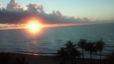
I envied your nice soft gradient in the OP image and the style of the next two you posted. They weren't barren of detail, and they didn't look like they were being viewed through some technological lens like "reclaim equestria" and "SHALL NOT BE INFRINGED". I started with the gradient in the background. My goal was for it to remind the viewer of the morning, with the part above the horizon looking like the sky a minute or two after dawn and the part below the horizon to be covered in that blue haze you see before dawn. I'd saved a few raw grids so I picked one and slapped it on, replacing the black with transparency. I meant to refine it until it was clean (or more likely switch to one that was easier to clean) but I thought the lazy first pass looked organic, like a cracked sidewalk or something. Led to me choosing the Endless Bummer font for "catch the lightning". I'm not surprised or offended that it comes off looking grody/unfinished, especially with how the transparency stops before the grid has reached the horizon. I could trace over the lines to make a cleaner grid, but the horizontal ones get so close together around the text that I can't even pick 'em out. Anyone got ideas for an alternate floor? Maybe I could just use some ocean.
>>5080
>>5109
A couple of things you might want to experiment with and see what you like:
Put the first raw grid that you had back on, but instead of deleting the black leave it in and just have it end where the grid in the first picture ends, with a bit of the blue gradient showing at the bottom. You can also mess with the layer blending so it interacts with the gradient underneath, or move the gradient layer on top of the grid layer and adjust blending on the gradient layer.
In the images of mine that you mentioned that's basically what I did; I had a cyan to magenta gradient as the background and then placed a vaporwave landscape graphic I found over it and set the blend mode to overlay or something like that. A lot of working in this art style is just a matter of messing with colors and blending options honestly. If you decide to go with the ocean I would definitely adjust the blending in some way, and probably add some scan lines, or maybe have a few blended slightly offset copies of it layered on top of each other, make it a little more vaporwavey.
Another random idea I had that may or may not work is taking the photo of morning over the ocean that you started with, putting it under the gradient layer, and then blending the gradient layer on top of it.
Definitely play around with it a little more and see what you like, you're definitely on to something.
1491923406.png (238.0 KB, 1165x787, 1167867__safe_solo_oc_spec….png)

https:// www.youtube.com/watch?v=gCXpVakWSqA&list=PLuDCrjOek9nii9oInGbE-BGZoAplm6MeZ
>>6891
Glad you liked it this much Anon. the OST of Blood Dragon is a nice soundtrack to do exessive thing to. I never really was into Vaporwave or 80's style music, but this is something I too can enjoy.
Glad you liked it this much Anon. the OST of Blood Dragon is a nice soundtrack to do exessive thing to. I never really was into Vaporwave or 80's style music, but this is something I too can enjoy.
Just found this board thanks to a friendly anon. This is great!!
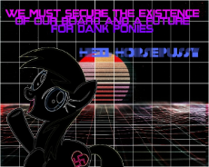
Is this too dark btw?
youtube.com/watch?v=NyfL9LC1DC4
Is this too dark btw?
youtube.com/watch?v=NyfL9LC1DC4
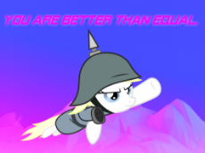
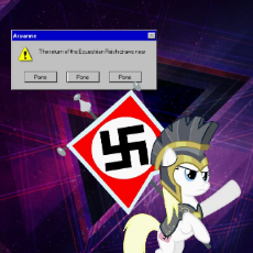
Here's a quickie I just did. It's not subtle or elaborate but I like it.
>>10110
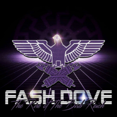
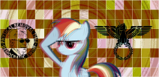
I like the purple on black scheme, that's an idea that hadn't occurred to me but I definitely want to play around with that now. The Equestrian Reich one I really like, definitely do more like that.
I like the purple on black scheme, that's an idea that hadn't occurred to me but I definitely want to play around with that now. The Equestrian Reich one I really like, definitely do more like that.
>>10224
Nice. Text is a little plain, you might want to consider vaporwaving it up a bit. Love the design and the colors.
Nice. Text is a little plain, you might want to consider vaporwaving it up a bit. Love the design and the colors.
these are nice vapor edits
1492824315.png (409.6 KB, 1000x1000, 601768__safe_pinkie pie_up….png)

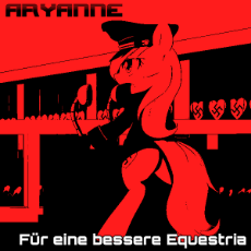
I made this trying to make something with a KMFDM look to it. Not really vaprwave looking but I didn't know where else to put it.
>>11878
I never understood the 4/20 meme…
Does anybody know why they made 4/20, of all days, Weed Day?
I never understood the 4/20 meme…
Does anybody know why they made 4/20, of all days, Weed Day?
>>16095
No one actually knows why 4/20 is associated with marijuana usage, but my favorite theory is that it comes from a passage in H. P. Lovecraft's "In the Walls of Eryx" where the narrarator comes upon a plant that disorients his sense of time, and then discovers that the time is only 4/20. The text is as follows:
"I had encountered at last one of those curious mirage-plants about which so many of our men told stories. Anderson had warned me of them, and described their appearance very closely—the shaggy stalk, the spiky leaves, and the mottled blossoms whose gaseous, dream-breeding exhalations penetrate every existing make of mask.
Recalling what happened to Bailey three years ago, I fell into a momentary panic, and began to dash and stagger about in the crazy, chaotic world which the plant’s exhalations had woven around me. Then good sense came back, and I realised all I need do was retreat from the dangerous blossoms; heading away from the source of the pulsations, and cutting a path blindly—regardless of what might seem to swirl around me—until safely out of the plant’s effective radius.
Although everything was spinning perilously, I tried to start in the right direction and hack my way ahead. My route must have been far from straight, for it seemed hours before I was free of the mirage-plant’s pervasive influence. Gradually the dancing lights began to disappear, and the shimmering spectral scenery began to assume the aspect of solidity. When I did get wholly clear I looked at my watch and was astonished to find that the time was only 4:20. Though eternities had seemed to pass, the whole experience could have consumed little more than a half-hour."
>>16095
The story I heard there was a social clique of stoners at some high school in California in the 1970s that always used to meet up after school to smoke pot. 4:20 was when school got out or their team practice ended or something so that's when they would meet up, and they started using it as their code word for getting high. The term got spread around the weed culture in the local area and outwards from there.
That could very well be bullshit though, I know there's a million other stories floating around. It's one of those pre-internet memes whose origins are vague.
good thread I think
So, once we have, say, 100 good vaporwave pics, should we create an imgur album?
>>16793
I think that's a good idea, we've all put a lot of hard work into these and they definitely deserve preservation beyond remaining in a thread that could potentially be slid off the board at some point. I've been meaning to do a few more but I've mostly been shitposting /qa/ recently, I'll try to get back on it in the next few days.
I think that's a good idea, we've all put a lot of hard work into these and they definitely deserve preservation beyond remaining in a thread that could potentially be slid off the board at some point. I've been meaning to do a few more but I've mostly been shitposting /qa/ recently, I'll try to get back on it in the next few days.
99 replies | 63 files | 1 UUIDs | Archived


















 Ex: Type :littlepip: to add Littlepip
  Ex: Type :eqg-rarity: to add EqG Rarity