We already have a dope symbol, something really nice to get behind but I realized, we don't have an actual logo or a flag! At least not one following the best practices!
A good logo should be easily recognizable, simple, printable in black and white
a good flag should have a limited color palette, not include complicated shapes, be representative of the whole community that it stands for
In the spirit of April, Lets get the creative juices flowing once again anons!
/mlpol/ - My Little Politics
Archived thread

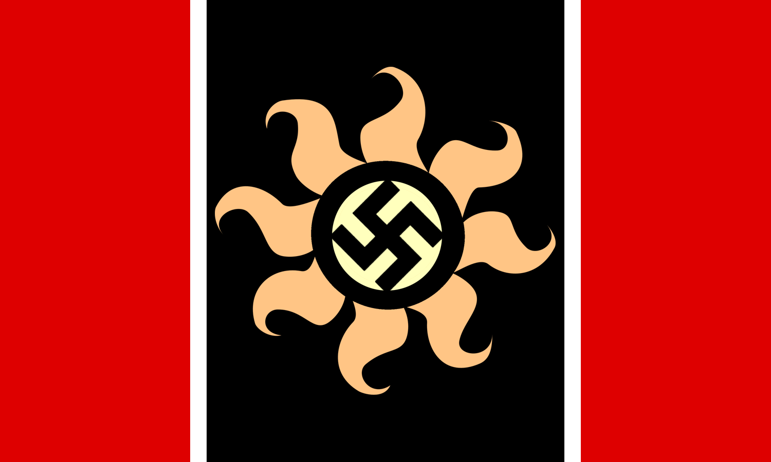
1523057426_1.png (603.1 KB, 1875x2021, 1401758__safe_oc_oc-colon-aryanne_4chan_logo_-fwslash-mlp-fwslash-_-fwslash-mlpol-fwslash-_nazi_-fwslash-pol.png)

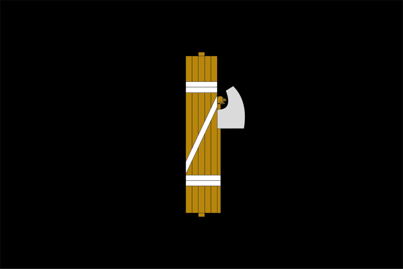
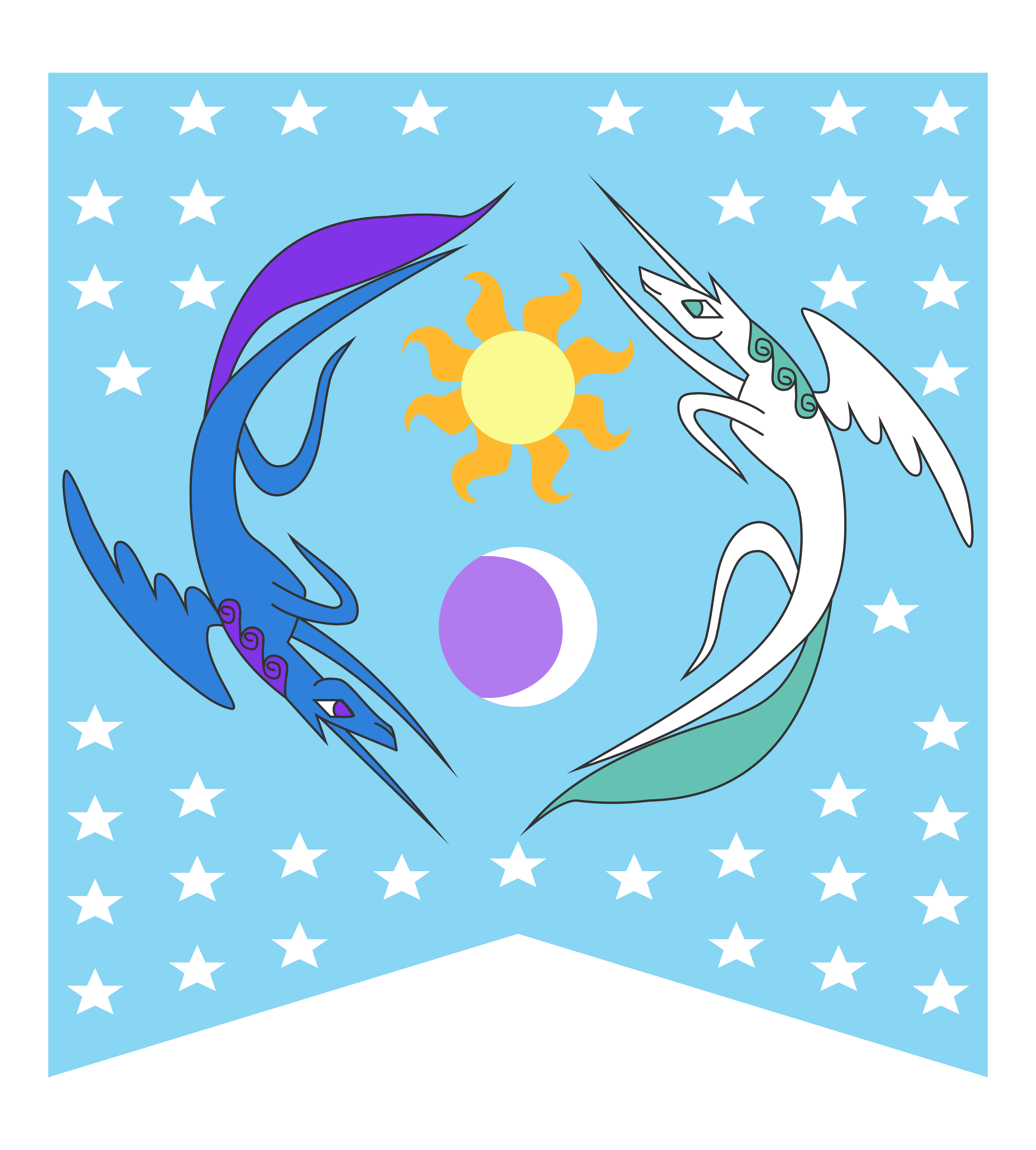
1523057426_2.png (169.2 KB, 1159x801, 06_Official MLPOL board flag.png)


MLPOL never bothered to make its own symbols, we just took the old ones.


>>137826
I think we already had a good collection of stuff these being my favorites. But hey if you want to make a new one or think up something else I'd suggest we go with something similar to these.
I think we already had a good collection of stuff these being my favorites. But hey if you want to make a new one or think up something else I'd suggest we go with something similar to these.
>>137830
>>137835
>>137834
Well a couple of reasons imo.
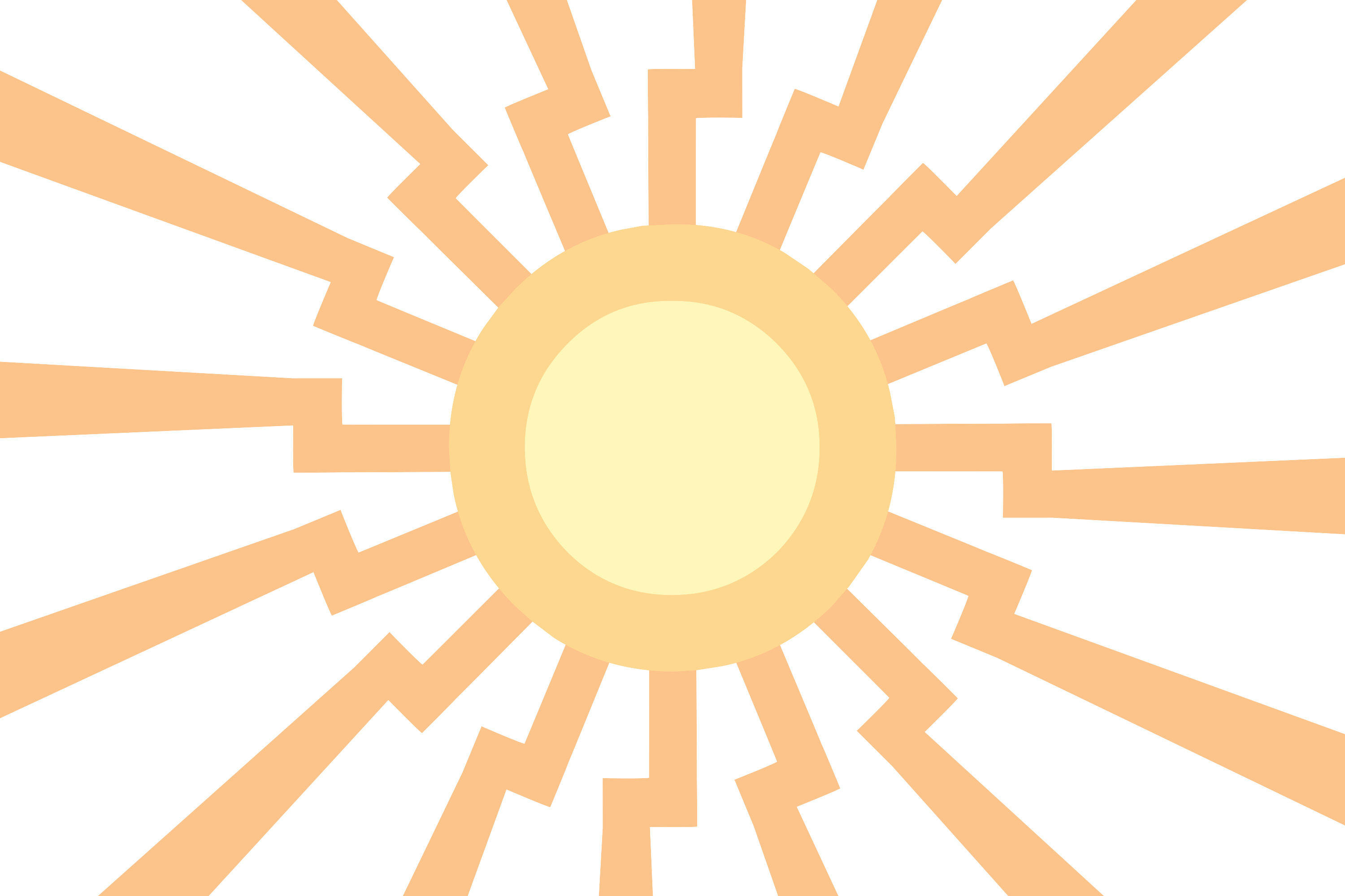
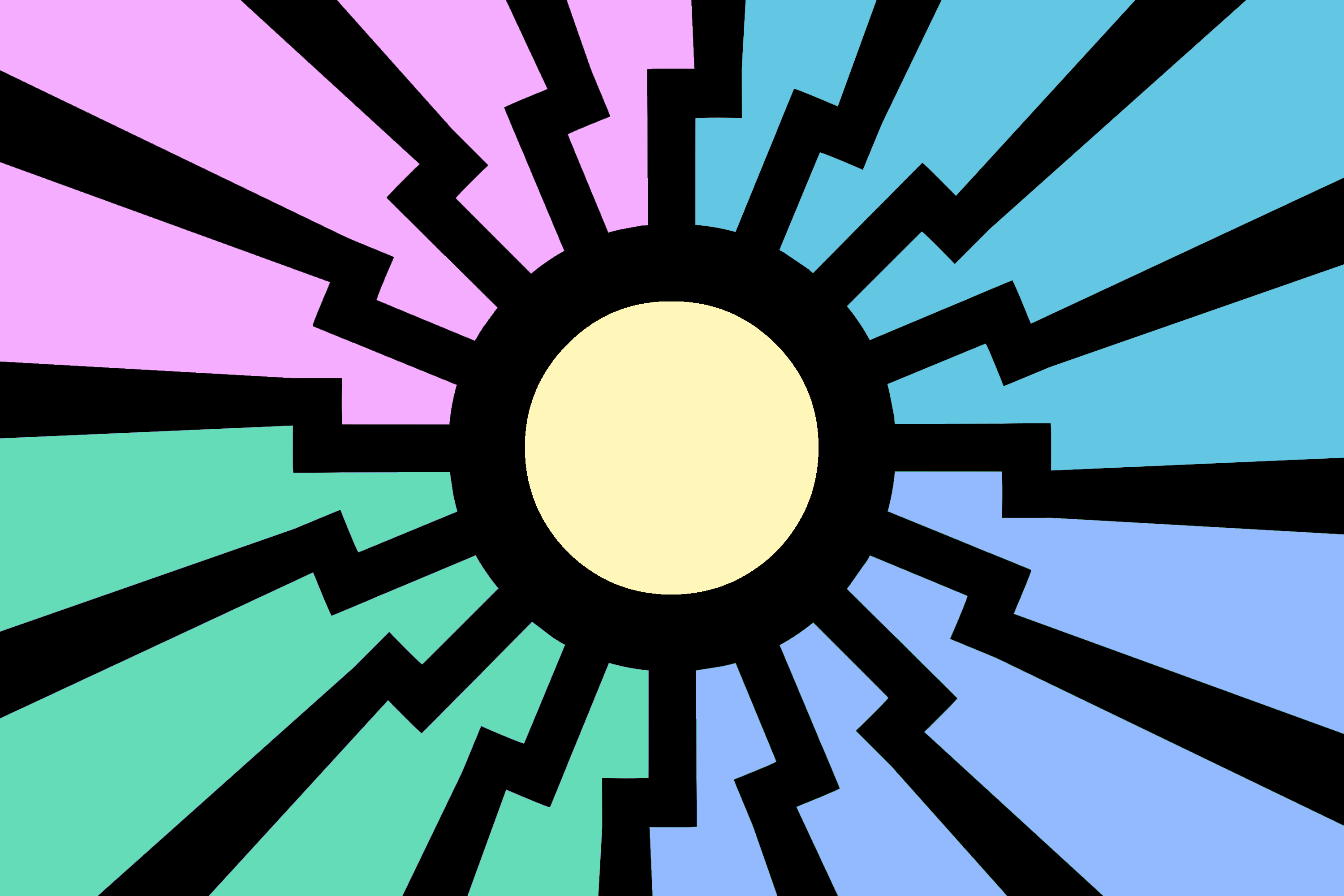
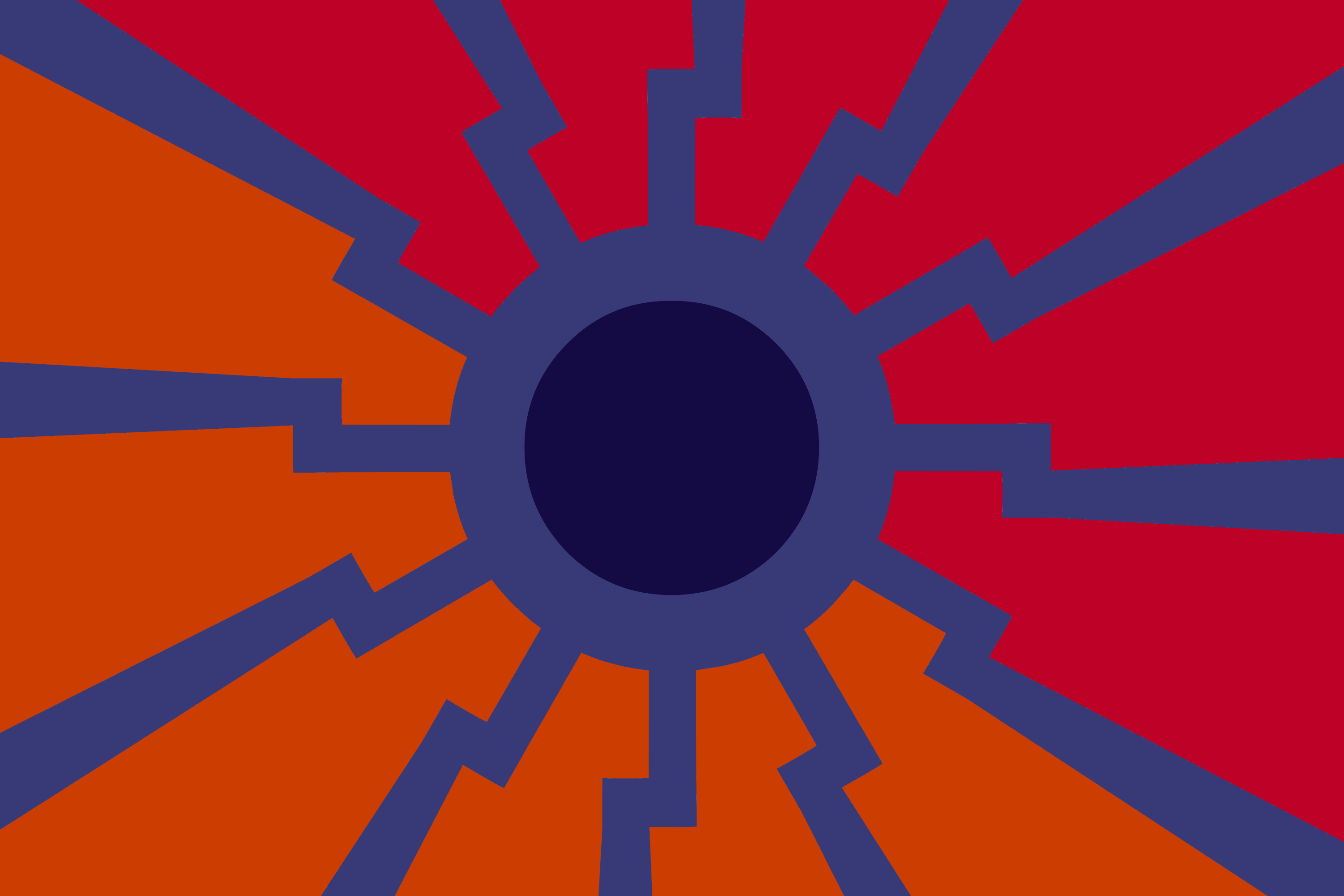
a) the symbol we have, the unicorn symbol is way too complicated to be used on a flag or in a logo, a lot of small spaces and geometry. Great symbol, but doesn't work from a /gd/ standpoint when it comes to flags and smaller logos. It only works if you have the flag on your computer, and can zoom in on it
b) I feel we have lost some of our creative drive and I'm hoping to spark some creativity and fun again! I'll post mine when I'm done with them
c) feels cheap to just steal it off of /pol/ imo
>>137835
>>137834
Well a couple of reasons imo.
a) the symbol we have, the unicorn symbol is way too complicated to be used on a flag or in a logo, a lot of small spaces and geometry. Great symbol, but doesn't work from a /gd/ standpoint when it comes to flags and smaller logos. It only works if you have the flag on your computer, and can zoom in on it
b) I feel we have lost some of our creative drive and I'm hoping to spark some creativity and fun again! I'll post mine when I'm done with them
c) feels cheap to just steal it off of /pol/ imo

>>137837
Well, trying to get some autism running is always a good idea, the first thing I'd ask then is what colors do you think is appropriate? I'd say white should be one of the main because Aryanne.
Well, trying to get some autism running is always a good idea, the first thing I'd ask then is what colors do you think is appropriate? I'd say white should be one of the main because Aryanne.
>>137838
I'm not necessarily against any color so far. although I'd personally try to avoid the red/black/White combo because I think it carries to much baggage with it historically. It will be harder to get more people in if they just think of us as pony nazis right of the bat. we need to bring them here under and redpill them gradually!
Actually, we I'm probably going to try and see how does the full Aryanne palette work for a flag, Yellow/White/Blue maybe? We could also go into kekistany green?
>>137840
>We could also go into kekistany green
Green is a bad idea. The Aryanne color pallet is a good idea in theory if we can make it work. We'd still need a symbol to work into it though, and it'd likely have to pertain the the far right in some way or another. Maybe simplifying the unicorn in the flags?
>>137840
>kekistany green
No. That has noting to do with us, and everything to do with Reddit.
>>137837
>>137838
If we're going to autism we are going maximum autism on this.
https://youtu.be/tXan6Sw_okc
>In depth flag creation video.
We need four core things when making a new flag. We need colors that represent what /mlpol/ is. We need a symbol that is uniquely /mlpol/. We need a design that enhances the meaning of the colors. Finally, we need to keep it simple.
>>137842
I disagree with this proposal. The Aryanne color pallet represents Aryanne, but not /mlpol/. Aryanne can be a part of /mlpol/ but does not represent all of /mlpol/.
I disagree with this proposal. The Aryanne color pallet represents Aryanne, but not /mlpol/. Aryanne can be a part of /mlpol/ but does not represent all of /mlpol/.
1523062295.png (174.3 KB, 928x861, angry_limestone_pie_by_pink1ejack-db7mo4o.png)

>>137851
>Aryanne can be a part of /mlpol/ but does not represent all of /mlpol/.
What the fuck are you talking about? Even if you are a lolbertrian or a civic nat *vomits* you have to recognize the importance of Aryanne in our history similar to how national socialism has shaped /pol/.
That said, I really don't like the color pallet of Aryanne, white is good but the other colors are way too light in my mind, and don't contrast well at all.
>>137852
What does the red, white, and yellow represent?
>>137853
I never said Aryanne lacked importance. The logic that due to her importance the /mlpol/ color pallet should be her colors is bad. She should obviously be represented in the flag in some way though. Can we agree that the color white should be incorporated into the design to represent her? Asides from representing just Aryanne, it also can represent some of the board's ideals. The board wants to remain pure from shills, and annoying redditfags. I think this is a great fit.

1523063231.png (10.9 KB, 800x533, Flag_of_the_National_Fascist_Party.png)
1523063500.png (376.3 KB, 937x718, Drunken Shitposting Colorized.png)
>>137860
that could also work, especially given the two main ideology ponies we have are white/yellow and yellow/black.
that could also work, especially given the two main ideology ponies we have are white/yellow and yellow/black.

Thoughts?

I have no idea how an mlpol logo should look like

>>137876
it does, but as I stated before, it doesn't follow the good flag design practices, lets get something that can represent us even in a flag like the ones that are assigned to board posts, you wouldn't even see the pony in it in that scale, have 2 or 3 that just have a complex thing in the middle, and they all look identical
it does, but as I stated before, it doesn't follow the good flag design practices, lets get something that can represent us even in a flag like the ones that are assigned to board posts, you wouldn't even see the pony in it in that scale, have 2 or 3 that just have a complex thing in the middle, and they all look identical


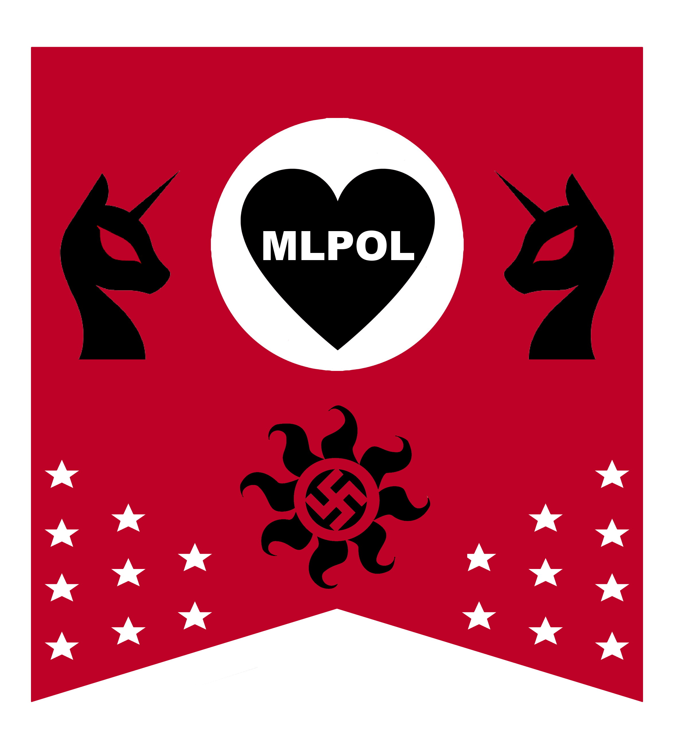
Doing a little work with black and white, resulting in this. On the outside /mlpol/ puts on a face of strength, desiring victory in all battles. On the inside though, protected by its strength (horse puss) the intentions of /mlpol/ are pure. Those intentions being to have meaningful discussion, having fun, and remaining pure of Reddit shills. I know this sounds fucking gay please bear with me. Ideally, the middle will have a symbol of some sort. Probably a reichalicorn. I just think it needs more colors somehow before I go further.
>>137894
Why not the Black Sun?
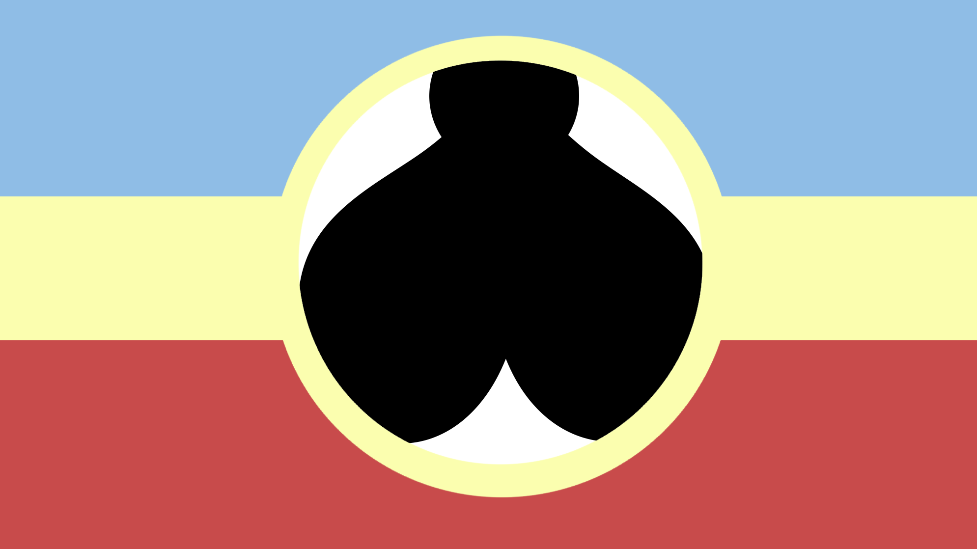
To add more color to it, I would flip the design 90 degrees so that the white bar is vertical. Then, on the left and right extremes have a vertical yellow bar. The yellow should not touch the white.
>>137826
>>137877
>complex thing
Are you really this new, that you can't recognize the Black Sun?
>>137868
That looks like the Batman logo.
Why not the Black Sun?
To add more color to it, I would flip the design 90 degrees so that the white bar is vertical. Then, on the left and right extremes have a vertical yellow bar. The yellow should not touch the white.
>>137826
>>137877
>complex thing
Are you really this new, that you can't recognize the Black Sun?
>>137868
That looks like the Batman logo.
>>137826
What we have is perfectly fine, there's absolutely no need to alter what we made in the first days and doing so only distances ourselves from our roots.
What we have is perfectly fine, there's absolutely no need to alter what we made in the first days and doing so only distances ourselves from our roots.
1523094978.png (10.4 KB, 442x147, 3778cfa3-8be0-4b45-a977-2d6a5e621847.png)
>>137840
Do not forget your past.
>>137830
They are our symbols. Although I accept that the right thought is put into new design ventures, the products often or not have much to be desired. From some of the site created ocs to the orange anon, the designs I see on this site don't capture the eye. Much of it doesn't have a good grasp on graphics.

The Aryanne logo is the perfect evolution of the /pol/ logo. The synthesis of mlp and pol adds a pony to the infamous design. Don't fix something that is not broken. excuse the file name
>>137935
I am willing to agree that most of the OC created on 4/mlpol/ was and is objectively better than most what we have today. However, that board is history. We have to work with what we have and unless we manage to expand our userbase, we wont have the support needed to create OC of this quality. That said, not all of the OC created on MLPOL is trash and luckyly i can say that most of it was, at some point, of acceptable quality.
>>137937
also this, i myself do not really see a need for a redesign (nonetheless something that even the site owner of 4chan actually bothered to repost on twitter), but as far as i can tell this thread more or less serves as some kind of hub for sitemeta related OC, which is in itself not bad. I suggest we keep it up regardless in case someone comes up with something worthwhile.
>>137938
I would agree that expansion is needed, but I don't see the longterm nor immediate effect of a new logo on attracting users, especially when our site is already so niche. If anything since we're willing to give that much up for new users, I'd suggest advertising on places like derpibooru.
I would agree that expansion is needed, but I don't see the longterm nor immediate effect of a new logo on attracting users, especially when our site is already so niche. If anything since we're willing to give that much up for new users, I'd suggest advertising on places like derpibooru.

>>137957
the red flag with the green lauren and aryan alicorn is de facto our official flag. it received so much positive response since its creation on 4mlpol, we quickly elected it as our choice of colors.
i like the marine version too a lot and used it for a short while as a custom flag
the red flag with the green lauren and aryan alicorn is de facto our official flag. it received so much positive response since its creation on 4mlpol, we quickly elected it as our choice of colors.
i like the marine version too a lot and used it for a short while as a custom flag


>>137895
> Are you really this new, that you can't recognize the Black Sun?
>>137835
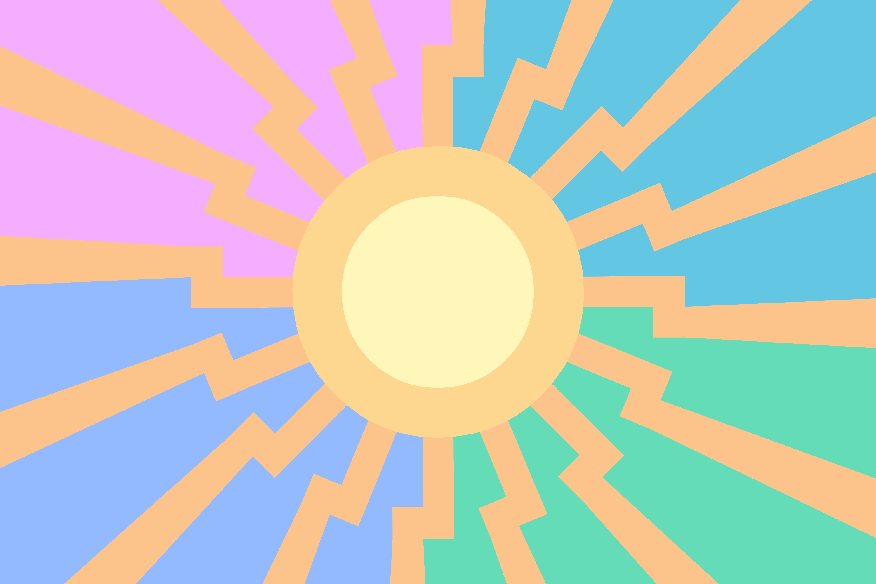
2nd flag here is a flag I made on April last year. An as you can see I tried to keep it simple and with bigger, recognizable shapes following good practices. Tho Im not sure how I much I like it still
>>137958
>>137940
>>137938
>>137935
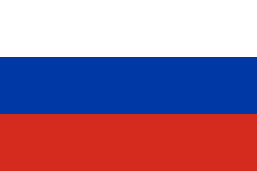
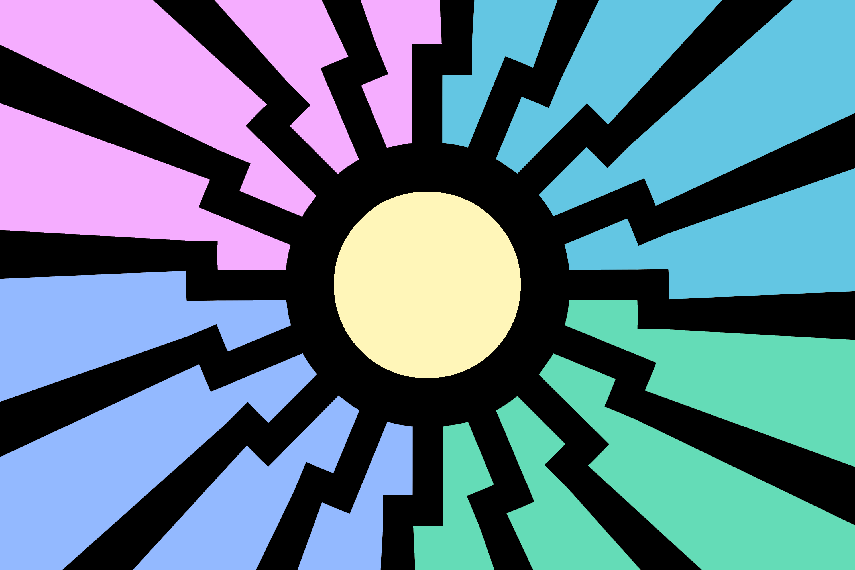
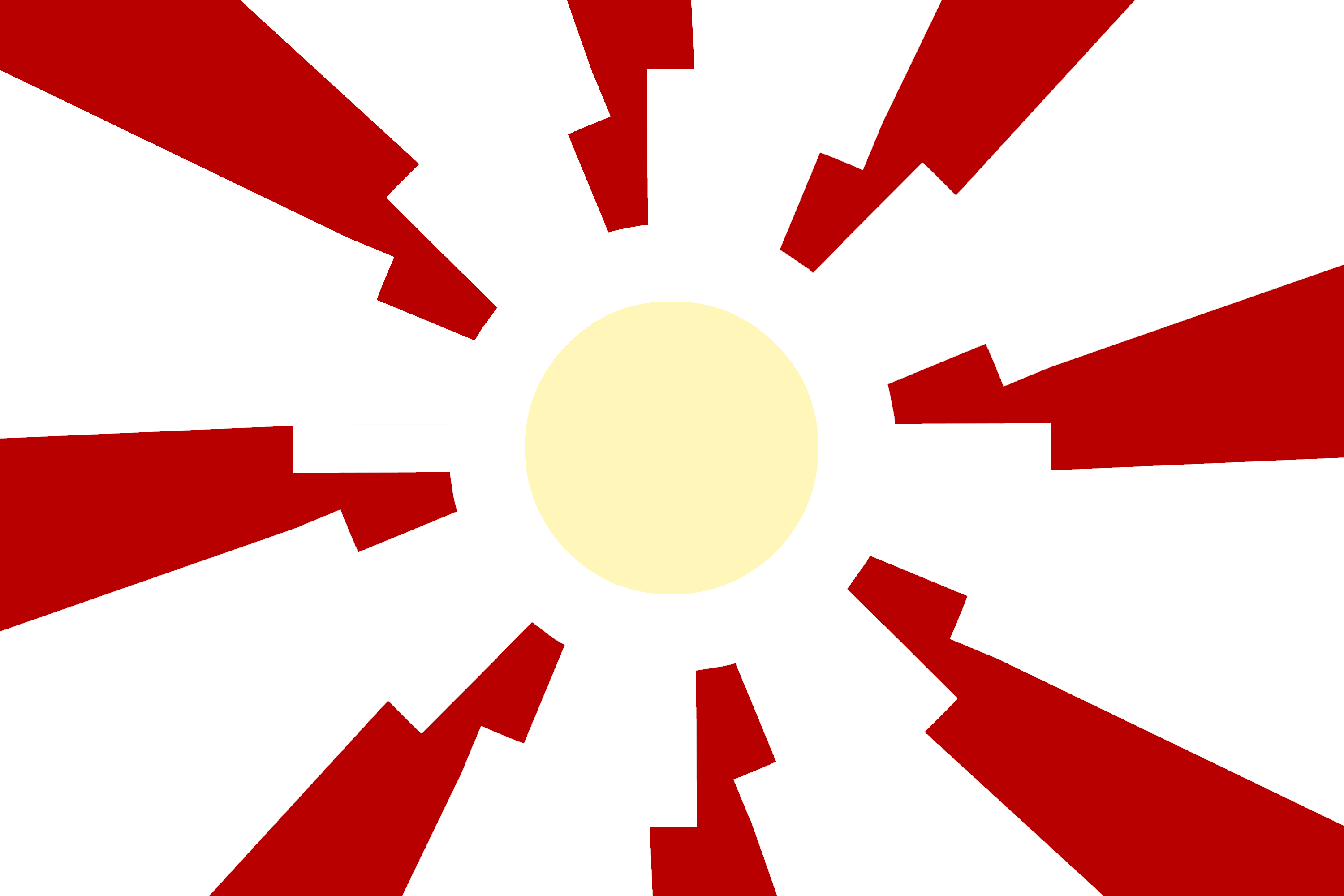
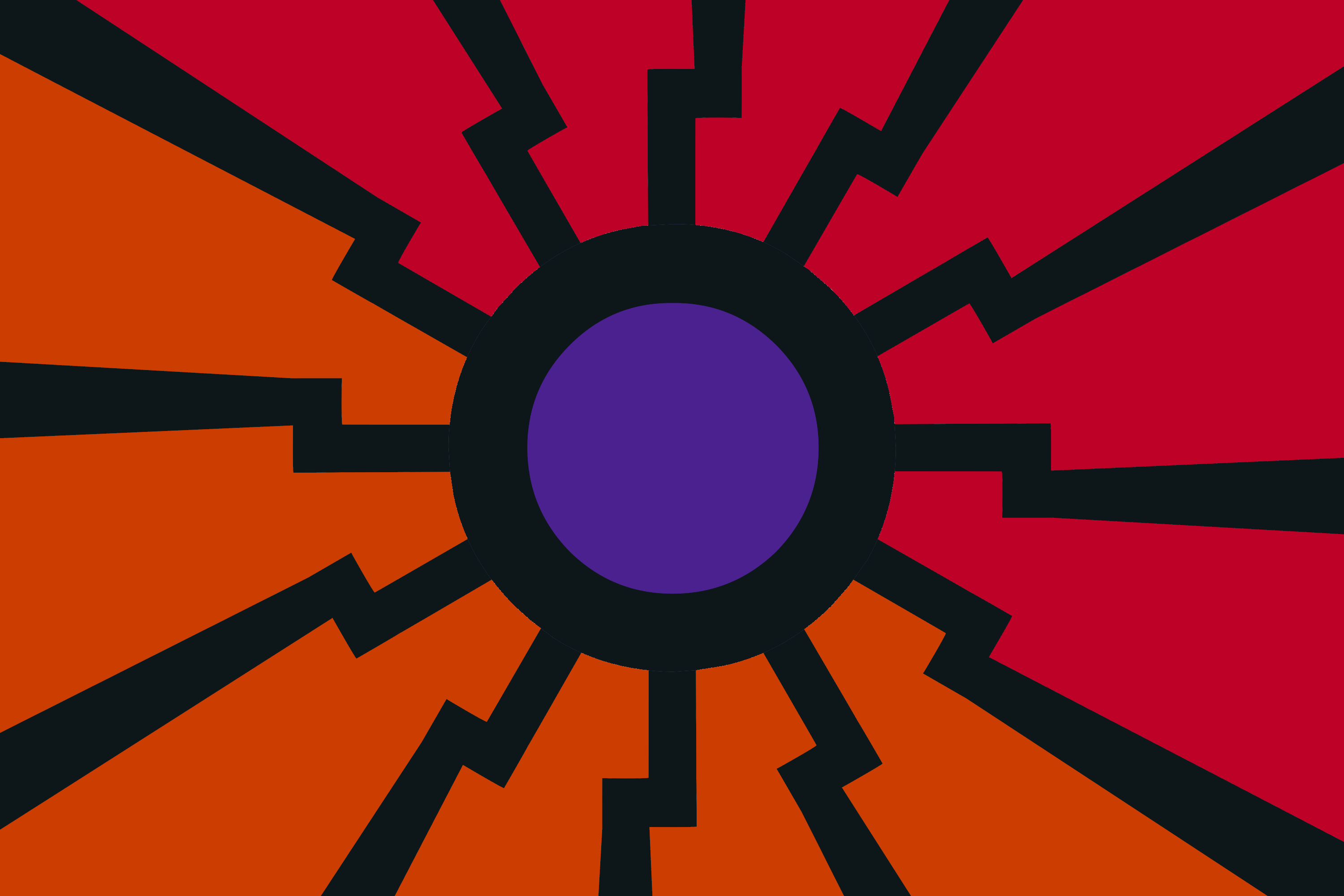
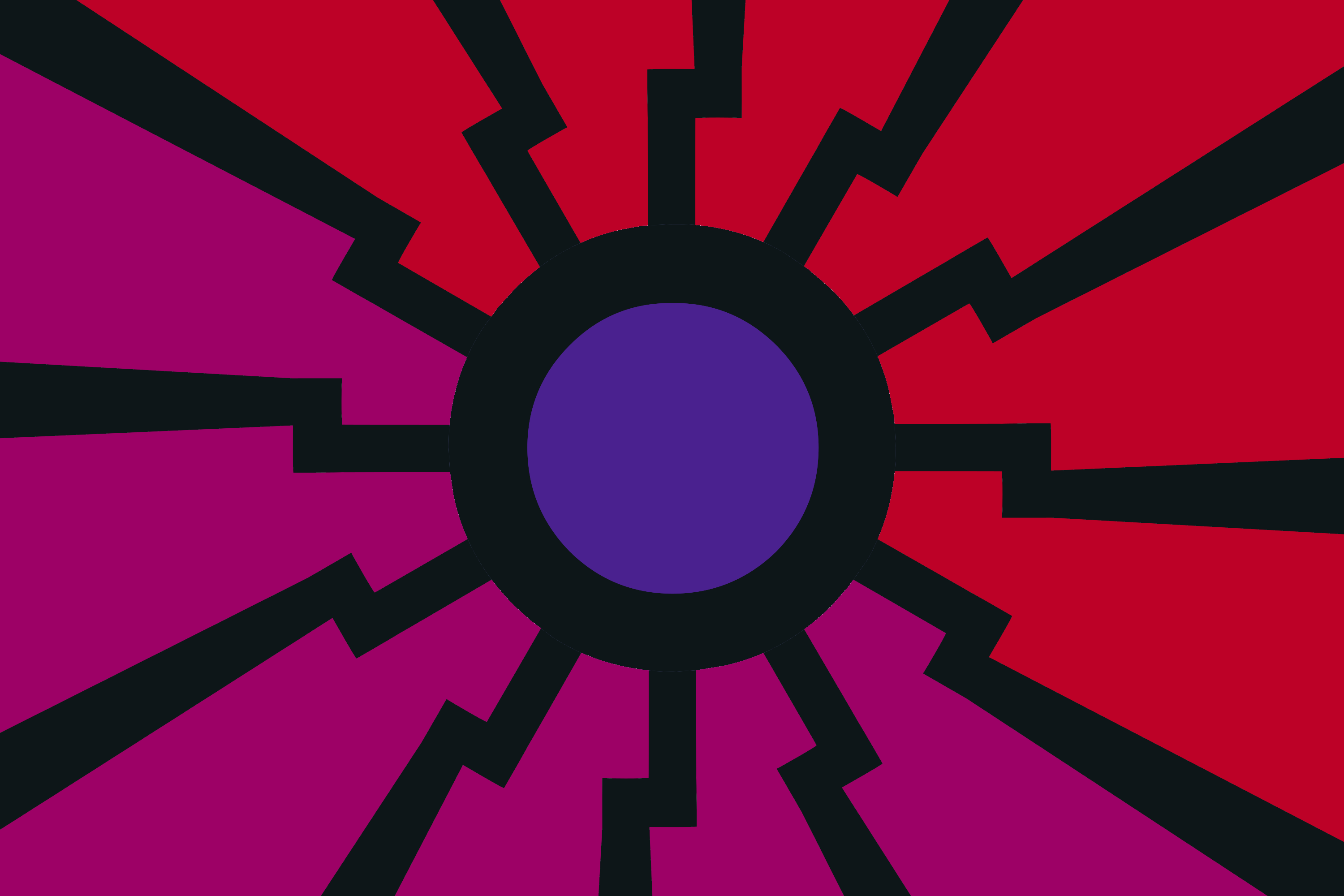
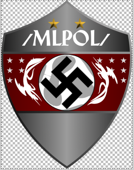
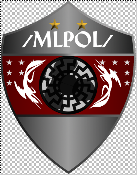
Our symbols are great, Im not saying we should ditch them. The symbols we have are a work of art, but does it work as a *flag* in your opinion? Compare the flags in pic related
Germany, simple 3 colors, easily recognizable, everyone can immediately say what its representing (and germany has symbolism thats also not included on the flag)
Second one... you couldnt really say if we are literaly just posting under the nazi flag, the symbol is lost at that resolution (or at sufficient distance) doesnt work as a flag at all
Third one, Its distinct enough to be a flag, but ultimately its just a bunch of scrambled pixels, all the symbolism is lost, you are only left with a vague pattern.
honestly I think the Third option *can* work, but thats not to say we cant do better.
> Are you really this new, that you can't recognize the Black Sun?
>>137835
2nd flag here is a flag I made on April last year. An as you can see I tried to keep it simple and with bigger, recognizable shapes following good practices. Tho Im not sure how I much I like it still
>>137958
>>137940
>>137938
>>137935
Our symbols are great, Im not saying we should ditch them. The symbols we have are a work of art, but does it work as a *flag* in your opinion? Compare the flags in pic related
Germany, simple 3 colors, easily recognizable, everyone can immediately say what its representing (and germany has symbolism thats also not included on the flag)
Second one... you couldnt really say if we are literaly just posting under the nazi flag, the symbol is lost at that resolution (or at sufficient distance) doesnt work as a flag at all
Third one, Its distinct enough to be a flag, but ultimately its just a bunch of scrambled pixels, all the symbolism is lost, you are only left with a vague pattern.
honestly I think the Third option *can* work, but thats not to say we cant do better.
>>137961
Exactly, for example see >>137830
1) is more of a logo type, doesnt fit on a flag at all
2) and 3) could be the coat of arms. It can be included in/printed on the flag like other countries do (example germany) but the flag itself still needs to be made. Simple, very distinct and recognizable. Nothing that can be confused with the reichsflagge or similar already broadly known flags.


A flag should be recognizable from a distance, at any rotation, and mirrored, so you don't have to make two different sides of the flag.
It should ideally be distinguishable from other flags.
Tricolors fucking suck at this. They are the worst thing to come from the french revolution. If only one or two copied them it would be fine, but everyone and their grandma now has a tricolor to represent them. Look at fucking Belgium and Germany
I'm German and I can barely distinguish them at a glance, especially if they are rotated even a bit. Then there's those fuckers who just fucking steal a flag and change the absolute tiniest of details, like Chad's flag vs Romania's flag. Or tricolors that just have one stripe swapped.
Just look at the flags I posted, that's Russia, Luxembourg, Netherlands and France
And I'm just gonna ignore Slovakia, Slovenia, Serbia and Paraguay because they at *least* have some extra thing on there that might make it easier to recognize. Even though that's still a shit approach.
Another thing a flag should do is, if it has details on it, they should be close to the mast (usually left), so the details don't collapse entirely in on themselves when there is little to no wind. See the US flag, the aussie flag, etc. Top left is a good place for special details like that.
A flag should be so simple that a child could draw it and it would be identifiable.
But at the same time distinguishable.
It takes a really creative person to come up with a good flag, hence why 90% of (non irrelevant) countries just steal their flag design, do a pallet swap and call it their OC donut steel
Needless to mention, the stuff mlpol has are generally *not* suitable flags as either it has too many details, it has text, or it looks exactly like a flag that existed before but with slight differences.
Something like >>137867 could be distinguishable, but the RD in the center is too detailed, fro m a distance it looks like a white blob on a mustard stripe on black background.
All the "spread wing alicorn sitting on a round-ish thing" logos we have here are extremely undistinguishable from existing variants, if you just squint your eyes or walk away a bit.
A flag would be cool, but anything we have would simply not work as one.
Done with my rambling for now.

>>137968
personally i think all of these flag designs are fucking terrible and i did actually come into a situation where i could not tell one country apart from the other. Red, White and Blue are overall stripe designs are terribly overused patterns.
personally i think all of these flag designs are fucking terrible and i did actually come into a situation where i could not tell one country apart from the other. Red, White and Blue are overall stripe designs are terribly overused patterns.
>>137970
if you read the post again, you'll see that anon was complaining about those 4 flags as being some of the worst tricolors.
if you read the post again, you'll see that anon was complaining about those 4 flags as being some of the worst tricolors.

>>137983
i never want to read the end of a sentence or read it twice, its usually more fun to respond this way.
i never want to read the end of a sentence or read it twice, its usually more fun to respond this way.
>>138022
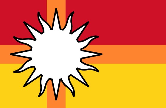
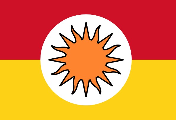
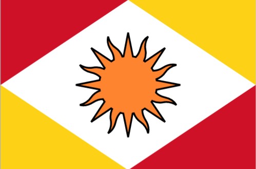
How did you come up with that particular colorscheme (Red, orange, yellow) and why did you choose it? Does it have a meaning?
How did you come up with that particular colorscheme (Red, orange, yellow) and why did you choose it? Does it have a meaning?
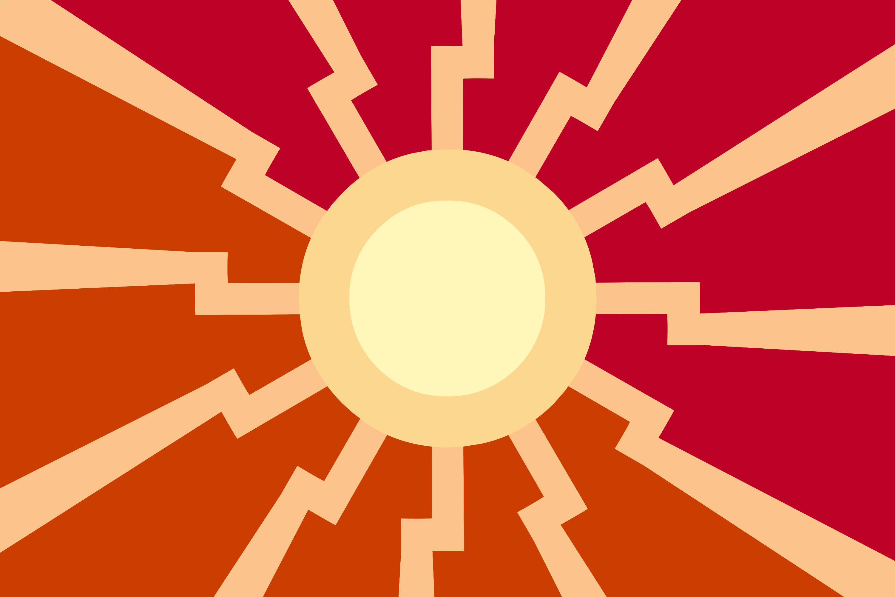
Thought I'd give this a quick and dirty whirl.
Decided to see how marrying the flags of the Imperial Japanese Navy and the black sun would turn out.
Decided to see how marrying the flags of the Imperial Japanese Navy and the black sun would turn out.
>>138028
Red for those on the NatSoc, yellow for the Ancap,Libertarians and orange for our anon color as a way to represent the users of the site, with the Sun for the pony posters, white representing purity. Willing to make all changes to any or try again.
Red for those on the NatSoc, yellow for the Ancap,Libertarians and orange for our anon color as a way to represent the users of the site, with the Sun for the pony posters, white representing purity. Willing to make all changes to any or try again.
>>138022
the 3rd one is the best, 1st looks a bit out of place, 2nd, the black clashes with the colors too much. but 3rd looks really nice
the 3rd one is the best, 1st looks a bit out of place, 2nd, the black clashes with the colors too much. but 3rd looks really nice
>>138034
Hmm, not bad anon. Although I have to say that I personally dont like these too much, the 3rd one is the best out of those.
>>138033
I dont think we should reuse historical flags.
Always gives the whole thing a bad note, doesnt really matter where the original flag comes from.
Although I wouldnt mind using single historically meaningful symbols (swastika for example) I wouldnt base the thing on a already existing flag.
>>138022
actually, how does it work out if you remove the black stroke around the sun? I feel the stroke is a bit in the way
actually, how does it work out if you remove the black stroke around the sun? I feel the stroke is a bit in the way

I really like the black sun alicorn, which is de facto our symbol and flag. The image of Atlas carrying something on his shoulders is also something I associate with the board. John "Football" Elway, too, is such a great figure I wouldn't mind using his likeness. Lastly, Aryanne's cutie mark, a swastika inside a heart, is something only our bretheren would gather under. Perhaps a viable option when juxtaposed with Leslie's cutie mark?
In reality though, should the flag also represent mlsg, christianit, the cult of epona, and 1ntr? mlpol is incredibly diverse, I'm not sure you can please everyone.
Some ideas:
snek faggot
>represents the pol-side of the board well
>complex, but could be abstracted
>no ponies
white knight
>too simple/too common?
>represents 4D political chess
>horse
Right now using a quick program to make alot of templates and fishing for ideas. Without the black around the orange it would blend much better and once, if we get a flag from any ideas posted here and other artist make it can be perfected without the outlines. But polishing comes later
>>138039
You cant feature every single group of people in the flag, wayy too many symbols.
>black sun alicorn
possibly still the best symbol we have to represent this mlpol
>Aryanne's cutie mark, a swastika inside a heart
Everyone in this board knows this cm, very recognizable and distinct, also a good possibility.
I love the first one, but not because of its flag potential. Its just funny
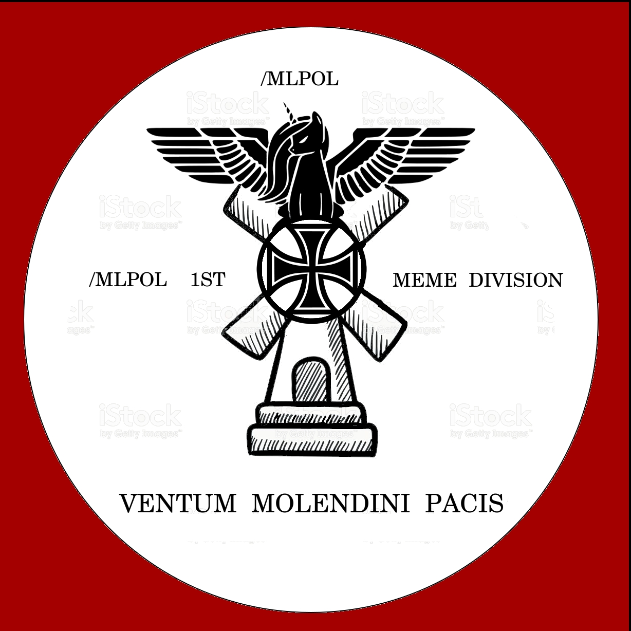
2nd Too overloaded, also text. Definitly not a flag, rather a division symbol or logo.
3rd is weird.
At once its too simple and it doesnt say a thing, on the other hand it can be refined and maybe used as symbolism on the flag, I doubt it though.
Nice idea anyways
>>138042
Now we're getting somewhere, looks much better than the ones in your previous post
Wish I could help in any other way than just criticism, but Im absolute shit at designing anything, let alone a good flag.
You cant feature every single group of people in the flag, wayy too many symbols.
>black sun alicorn
possibly still the best symbol we have to represent this mlpol
>Aryanne's cutie mark, a swastika inside a heart
Everyone in this board knows this cm, very recognizable and distinct, also a good possibility.
I love the first one, but not because of its flag potential. Its just funny
2nd Too overloaded, also text. Definitly not a flag, rather a division symbol or logo.
3rd is weird.
At once its too simple and it doesnt say a thing, on the other hand it can be refined and maybe used as symbolism on the flag, I doubt it though.
Nice idea anyways
>>138042
Now we're getting somewhere, looks much better than the ones in your previous post
Wish I could help in any other way than just criticism, but Im absolute shit at designing anything, let alone a good flag.
>>138042
this one looks good too, i would suggest keeping the sun orange, works better with the solar body
i would suggest making templates with and without a black outline to see how it looks. our old flags mostly have none but id like to see how it looks.
this one looks good too, i would suggest keeping the sun orange, works better with the solar body
i would suggest making templates with and without a black outline to see how it looks. our old flags mostly have none but id like to see how it looks.
>>138042
The shapes and colors remind me of chess and McDonald's. Not sure if that's relevant.
>>138039
Using the knight symbol is genius. It's recognizable, simple, traditional, and represents horses. It also won't scare away newcomers before they even come to the site.
We should combine it somehow with right-wing iconography to make it our own.
>>138046
>The shapes and colors remind me of chess and McDonald's. Not sure if that's relevant.
are we the burger?
>The shapes and colors remind me of chess and McDonald's. Not sure if that's relevant.
are we the burger?
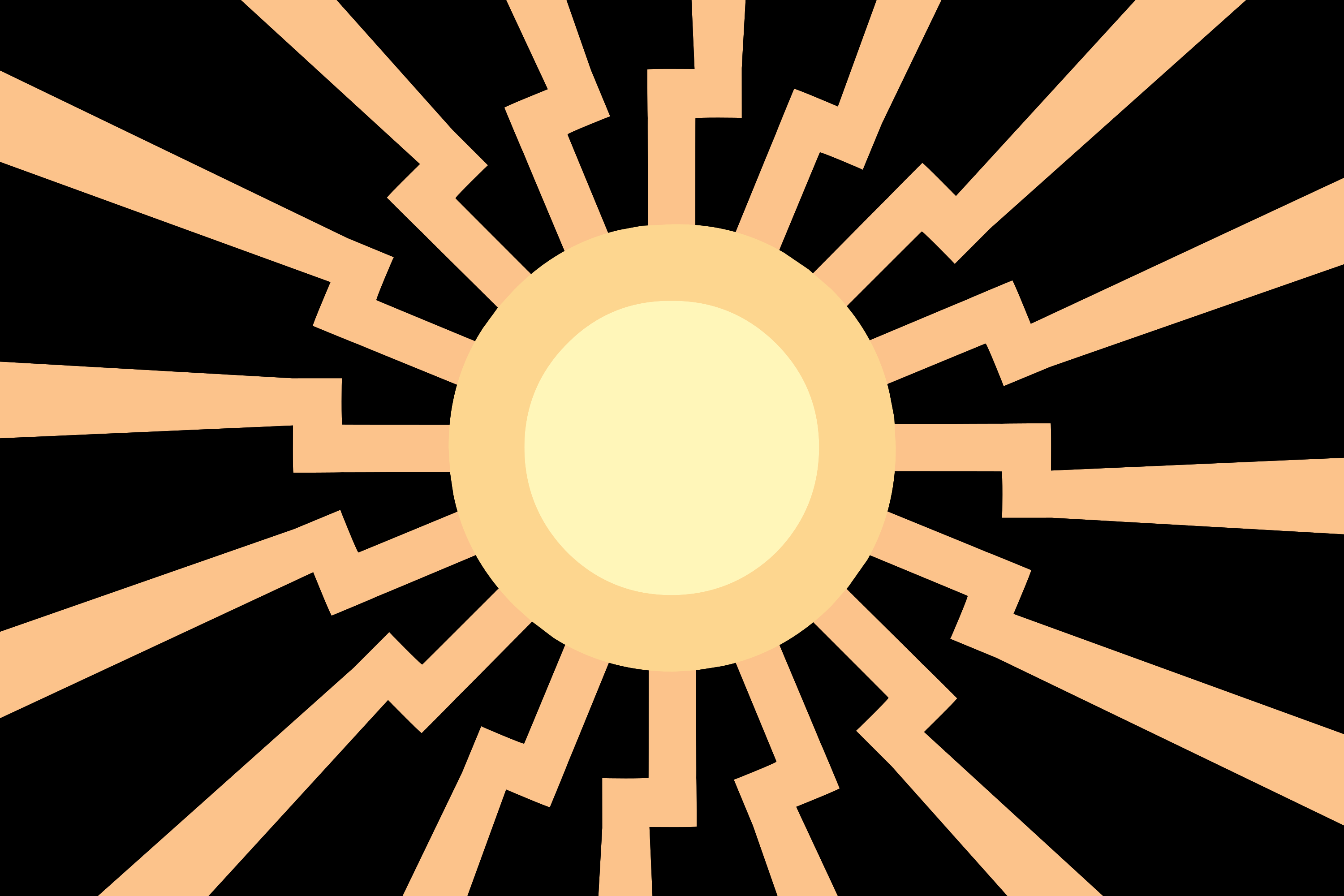
1523130133_1.png (64.6 KB, 900x600, mlpol flag prototype celestia scheme.png)
1523130133_2.png (65.4 KB, 900x600, mlpol flag prototype celestia scheme heart.png)

1523130133_3.png (67.3 KB, 900x600, mlpol flag prototype celestia scheme knight.png)

1523130133_4.png (65.8 KB, 900x600, mlpol flag prototype celestia scheme pink knight.png)

Went with Celestia's cutie mark colour scheme for this try, find it looks way nicer.
Also, fell completely in love with the white knight icon, decided to try integrating it.
Thoughts?
Also, fell completely in love with the white knight icon, decided to try integrating it.
Thoughts?
>>138052
#2 looks great to me, 1's a bit plain and 3/4 are a bit complex with the chess piece. All this is just my opinion though.
#2 looks great to me, 1's a bit plain and 3/4 are a bit complex with the chess piece. All this is just my opinion though.
>>138052
i like 2 and 4. if those have black outlines, they look unclean. i would suggest making them thicker and/or removing them to see how it looks.
i like 2 and 4. if those have black outlines, they look unclean. i would suggest making them thicker and/or removing them to see how it looks.
>>138052
Other then needing to be cleaned up a bit I think they look good overall. I like 3 the most.
Other then needing to be cleaned up a bit I think they look good overall. I like 3 the most.
>>138055
Looks like artifacts from filling over those areas. Should be fixed next time around.
Still need to find a way to work out the aliasing on those lines, too. Might just need a resolution increase for that, though.
>>138056
Any suggestions? Personally, I think the white background isn't working out too well, but I can't think of something to replace it.
1523132678_1.svg (6.2 KB, 500x501, Celestia_cutie_mark_Discover_the_Difference_game.svg)

1523132678_2.png (75.0 KB, 299x303, Sunburst_cutie_mark_crop_S5E26.png)

1523132678_3.png (5.5 KB, 185x223, Sunset_Shimmer_cutie_mark_ID.png)

>>138062
Liking the dark background more than I thought I would, though I don't know how to feel about the two-tone thing.
So far, I'm basing the primary colours off of Celestia's CM, but I might try with some other sun-themed ponies as well, pics related.
Liking the dark background more than I thought I would, though I don't know how to feel about the two-tone thing.
So far, I'm basing the primary colours off of Celestia's CM, but I might try with some other sun-themed ponies as well, pics related.
>>138067
>about the two-tone thing.
I was too lazy to create two seperate versions, as said, the two-colored theme is optional, only trying to show some color options.
I think celestias cutiemark is the only one of those three that make sense
>about the two-tone thing.
I was too lazy to create two seperate versions, as said, the two-colored theme is optional, only trying to show some color options.
I think celestias cutiemark is the only one of those three that make sense
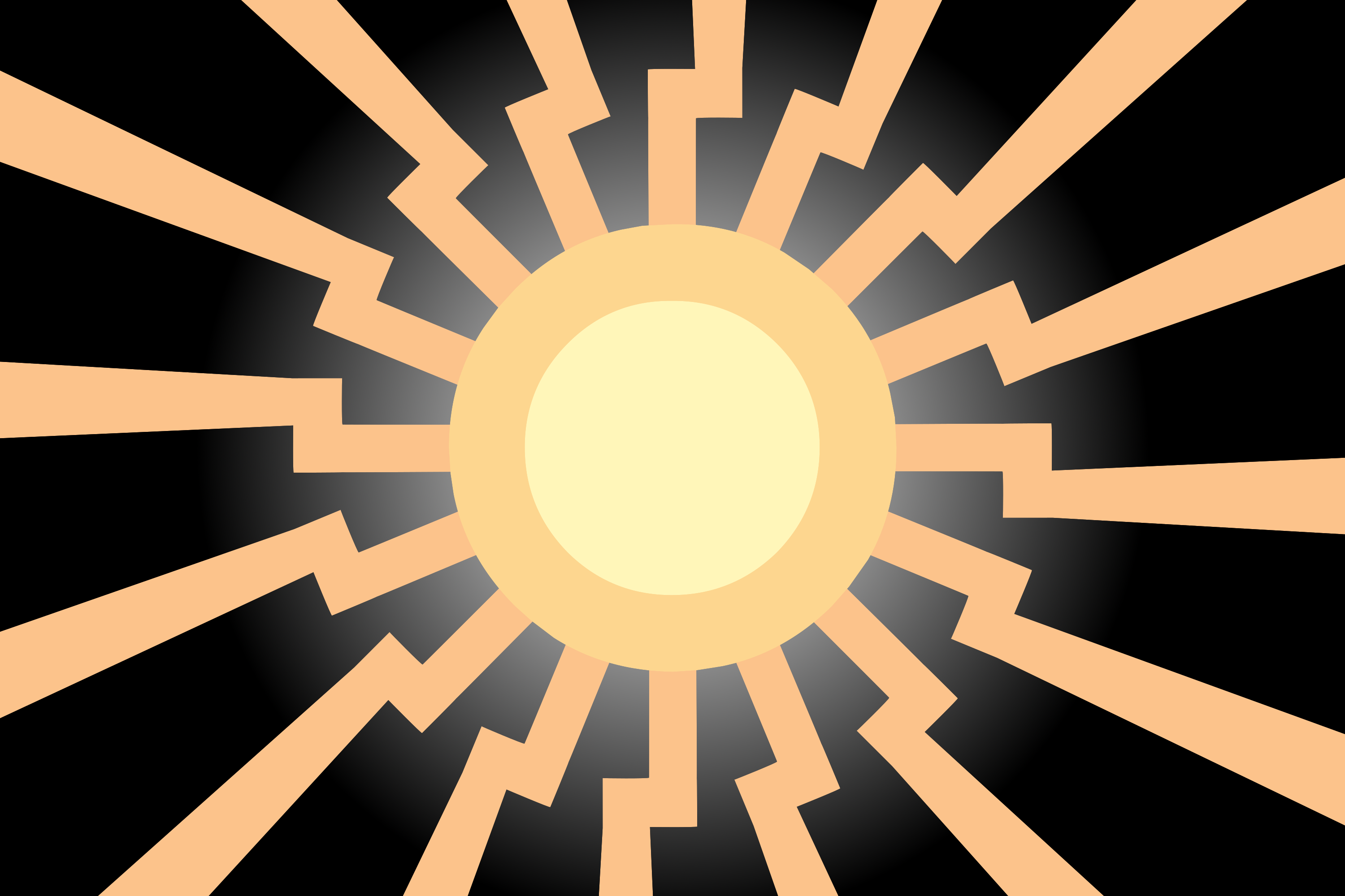
1523136363_1.png (238.8 KB, 3000x2000, mlpol flag prototype hi-res celestia scheme black bg.png)
1523136363_2.png (1.4 MB, 3000x2000, mlpol flag prototype hi-res celestia scheme black radial bg.png)
1523136363_3.png (1.4 MB, 3000x2000, mlpol flag prototype hi-res celestia scheme black radial bg heart.png)

All right, so far we've got
- Huge resolution bump
- Cleaned up all artifacting
- Gave the sun a two-colour look, as per Celestia's CM (importing vector paths directly is the best thing)
- Two different black backgrounds: pure black, and black with a white glow from the centre, my personal favourite
- Higher-res, cleaner, and better centred heart and knight icons
Input welcome, as always.
>>138075
Huge step up.
I love the white glow, very nice touch.
Overall a nice concept of how it could end up.
3rd is my favorite btw
Huge step up.
I love the white glow, very nice touch.
Overall a nice concept of how it could end up.
3rd is my favorite btw
>>138077
>something missing
... its the swastika isnt it?
To be serious though, youre right. its like a special touch thats missing, cant really put my finger on it. just seems a little bland, it needs some character to it
>something missing
... its the swastika isnt it?
To be serious though, youre right. its like a special touch thats missing, cant really put my finger on it. just seems a little bland, it needs some character to it


guaranteed original content.
>>138039
i like the chess idea. gonna add a few more stuff/declinations.
here goes nothin'
>>138039
i like the chess idea. gonna add a few more stuff/declinations.
here goes nothin'
>>138078
i am used to heartstikas, but besides that i genuinely feel it misses the final finish. what that should be i cna not say for sure.
>>138079
Looks pretty bitching, Darkdoomer. reminds me of some 1984 themed propaganda art for some reason or another. thats something i would put as a crest on the armor of some pony stormtroopers. Like it a lot. Thank You.
>>138079
Looks awesome. I like it a lot.
>I don't want to say this because it is so good, but if I was forced to give criticism it is that it looks a bit evil and changelingly.
But I love it.
Looks awesome. I like it a lot.
>I don't want to say this because it is so good, but if I was forced to give criticism it is that it looks a bit evil and changelingly.
But I love it.


>>138093
not bad. misses the next, so that is probably no advertising material. makes for a nice flag though.
not bad. misses the next, so that is probably no advertising material. makes for a nice flag though.
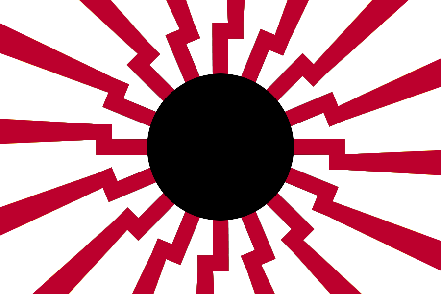
1523141703_1.png (1.3 MB, 3000x2000, mlpol flag prototype hi-res celestia scheme alt colour ftb.png)
1523141703_2.png (230.1 KB, 3000x2000, mlpol flag prototype hi-res celestia scheme alt colour.png)
1523141703_3.png (1.3 MB, 3000x2000, mlpol flag prototype hi-res celestia scheme sect colour ftb.png)
1523141703_4.png (229.0 KB, 3000x2000, mlpol flag prototype hi-res celestia scheme sect colour.png)
Adding some colour instead of a black-to-white effect, using Celestia's mane colours.
Either alternating colours, or separate sections, and in both solid and fade-to-black.
As an interesting side note, the image size really balloons with those gradients.
Either alternating colours, or separate sections, and in both solid and fade-to-black.
As an interesting side note, the image size really balloons with those gradients.
1523141890_1.png (1.3 MB, 3000x2000, mlpol flag prototype hi-res celestia scheme alt colour ftb lite.png)


Quick change: noticed the fade-to-black was a bit too intense, lightened it up.
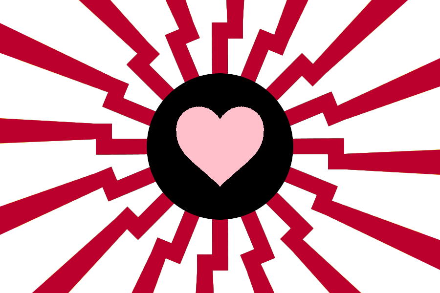
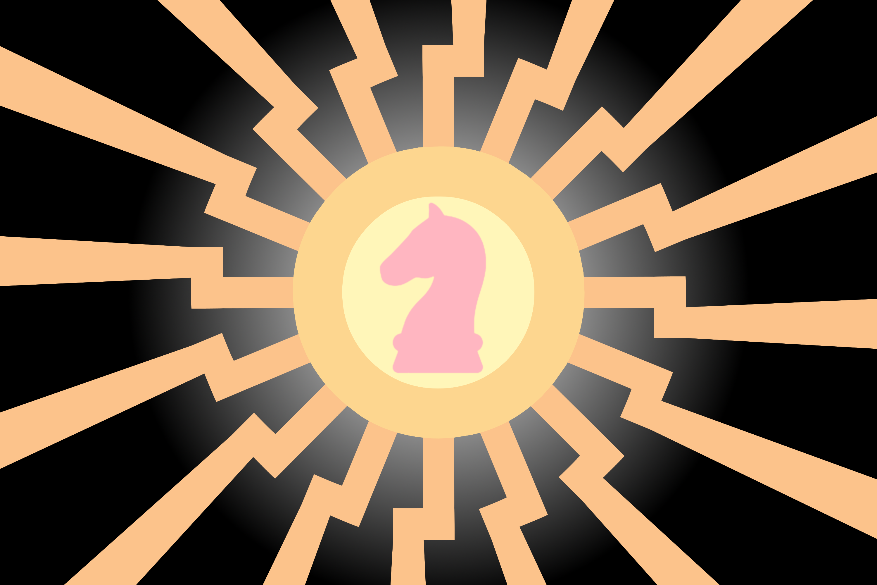
1523143241_1.png (1.3 MB, 3000x2000, mlpol flag prototype hi-res celestia scheme alt colour ftb heart.png)

1523143241_2.png (1.3 MB, 3000x2000, mlpol flag prototype hi-res celestia scheme alt colour ftb lite heart.png)

1523143241_3.png (1.3 MB, 3000x2000, mlpol flag prototype hi-res celestia scheme sect colour ftb heart.png)


>>138104
#2 and #4 were more to demonstrate the colour palette used, before any gradients were applied.
While we're evaluating the preference between strong and light fades to black, have both varieties with the heart, in both colour schemes.
Personally, the sectioned colours are more appealing to me: the alternating colours are a bit too busy.
>>138106
>alternating colours are a bit too busy.
true. 3) looks promising.
Maybe you could, instead of the harsh gradient, apply a softer gradient (like in 4)) but make the colors darker in the first place? It really needs some contrast in my opinion
>alternating colours are a bit too busy.
true. 3) looks promising.
Maybe you could, instead of the harsh gradient, apply a softer gradient (like in 4)) but make the colors darker in the first place? It really needs some contrast in my opinion
>>138106
>the alternating colours are a bit too busy.
I disagree the alternating color to me is far more appealing visually than the four corner colors
>the alternating colours are a bit too busy.
I disagree the alternating color to me is far more appealing visually than the four corner colors
1523147706_1.png (237.1 KB, 3000x2000, mlpol flag prototype hi-res celestia scheme alt dark colour heart.png)

1523147706_2.png (1.3 MB, 3000x2000, mlpol flag prototype hi-res celestia scheme alt dark colour heart ftb lite.png)

1523147706_3.png (238.4 KB, 3000x2000, mlpol flag prototype hi-res celestia scheme sect dark colour heart.png)

1523147706_4.png (1.3 MB, 3000x2000, mlpol flag prototype hi-res celestia scheme sect dark colour heart ftb lite.png)

1523147706_5.png (189.8 KB, 3000x2000, mlpol flag prototype hi-res celestia scheme transparent bg.png)
Applied 25% darkening to the colours, and it turned out really good, much better than I was expecting.
In fact, I don't know if it looks better with or without the gradient: I've attached both versions in both colour schemes for you to judge.
>>138122
It could work to make the sun 'spokes' black, but my idea for it is to make it stealthy: the original red made it too obviously inspired by the Imperial Japanese Navy, and the black gives away the black sun symbolism too quickly.
Plus, there's additional symbolism to the light, sun-coloured rays: piercing through the darkness surrounding us all. You know, if you wanted some Liberal Arts Symbolism™ to justify it with.
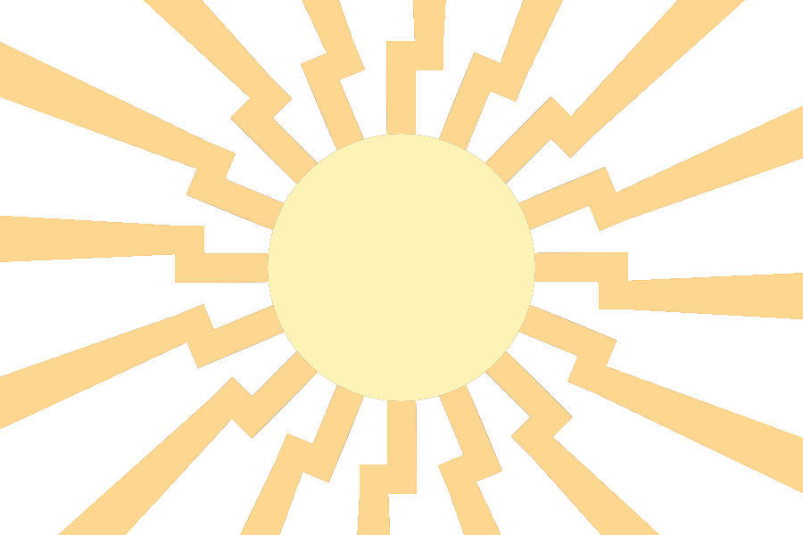
Anyways, I'm about done for tonight, and it's been real fun. I've attached an extra image of just the sun without any background, in case you want to screw around with the design. Catch you all tomorrow.
In fact, I don't know if it looks better with or without the gradient: I've attached both versions in both colour schemes for you to judge.
>>138122
It could work to make the sun 'spokes' black, but my idea for it is to make it stealthy: the original red made it too obviously inspired by the Imperial Japanese Navy, and the black gives away the black sun symbolism too quickly.
Plus, there's additional symbolism to the light, sun-coloured rays: piercing through the darkness surrounding us all. You know, if you wanted some Liberal Arts Symbolism™ to justify it with.
Anyways, I'm about done for tonight, and it's been real fun. I've attached an extra image of just the sun without any background, in case you want to screw around with the design. Catch you all tomorrow.
1523169107.png (1.2 MB, 5000x5550, equestrian_flag__hearth__s_warming_eve__by_gturkey-d56ijp2.png)

While working on a design, I came across an idea. It came out like this.


>forced meme orange
>low quality graphics
>low resolution
>three quarters of the flag is blank
A bit cryptic, the first one includes a normal distribution, which is incredibly racist. The second idea comes from >>138079, which are very nice and my infantile sketches cannot hold a candle to.
last two are just some graphics that never saw proper use but might be useful.
>>138101
>>138122
>>138126
Swap the bottom two colours, that will make it match the political compass colours.
Are there any other flags that use gradients? It looks incredible as a graphic but I'm not sure it's appropriate in a flag.
>>138126
Well Im usualy against gradients, blurs, emboss and similar effects, because they cover up problems and make it harder to incorporate the art into other media. From a /gd/ perspective effects should be part of designs, they are used to flash things up or incorporate them easier into other pieces, like posters, websites, cards etc... By applying effects to the initial design you force the next designer to either remove it or ignore it (which might make your piece stand out in a bad way) rarely is it possible to match it perfectly.
Its especialy tempting to do this if youve been working on a piece for too long and want to make quick progress. Its best to take some time off or work on a different one then.


I made a thing
it has aryanne colors
it has aryanne colors


>>138370
good effort. but i have to say as much as i love Aryanne, i dont think this arrangement works well. reminds me of some kind of LGBT flag.
good effort. but i have to say as much as i love Aryanne, i dont think this arrangement works well. reminds me of some kind of LGBT flag.

>>138082
yeah i came with the idea of designing something like a logo for just /mlpol/ or some propaganda, as for the flag itself, it's a whole different story. gotta think about it whenever i got time, rn got some things to fix.
i think an unicorn has the perfect historical symbolism for a logo/designish thing, or armories, here's an older thing i made, but well, not much a flag. can be inverted and all...
>>138093
yeah it looks a bit tiny into a circle like that. i should play with it this week if i got time.
>>138290
the armories of Equestria alone are pretty well done, it's got everything from a millennial monarchy.
>>138126
fuckin'saved~
>>138418
not really a fan of the whole unicorn thing since i am an earth pony supremacist but I cant feel but think that this looks really neat. (although i dont think that we even have a single unicorn OC here besides Franziska.)
You have a good hand at making marketable insignias.
Guess MLPOL is INGSOC now.
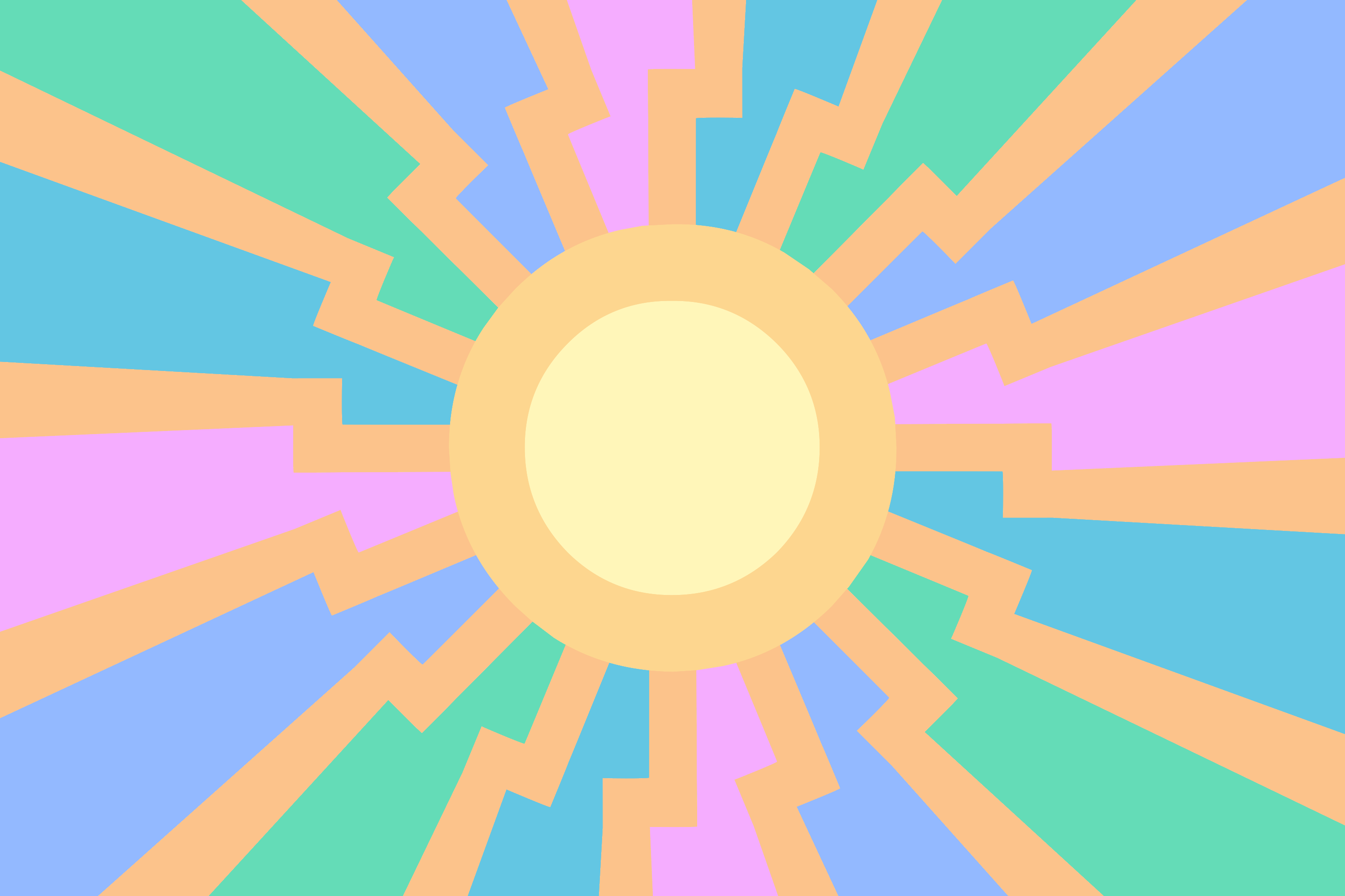
1523203840_1.png (241.9 KB, 3000x2000, mlpol flag prototype luna scheme polcompass colour.png)
1523203840_2.png (241.1 KB, 3000x2000, mlpol flag prototype luna scheme celcompass colour.png)

1523203840_3.png (253.8 KB, 3000x2000, mlpol flag prototype luna scheme celcompass colour moon.png)

1523203840_4.png (254.7 KB, 3000x2000, mlpol flag prototype luna scheme celcompass colour heart.png)

>>138335
>Swap the bottom two colours, that will make it match the political compass colours.
Didn't even think of that! Will do.
>>138350
Good points. Looking back, the gradients did look pretty tacky on all but the black-background versions. Will avoid using in the future.
>>138362
Well, you're in for some fun then, aren't you?
>>138418
Really digging the logos, friend. Even if you are a disgusting tripfag
I've tried a different approach to the sun, using Luna's CM colour palette instead of Celestia's. Very, very nice contrast on it.
Used the original political compass colours as a test, but they looked really bland compared to the Celestia mane colours, so I don't think I'll use them outside this test.
Also added Luna's moon insignia to the logo roster, just for shits and giggles.
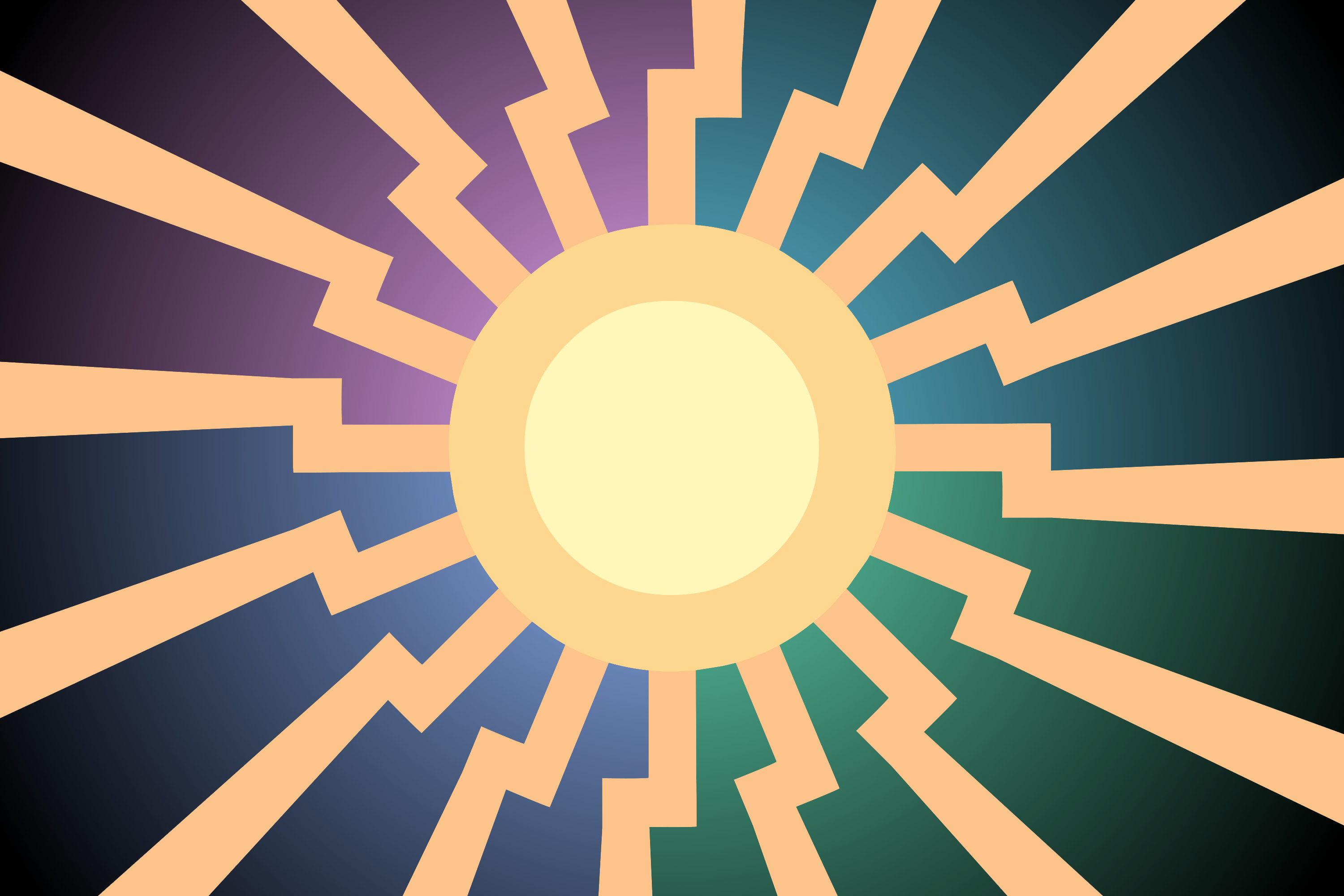
1523203903_1.png (252.5 KB, 3000x2000, mlpol flag prototype nightmare scheme polcompass colour.png)
1523203903_2.png (249.0 KB, 3000x2000, mlpol flag prototype nightmare scheme celcompass colour.png)
1523203903_3.png (261.4 KB, 3000x2000, mlpol flag prototype nightmare scheme celcompass colour moon.png)

1523203903_4.png (261.6 KB, 3000x2000, mlpol flag prototype nightmare scheme celcompass colour heart.png)

And once more, this time with Nightmare Moon's colour scheme!
>>138418
I'd totally wear this on a shirt or have it on a business card. Not the best as a flag, but amazing as a logo rly, looks really sporty and modern.
I'd totally wear this on a shirt or have it on a business card. Not the best as a flag, but amazing as a logo rly, looks really sporty and modern.
>>138443
>>138441
these are a great improvement imo. The darker luna palette really works good with the black sun insignia, in some cases it even looks darker.
The political compass colors was a decent shot, but you are right, it doesn't hold together as well as the celestia palette. however I also agree with >>138448. The amount of colors is a bit overwhelming, tho I played around with it a bit and its hard to get something better that wouldn't sacrifice the meaning of the flag. for now I'll say 2nd and 4th in both posts.
Maybe try using only one of the colors, this might even work with the polcom colors?

>>138418
Very reminiscent of INGSOC, but in a good way. It's very sleek and aesthetic. It also evokes politics, but not in an obvious way like the black sun. Saved.
Very reminiscent of INGSOC, but in a good way. It's very sleek and aesthetic. It also evokes politics, but not in an obvious way like the black sun. Saved.
1523213562_1.png (258.3 KB, 3000x2000, mlpol flag prototype luna scheme pinkred horizontal colour.png)
1523213562_2.png (257.5 KB, 3000x2000, mlpol flag prototype luna scheme pinkred vertical colour.png)
1523213562_3.png (259.9 KB, 3000x2000, mlpol flag prototype luna scheme pinkred diagonal colour.png)
Decided to mash together the pink in Celestia's mane, with the red in the /pol/ insignia, and layer the two in various orientations.
No logos yet, since there's a few too many permutations for that.
No logos yet, since there's a few too many permutations for that.
1523213590_1.png (240.5 KB, 3000x2000, mlpol flag prototype nightmare scheme pinkred horizontal colour.png)
1523213590_2.png (241.3 KB, 3000x2000, mlpol flag prototype nightmare scheme pinkred vertical colour.png)
1523213590_3.png (242.6 KB, 3000x2000, mlpol flag prototype nightmare scheme pinkred diagonal colour.png)
And once more in NMM flavour.
>>138507
I'm all ears for suggestions; I'm not a colour expert by any means, and for now, I'd rather not shotgun out new revisions until I have a good idea of what to work with.
I'm all ears for suggestions; I'm not a colour expert by any means, and for now, I'd rather not shotgun out new revisions until I have a good idea of what to work with.
1523220906_2.zip (227.3 KB, Listing of : C:\____\_COMBINED BACKUP\mlpol.net\mlpol\src\1523220906281-1.zip
Size Date Time Name
-------- -------- ------ ---------
5475 08-04-18 22:50 flagtest/FlagTest.html
156914 08-04-18 21:47 flagtest/images/flag.png
3181 08-04-18 22:19 flagtest/lib/colorpicker/css/colorpicker.css
4073 08-04-18 22:37 flagtest/lib/colorpicker/css/layout.css
......... (only showing the 10 first files) ......... , flagtest.zip)
>>138520
I created a simple html page and javascript so you can play around with color schemes. Hope it is of use.
I created a simple html page and javascript so you can play around with color schemes. Hope it is of use.
1523223332_1.png (231.8 KB, 3000x2000, mlpol flag prototype luna scheme orangered vertical colour.png)
1523223332_2.png (229.8 KB, 3000x2000, mlpol flag prototype luna scheme purplered vertical colour.png)

1523223332_3.png (231.7 KB, 3000x2000, mlpol flag prototype nightmare scheme orangered vertical colour.png)
1523223332_4.png (233.7 KB, 3000x2000, mlpol flag prototype nightmare scheme purplered vertical colour.png)
>>138530
>>138534
Very helpful, thanks a lot!
Got some dark shades of purple and orange that I think fit really well, though it's still an open question as to which black sun palette is the best.
As an aside, it's getting pretty funny, watching my layer count steadily rise. XCF's currently sitting at 32 MB.
>>138534
Very helpful, thanks a lot!
Got some dark shades of purple and orange that I think fit really well, though it's still an open question as to which black sun palette is the best.
As an aside, it's getting pretty funny, watching my layer count steadily rise. XCF's currently sitting at 32 MB.
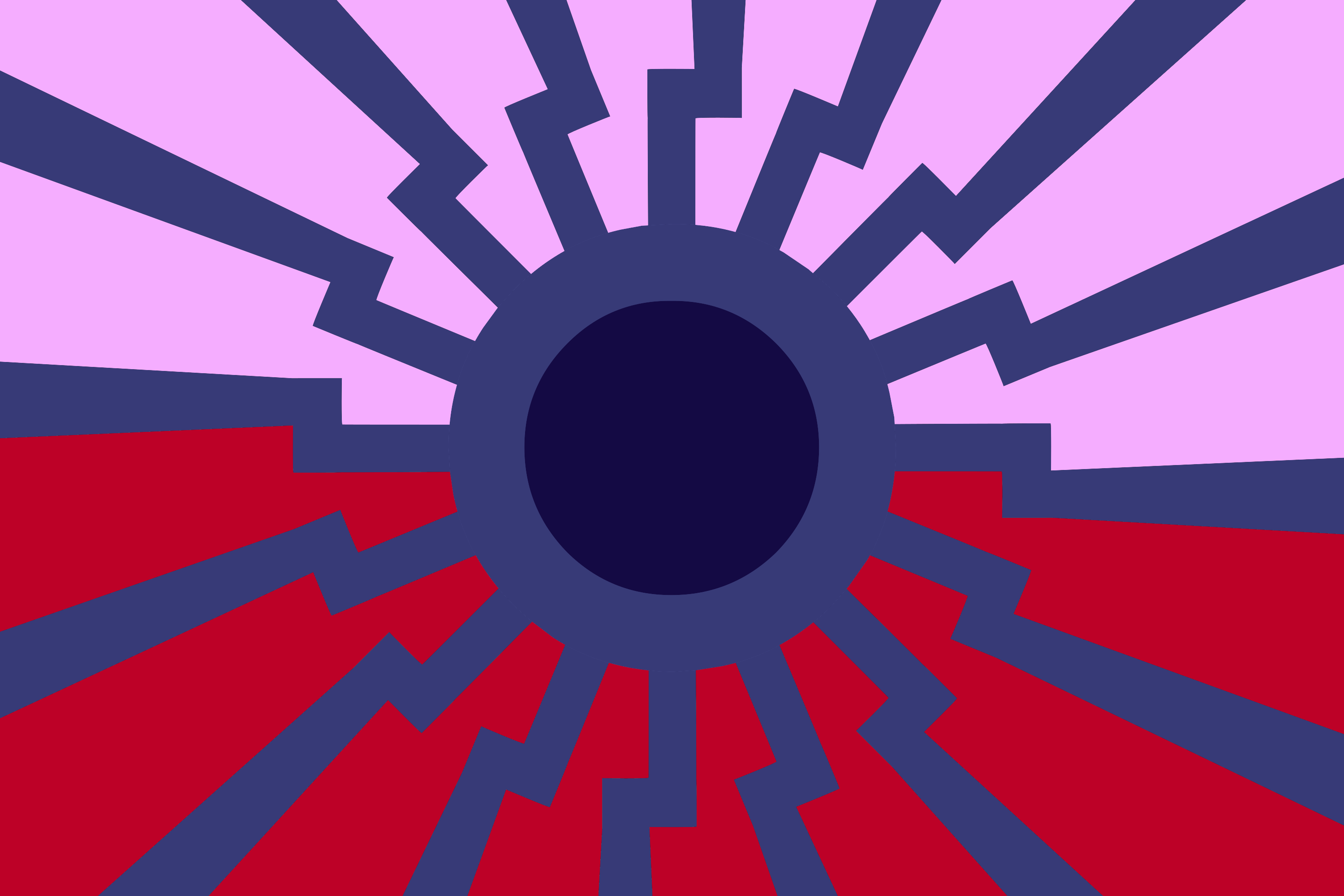
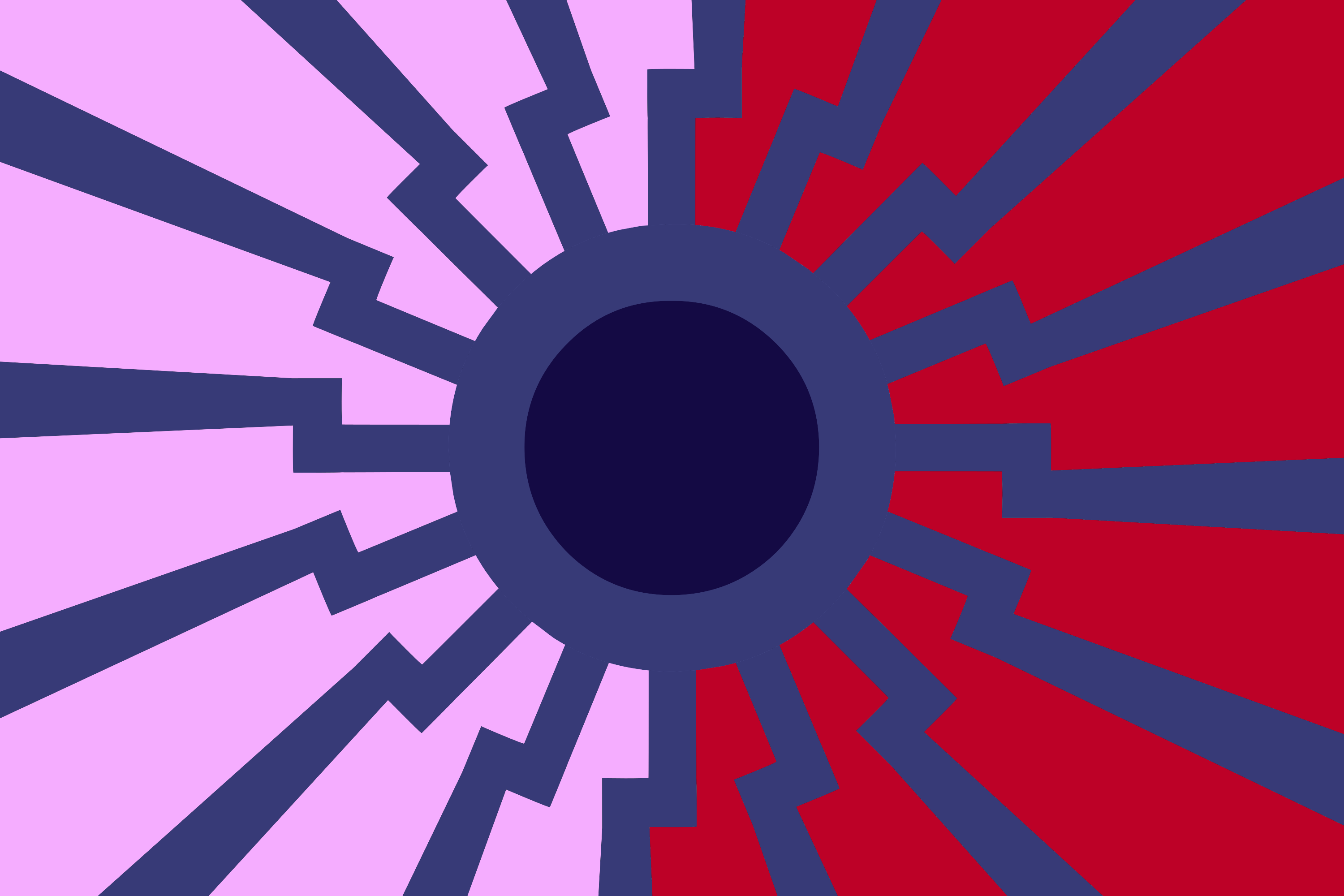
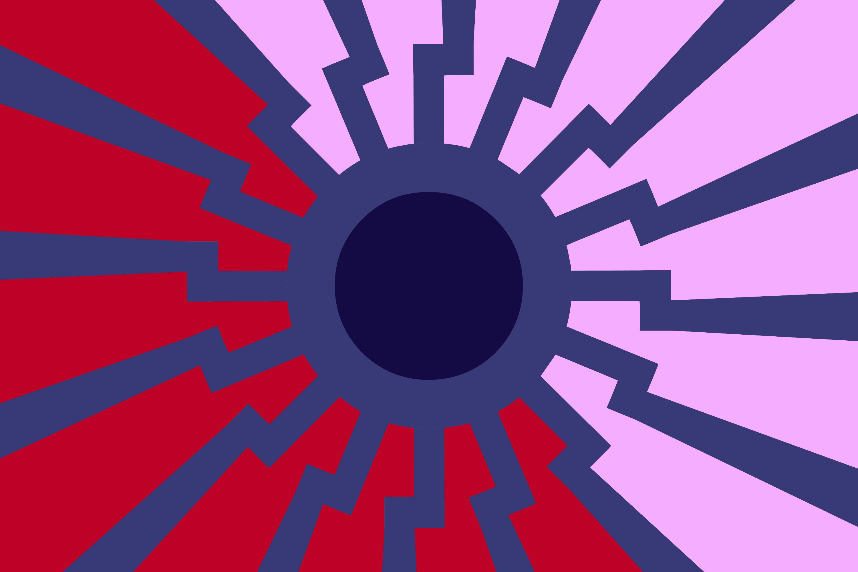
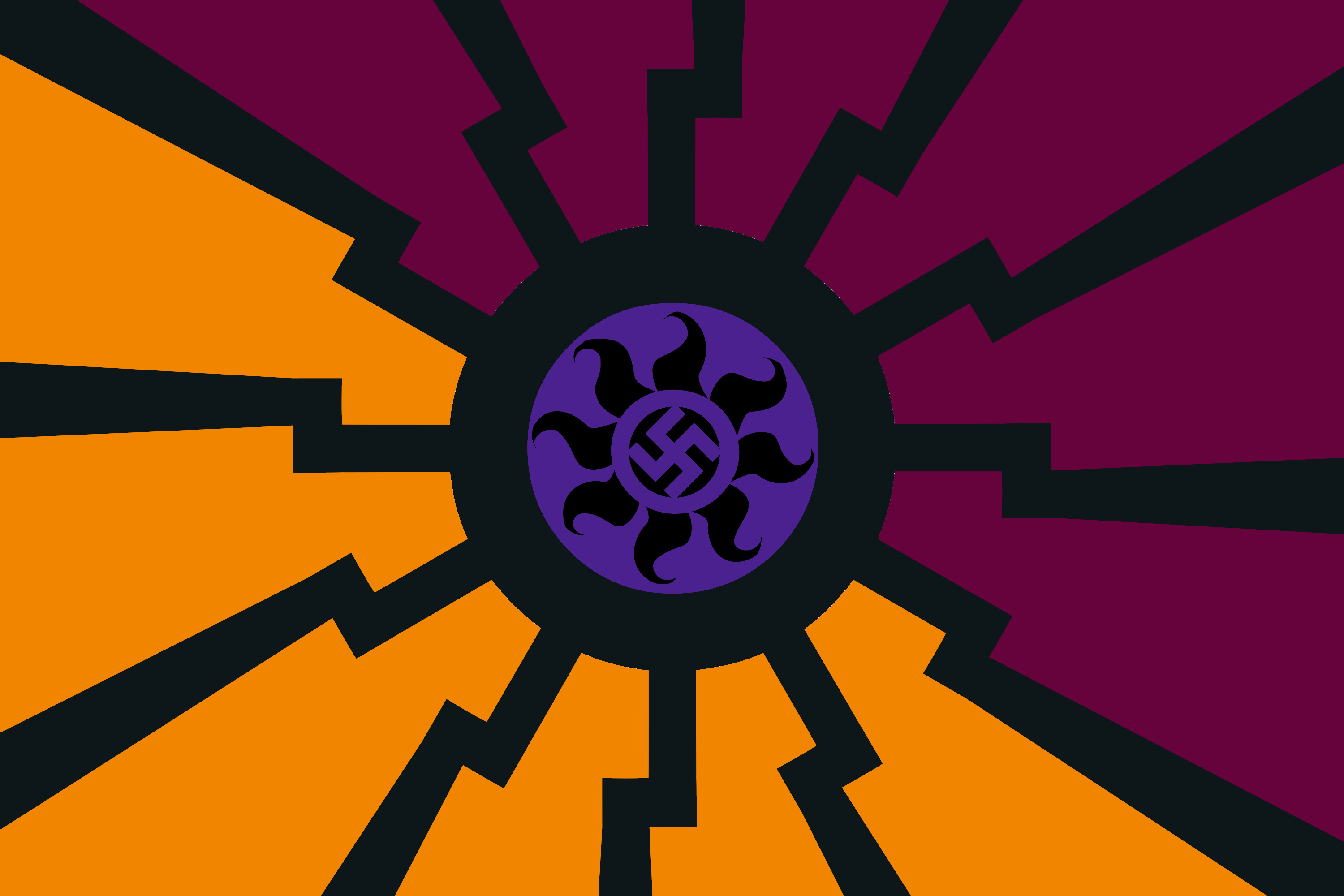
1523224761_1.png (194.2 KB, 3000x2000, mlpol flag prototype luna scheme orangered vertical colour.png)
1523224761_2.png (193.5 KB, 3000x2000, mlpol flag prototype luna scheme purplered vertical colour.png)

1523224761_3.png (192.7 KB, 3000x2000, mlpol flag prototype nightmare scheme orangered vertical colour.png)
1523224761_4.png (195.8 KB, 3000x2000, mlpol flag prototype nightmare scheme purplered vertical colour.png)
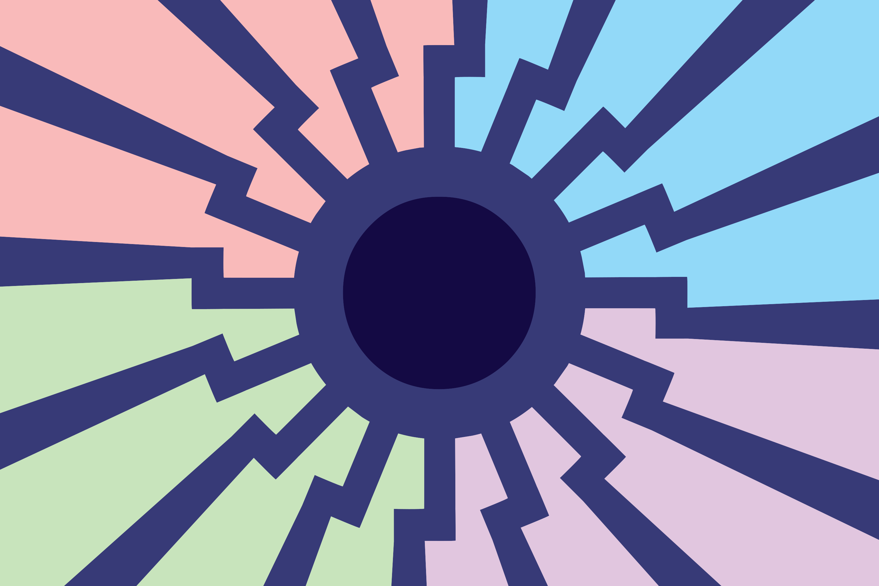
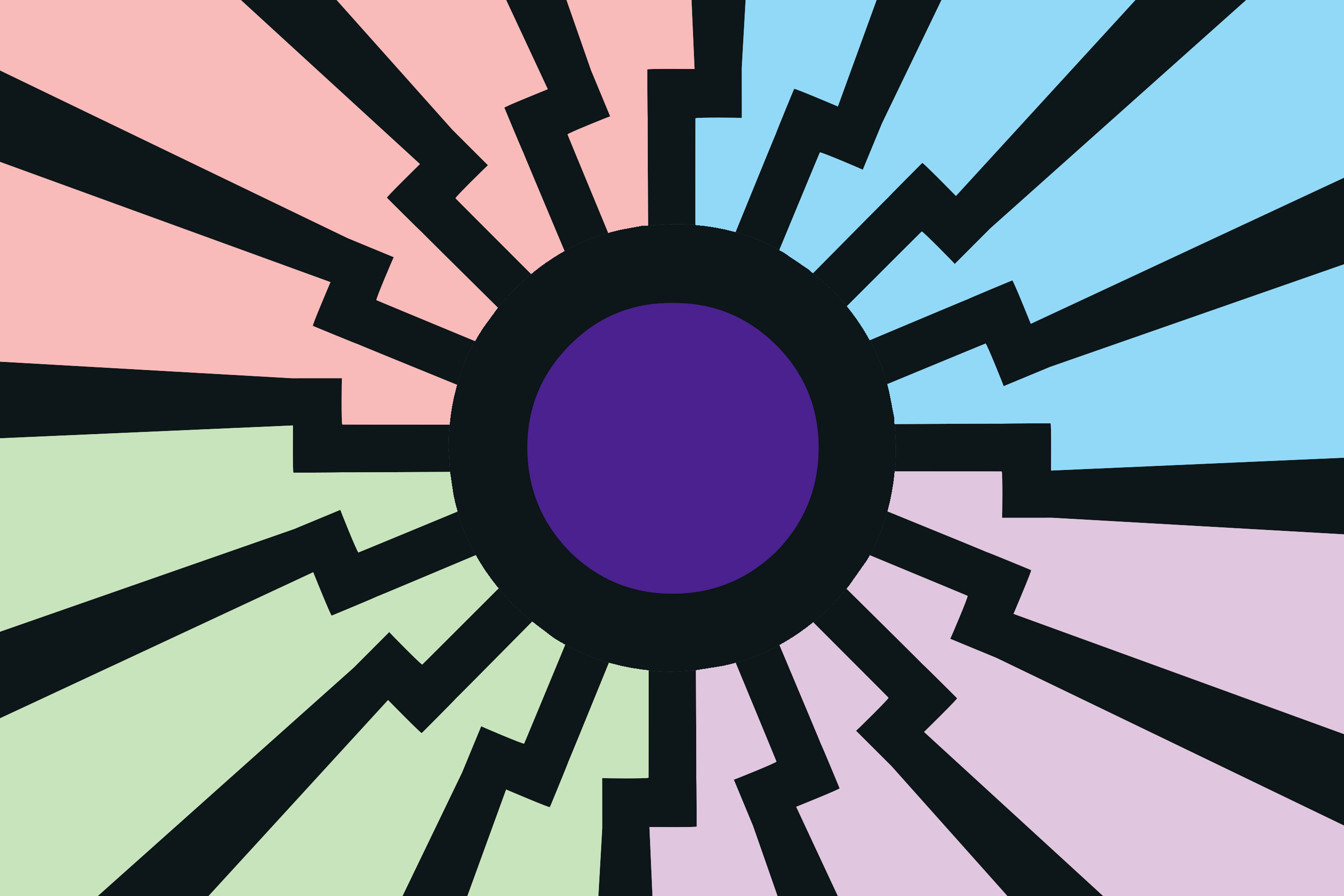
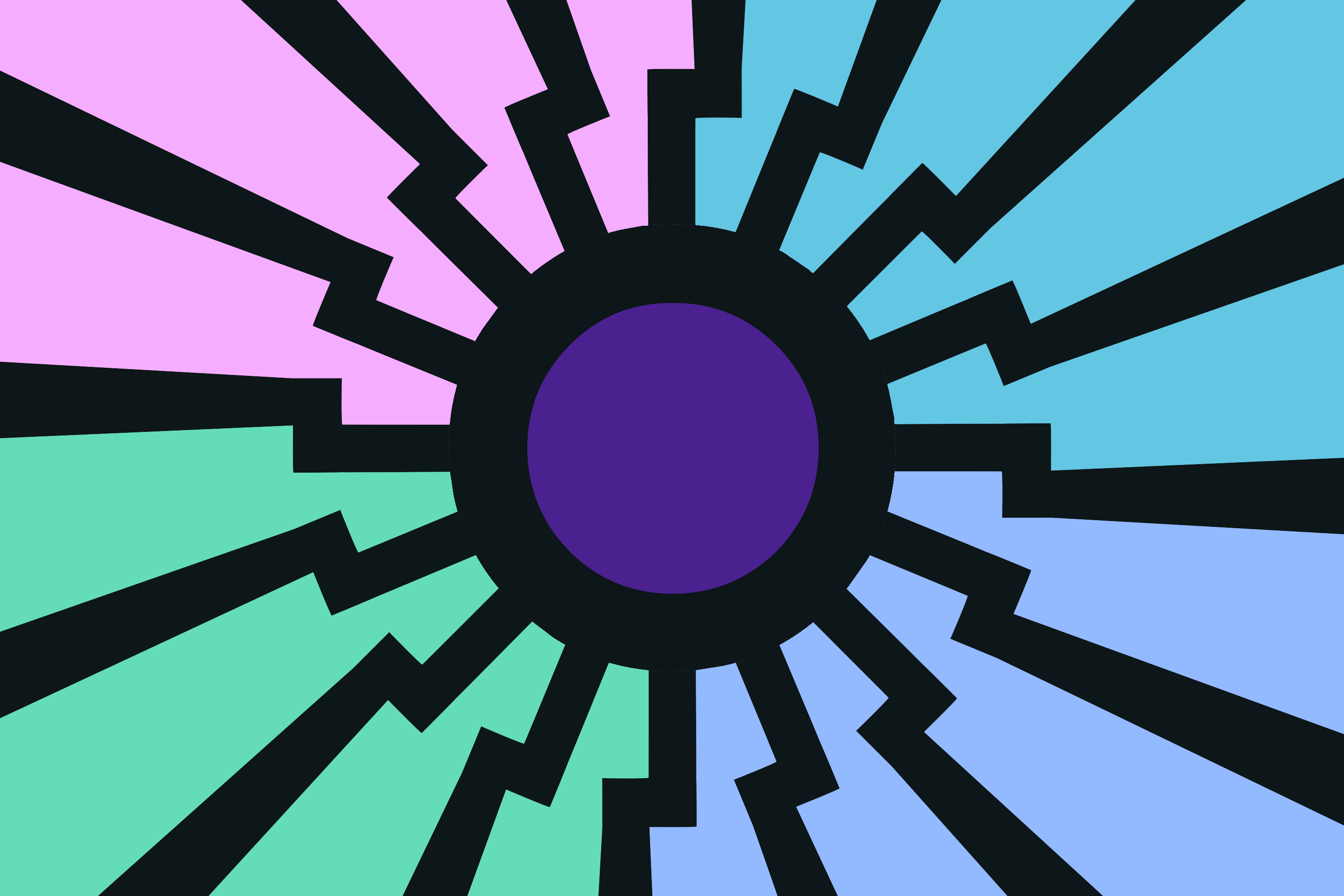
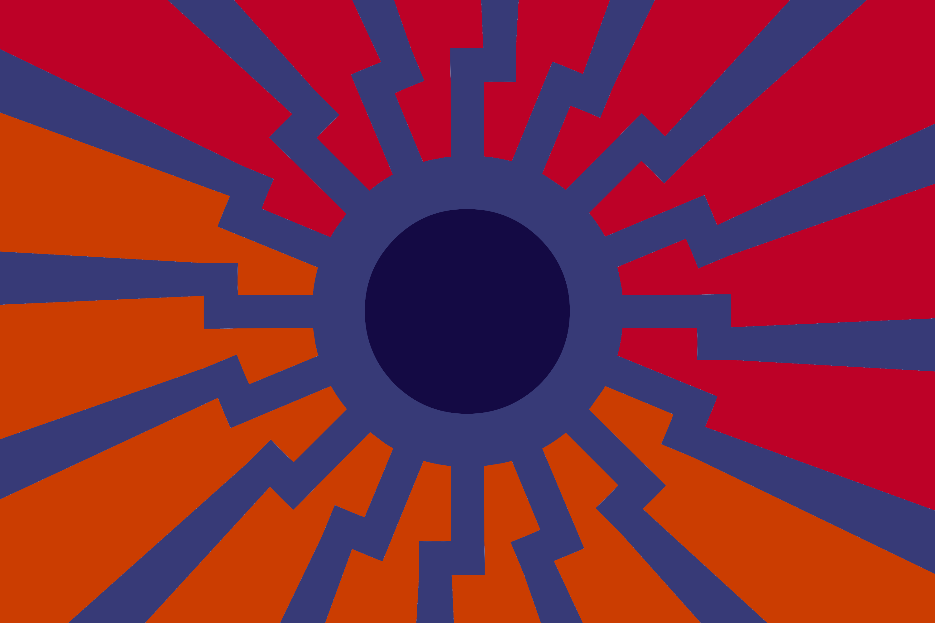
Quick update: I changed the amount of spokes to 12 instead of 16, as it is on the actual black sun. It wound up looking a lot less cluttered as a result, and I quite like how it turned out.
1523224805_1.png (201.4 KB, 3000x2000, mlpol flag prototype celestia scheme orangered vertical colour.png)
1523224805_2.png (197.8 KB, 3000x2000, mlpol flag prototype celestia scheme purplered vertical colour.png)
For some extra experimentation, have the same backgrounds with the Celestia palette sun.
>>138552
>>138553
wow ok, these look much better now. I really like both of the celestia ones. The 1st and 2nd luna ones clash a bit with their background, even tho they look much smoother than the 3rd and 4th.
Is there anything concrete the background colors represent anon? If we can justify the two colors in the background the 2nd celestia one would be my winner
>>138775
>no swastika or other symbol
The black sun featured is a nazi symbol already, even though less known to the general public.
Anyways:
1. What are those colors supposed to represent? They got to have some kind of meaning besides looking good imo
2. Its still a little bland I think, the middle is a good place for some kind of symbol.
Swastika?
Aryannas CM (optionally without swastika)?
Personally I really like the sun-swastika symbol used here >>138336 though idk if using a swastika at all is a good idea. Opinions?
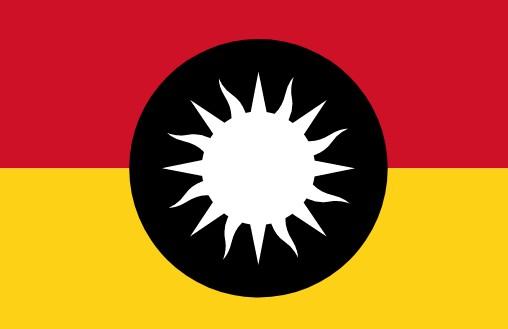
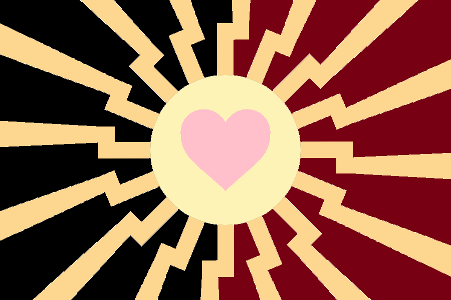
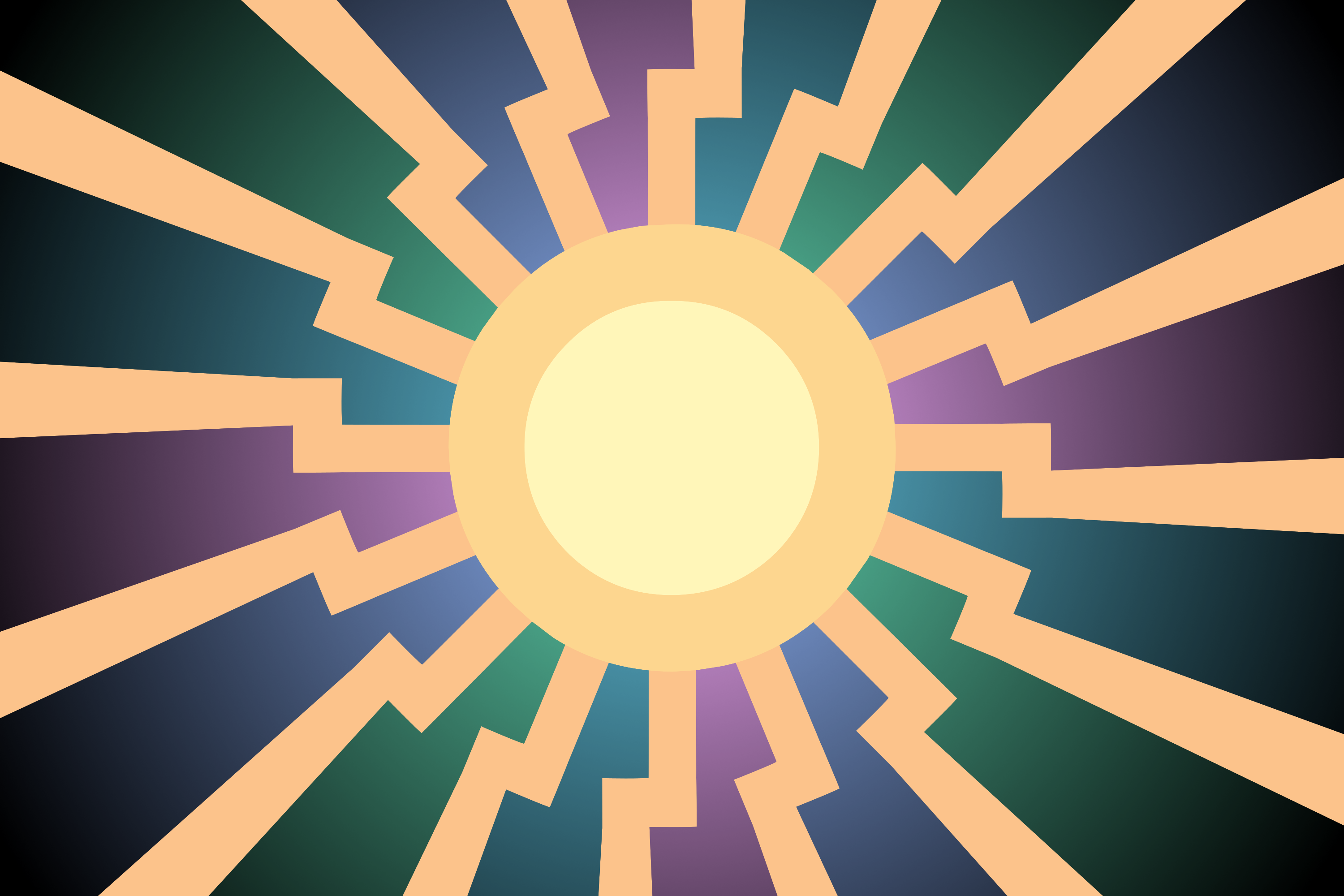
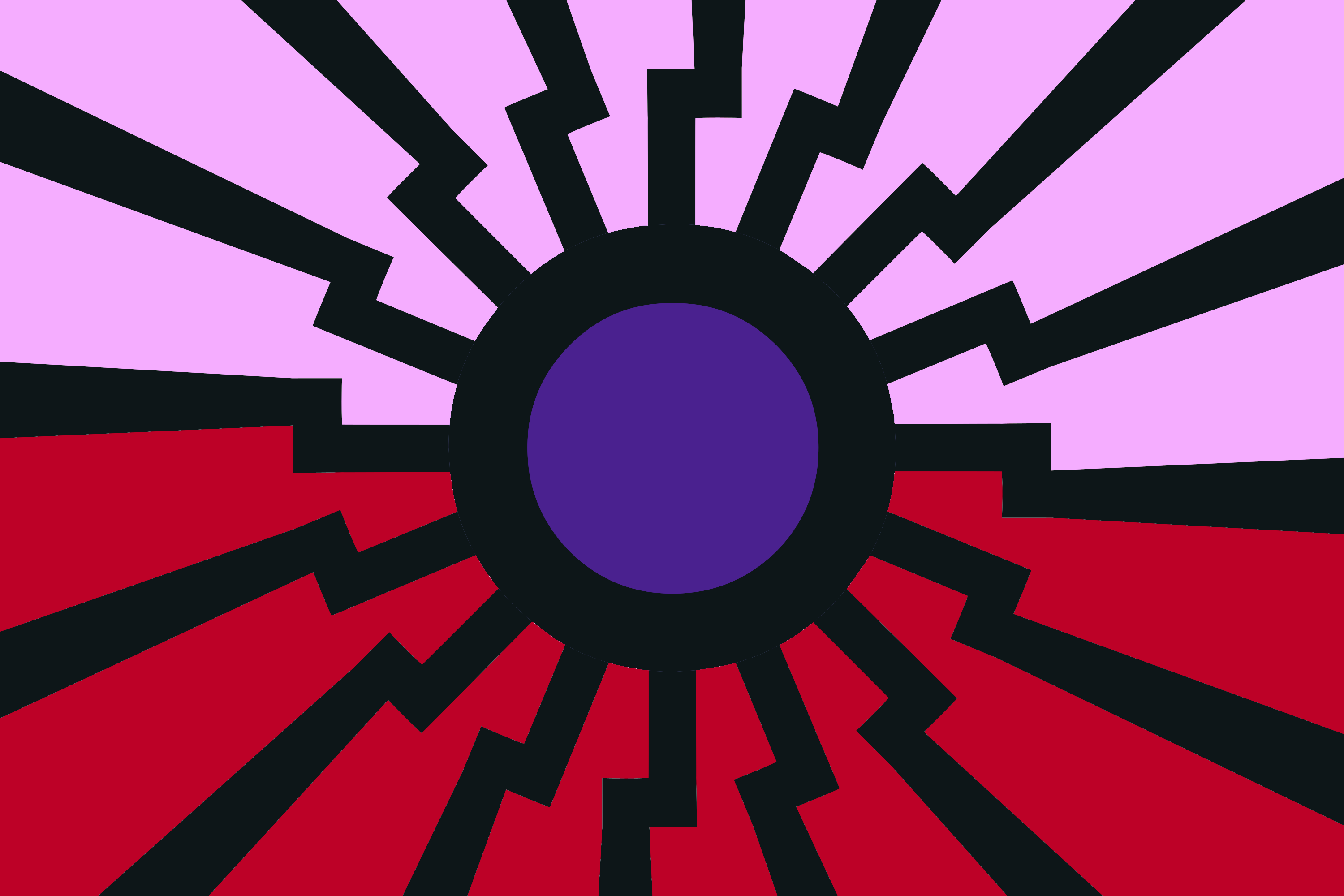
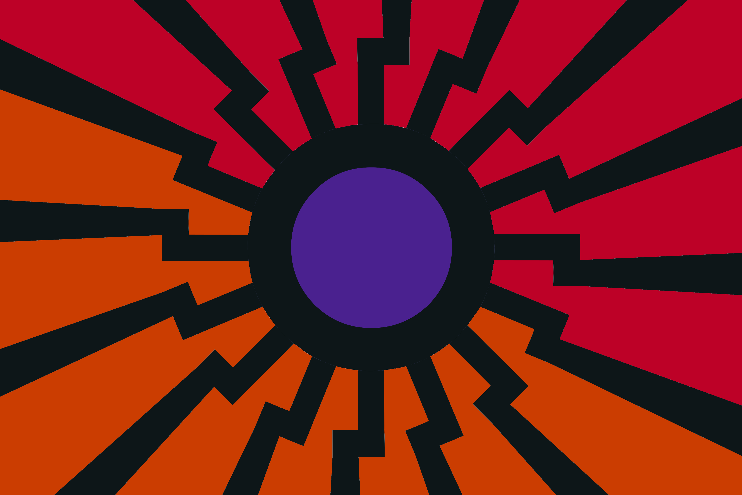
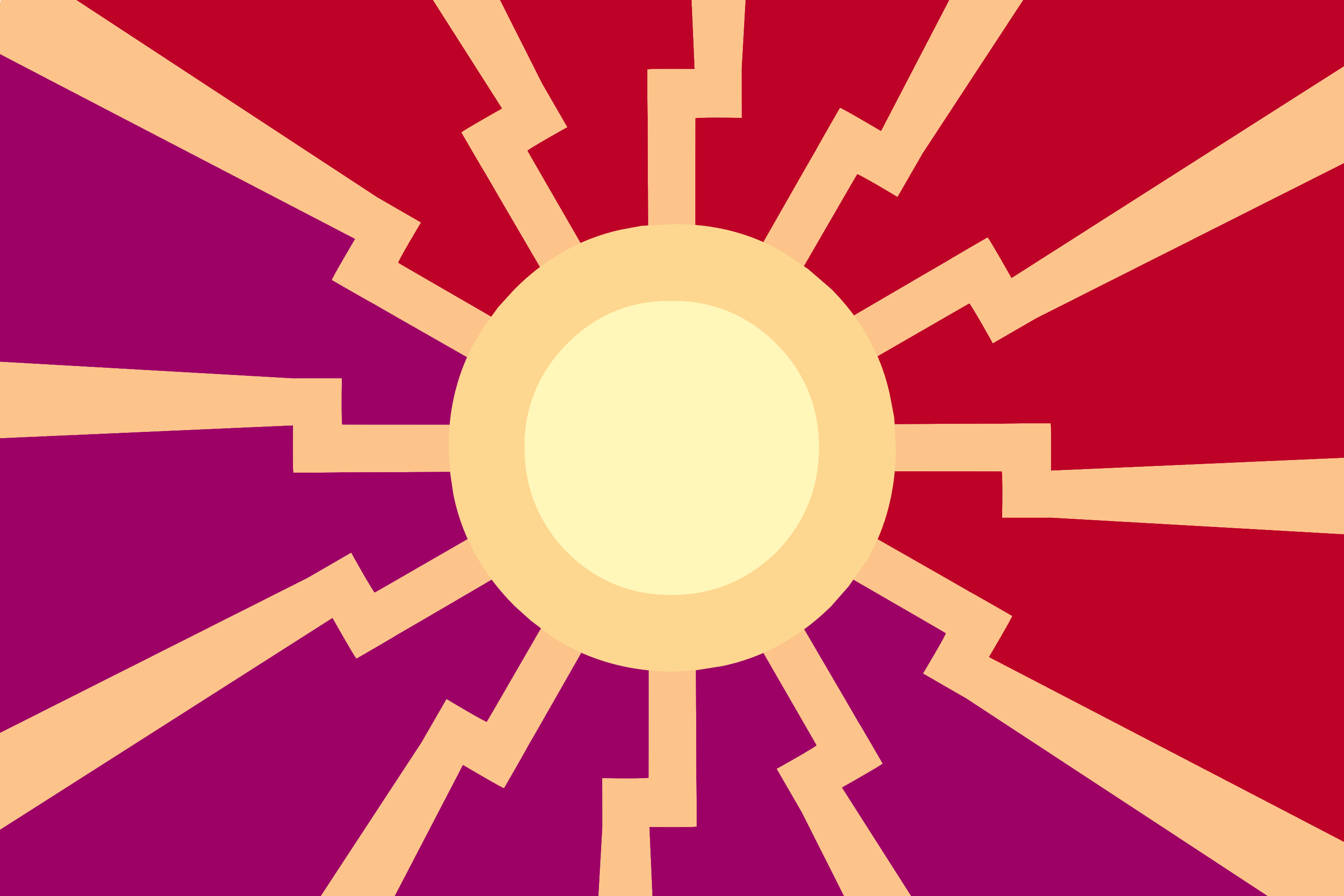
1523303481.png (204.5 KB, 3000x2000, mlpol flag prototype celes….png)

I think we're getting close to the ultimate design of this particular flag style.
After figuring out which colours work from last time, I went ahead and looked up some specific shades, and put some meaning behind them, as >>138800 suggested.
So, let's just go over the meaning of it all, one more time:
The dark shade of purple is Tyrian purple, as worn by the Byzantine emperors. Outside of contrasting really nicely, the comparison to Byzantium should be fairly obvious: showing a resiliency against outside forces, reflected in both the strength of our horsepoon walls and our internal unity.
The orange was lifted straight off of our own Anon colour scheme, and it went much better than I expected with the sun rays. While the orange Anon might not be that widely used, it's significance to our history should not be forgotten.
The black sun needs no introduction, and using the colour scheme of Celestia's cutie mark serves not only to refer to both the show and the character, but also to add some extra concealment to the black sun iconography, which itself is already lesser-known.
The heart is mostly an Aryanne reference, but could also easily be construed as another reference to the show, itself.
But enough of my Liberal Arts dissertation, what are your thoughts on this revision?
>>138840
We're getting closer boys.
I really like the purple-orange back ground theme.
Could you make a edited version with luna (similar to this >>138552) themed sun? Not at home right now so cant test it myself. I think it might look even better.
Even though this is high level moaning, It still misses that one touch imo. I dont know what it is, I will try some things when Im home.
Also, why are the rays a different color than the outer ring of the sun? Is that intentional?
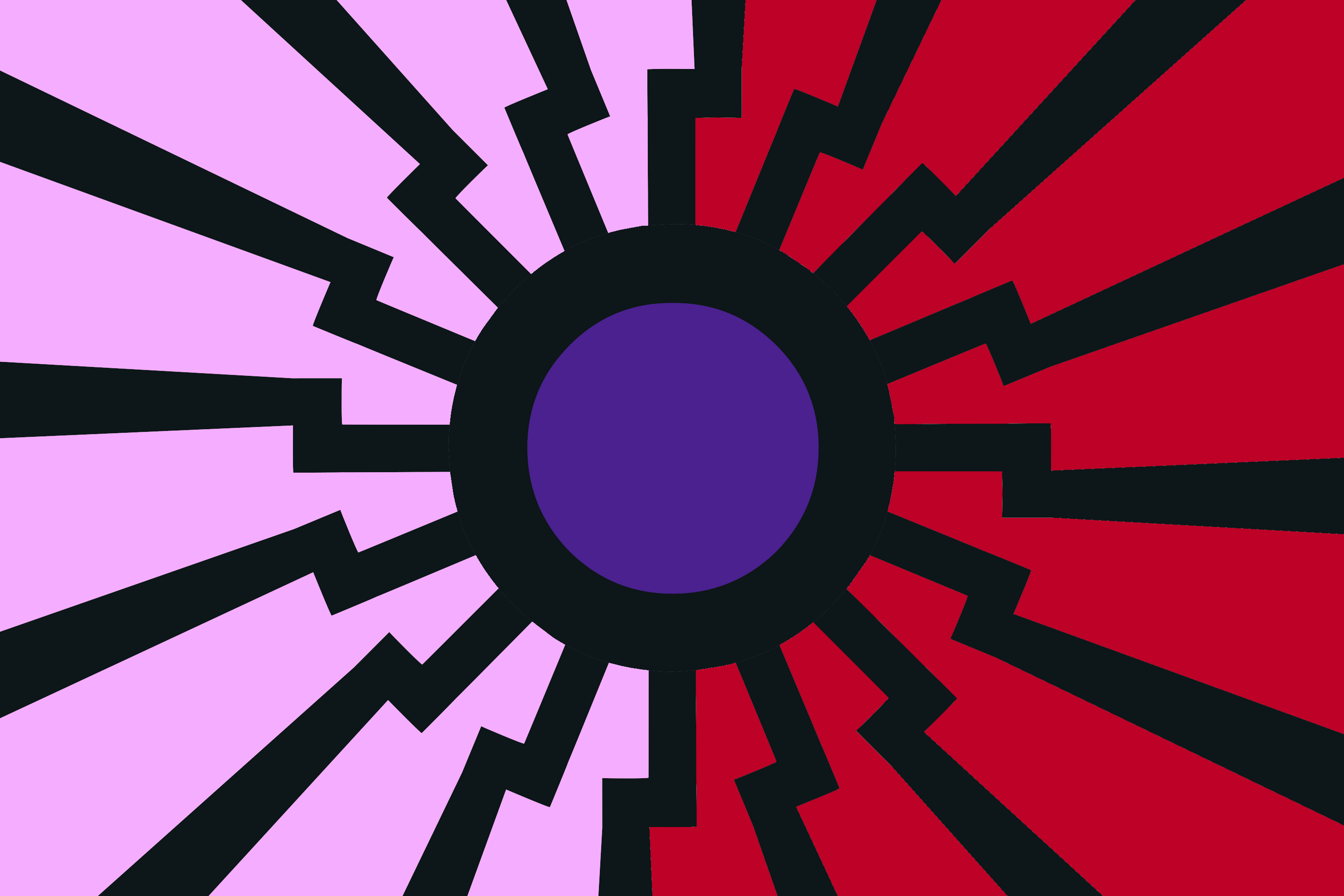
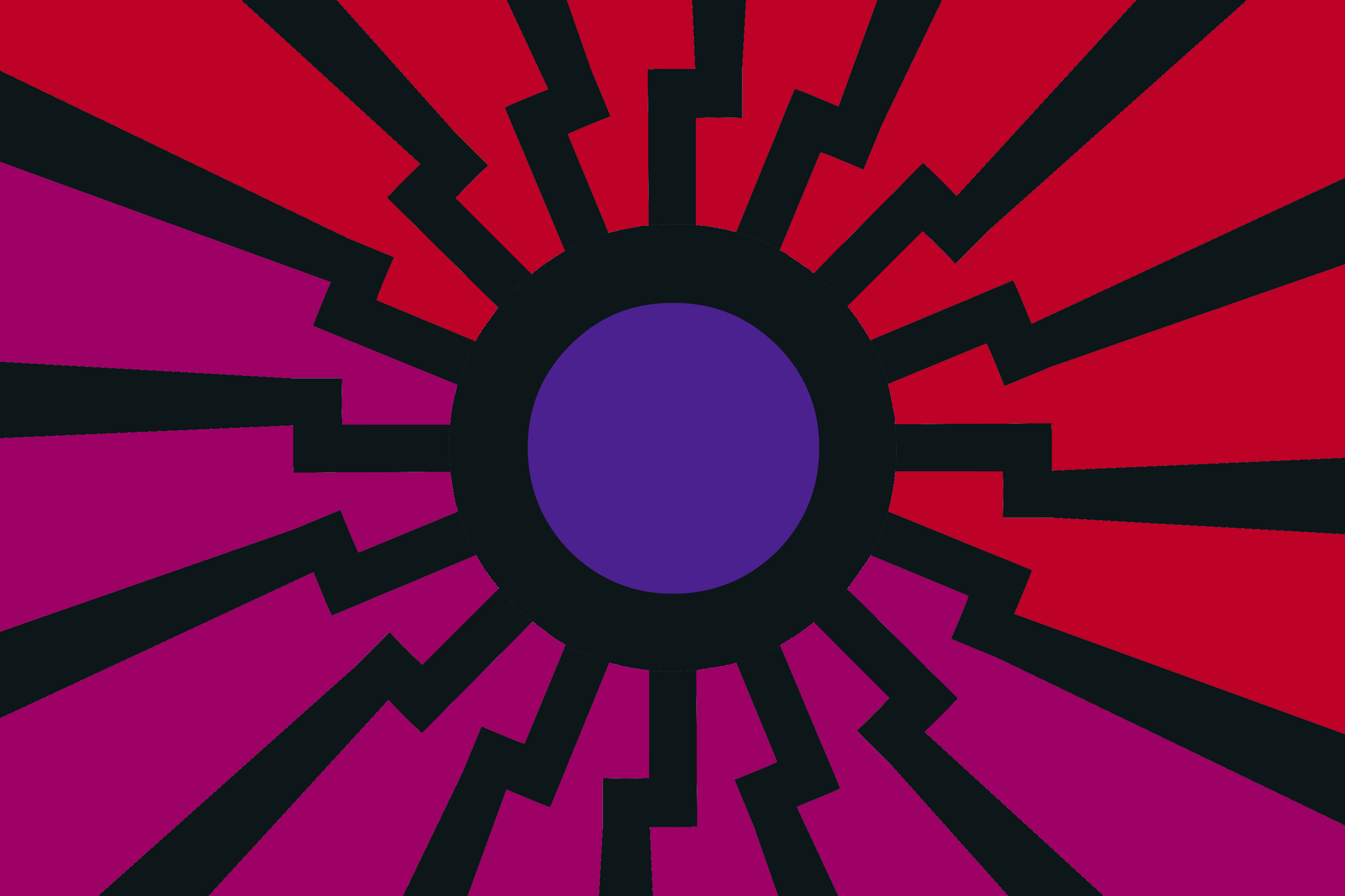
1523309823_1.png (206.7 KB, 3000x2000, mlpol flag prototype luna ….png)

1523309823_2.png (208.8 KB, 3000x2000, mlpol flag prototype night….png)

>>138864
Thanks mate
>Celestia's mark
I actually forgot about that, thanks for explaining it again.
All of those flags look good but
>>138864 2) looks the best at the moment, atleast in my opinion.
Guys, come on.
What we need is more ideas, more people in here. Only then we can truly come up with something great. (Especially since Im absolute shit at coming up with ideas myself)

>>138864
Liked the Nightmare Moon themed version.
Since I really digged the symbol of 2) here >>137835 and here >>138336 I thought I'd give it a go.
I kept the purple style for the second one, since the bright red (>>138336) clashed with the rest.
Especially the first pic came out really good imo
Both need major refining since the rays arent symmetrical at all, but I simply lack the skill (and atm time) to fix them.
Therefore Ive just done it quick and dirty, thoughts?
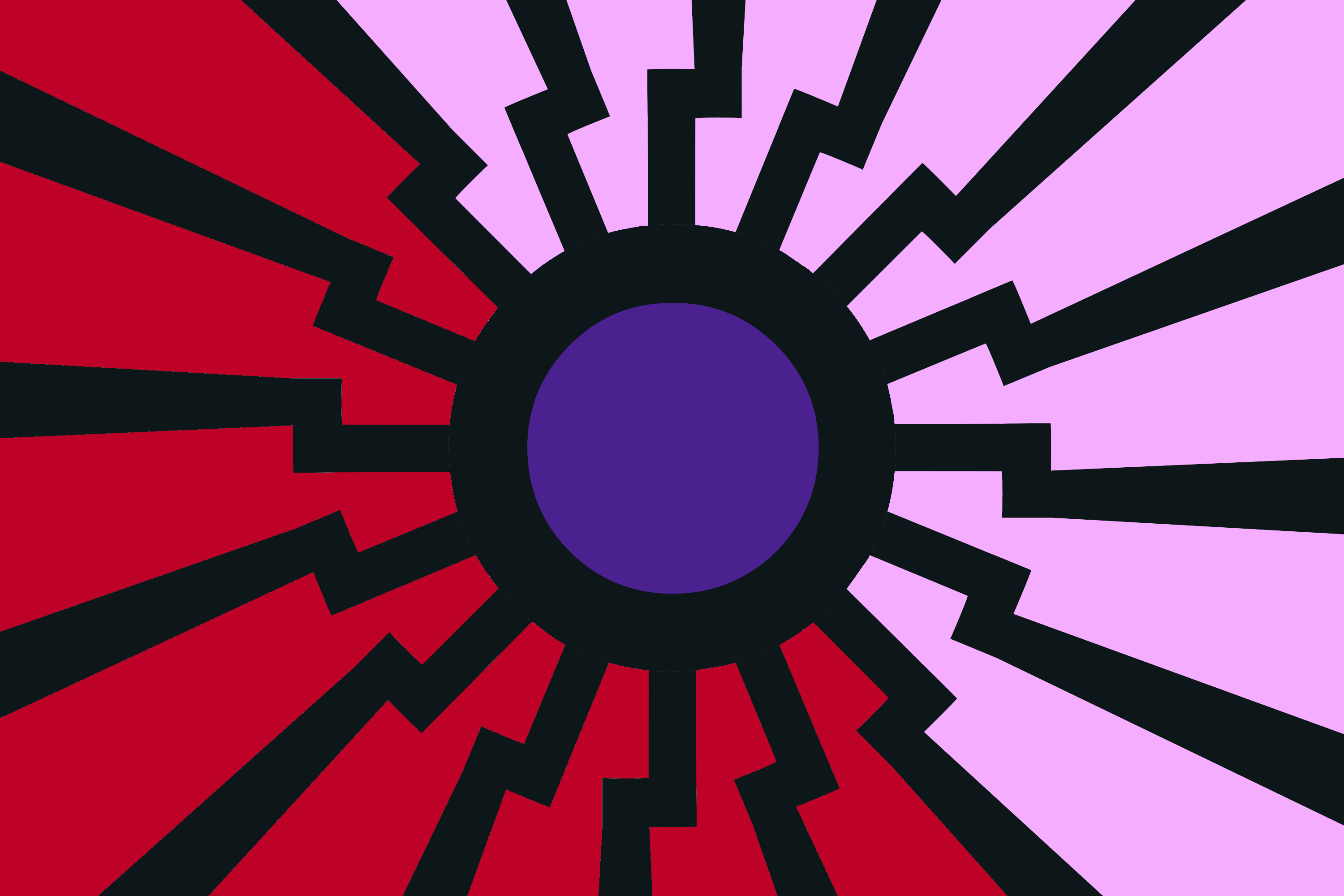
>>138840
I think this is pretty much the ultimate design, I really like this one
>>138864
these work too, but I don't necessarily like the blending in 1st and the contrast in 2nd
>>139203
this is a honorable mention, but Its moving from the simplicity towards more complex details again, we should avoid that pitfall


>>139203
>rays aren't symmetrical at all
Explain?
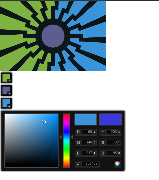
Also holy shit that filesize though, you might want to turn on PNG compression when uploading. Those images are 2/3 the size of my source XCF.
>>139237
Fine details such as that matter much more when it comes to scaling. To illustrate that, I've created example thumbnails, at 128px and 48px widths, respectively, of both your version and mine.
I do appreciate your input, and what you're trying to do, but fine details scale extremely poorly to lower sizes; try sticking to large, low-detail and well-defined insignias, instead!
>rays aren't symmetrical at all
Explain?
Also holy shit that filesize though, you might want to turn on PNG compression when uploading. Those images are 2/3 the size of my source XCF.
>>139237
Fine details such as that matter much more when it comes to scaling. To illustrate that, I've created example thumbnails, at 128px and 48px widths, respectively, of both your version and mine.
I do appreciate your input, and what you're trying to do, but fine details scale extremely poorly to lower sizes; try sticking to large, low-detail and well-defined insignias, instead!
>>139251
>file size
holy shit I didnt even notice. Thing is, I used gimp to create those images, and setting the compression to its lowest level of 1 already turned the pic into a blurry mess, thats why I just turned it off entirely. Didnt notice, my bad
>fine details
I know, fine details dont scale well, especially when viewed from a great distance for example, but as already explained I dont think that this hinders the recognisability of the flag itself. The design itself is very distinct already, a little bit of detail wont change that. Thats why many official country flags also have fine detail (for example having the coat of arms on the flag), but obviously kept to a minimum in most cases to not hinder recognisability.
I think we might just have to agree to disagree on this point.
>rays
I dont mean the black sun rays you created already, I meant the ones of the symbol I added.
>>139273
PNG compression does not make the image blurrier, as PNG is a lossless file format. I've been doing all my work in GIMP, too, and I've always been setting my compression levels to the absolute maximum.
PNG compression does not make the image blurrier, as PNG is a lossless file format. I've been doing all my work in GIMP, too, and I've always been setting my compression levels to the absolute maximum.
>>139280
I dont know much when it comes to that kind of topic, I can only tell you what happened when I turned compression on. I propably did something wrong in the process
I dont know much when it comes to that kind of topic, I can only tell you what happened when I turned compression on. I propably did something wrong in the process
something like this maybe with the x in a box
on a related but slightly different note. around the time of the last 4cc I pulled together a few ideas for a better cup emblem. Maybe we could do a full rebranding?
All are rough and need work but it seemed related so i thought i'd post
All are rough and need work but it seemed related so i thought i'd post
>>138418
though after reading through the thread (rather than skimming) I saw this.
seem as though this would be fan-fucking-tastic as a FC emblem for us. particularly if it had a was tilted a bit so the left side was a little higher than the right. thoughts?
though after reading through the thread (rather than skimming) I saw this.
seem as though this would be fan-fucking-tastic as a FC emblem for us. particularly if it had a was tilted a bit so the left side was a little higher than the right. thoughts?
>>139291
PNGs use lossless compression, that means there are is no artefacting, bluriness or anything of that sorts, the original stays the original
however if you selected a format like JPEG or JPG before, that uses a loosy compression, it replaces certain parts of the image with patterns that help save memory and that affects the image.
hope that clears it up a bit
sources: I'm /gd/ and been working with many kinds of software already
>>139458
Thanks for the explanation. I dont know what happened though, because the sourcefiles I used also were png. Weird
Thanks for the explanation. I dont know what happened though, because the sourcefiles I used also were png. Weird
I wonder what would emblems/service marks for an /mlpol/ nation military would look like.
We need to follow the rule of tincture. Flags which mostly follow it tend to look better.
>>139475
That would be sweet, only one problem, do we actually have symbols that are not the Nazi ones to include on a patch?
What's our ideology and what's our mission?
Do we have anything that might look serious instead of le weeb stuff like the shitty kekistan flag?
That would be sweet, only one problem, do we actually have symbols that are not the Nazi ones to include on a patch?
What's our ideology and what's our mission?
Do we have anything that might look serious instead of le weeb stuff like the shitty kekistan flag?
>>140050
This is /mlpol/, so swastikas and black suns are inevitable I believe.
As for the mission? Other than defending Equestria and The Reich? I'm not sure. I was purely wondering about aesthetics and what would look good to be an actual military patch. I'm hoping for something as good as the Ace Combat ones.

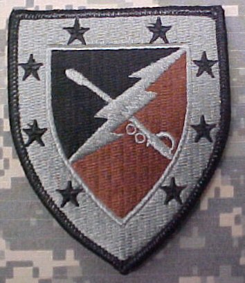
>>140119
Tbh the others could work too with a recoloring and mild redesign. The second looks somewhat "fascist" already with the lightning bolt, and the last has a simple yet eye-catching design; replacing the topmost symbol with Celestia's cutie mark is a plus.
Tbh the others could work too with a recoloring and mild redesign. The second looks somewhat "fascist" already with the lightning bolt, and the last has a simple yet eye-catching design; replacing the topmost symbol with Celestia's cutie mark is a plus.
>>140122
another thing to consider would be looking at the patches of modern attack helicopter forces. they have replaced hoerses as cavalry units presently and have that every so lovely link to physical removal of communists
another thing to consider would be looking at the patches of modern attack helicopter forces. they have replaced hoerses as cavalry units presently and have that every so lovely link to physical removal of communists
>>140248
Attack helicopter forces? Do those exist? I looked at helicopter patches, but a lot of them seem complicated besides the one that is famously in use (but not ours.)
Attack helicopter forces? Do those exist? I looked at helicopter patches, but a lot of them seem complicated besides the one that is famously in use (but not ours.)
>>140259
I think so. I was referring to divisions of the army that have a cavalry-esque role. that being attack choppers. IDK what divisions exactly are designated as though.
I think so. I was referring to divisions of the army that have a cavalry-esque role. that being attack choppers. IDK what divisions exactly are designated as though.
>>140260
looking into it a little bit (not a amryfag) it seems that in the US at least there is a single division that maintains the cavalry designation
https://en.wikipedia.org/wiki/1st_Cavalry_Division_(United_States)
this division consists of both mobile armor and attack aircraft, most notably attack helicopters.
patchs can be sen on each of the sub-divisions pages, linked from the "current structure" section most seem pretty complicated though.
169 replies | 137 files | 31 UUIDs | Archived