Ok, I'm porting this thread over from /4pol/ because it's surprisingly not shit and is actually kinda neat on a couple of different fronts.
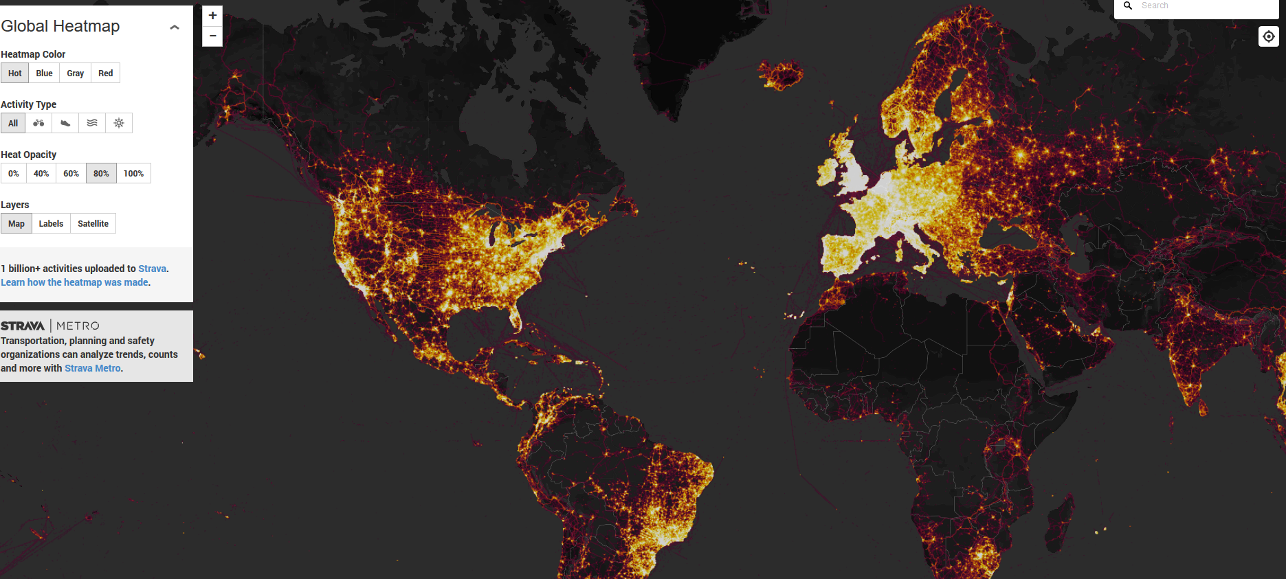
STRAVA has compiled a heatmap from GPS data collected from various fitbits and other fitness devices that have been interacting with their fitness apps.
On the one hand, the dataset in itself is a little bit spooky. If some fitness company has compiled this, imagine what the various Intelligence agency spooks have compiled.
Put those concerns aside for a moment, and it's neat to see the differences of population distribution in different areas of the world. You can really see how the United States has a lot more uninhabited land between its population centers in comparison to most of Europe.
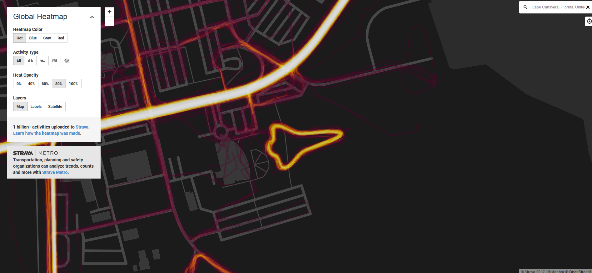
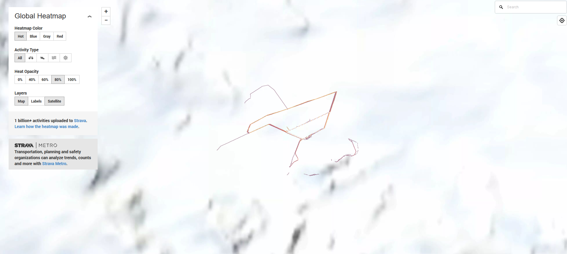
You can also see some oddities where a lot of people follow the same route. Like these people walking around the shuttle exhibit at the Kennedy Space Center museum at Cape Canaveral Florida. Also these people who keep walking the same route around fucking nothing in the middle of the god damned Antarctic. Did I mention that the polacks think that this data is exposing assorted undisclosed military bases?
Although take what you find with a grain of salt. The map isn't immune to spoofed GPS data. Some people were freaking out about a spaceship looking silhouette on some pacific island, but it turned out to be the virtual course of some weird virtual bike race game that linked your smartphone to your TV and a stationary bike machine.
https://labs.strava.com/heatmap/#11.22/-82.83198/-79.76146/hot/all
/mlpol/ - My Little Politics
Archived thread
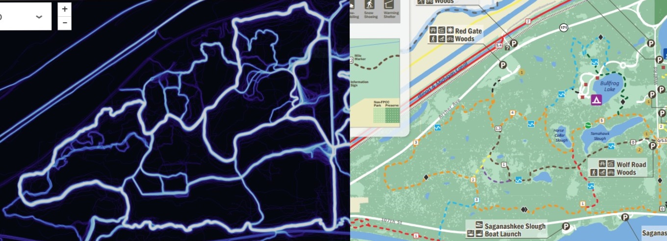
It's kind of interesting looking at how people walk around my local forest preserve. Don't like the idea of my traveling getting recorded though.
3 replies | 4 files | 1 UUIDs | Archived