>>73874I have much much more to share from my personal collection if any of you goys want to have a taste of it.
>>73874Some of my favorite. I think its really easy to go overboard and lose a lot of the aesthetic but if you balance it right and keep it relatively simple it can look great.
Awesome. I've been meaning to start another one of these threads. Dumping my OC from the previous threads. I'll try to make some more later as well.
last but not least some joke images and a modification of "long live mlpol" for distribution on 4chan.
The Mind's Eye. A VHS video produced in 1990 showcasing computer animation, which was considered a cutting edge art form at the time. I remember watching this in grade school and having my mind completely blown by it.
This is literally the comfiest thing you will watch all day that doesn't have a pony in it.
https://www.youtube.com/watch?v=cbG34c1qorQ [Embed]https://youtu.be/lcLJv4FEB5o [Embed](i know this video isnt Fashwave, but his message is really good)
https://youtu.be/y9cVrTbquiQ [Embed]This is what I have so far, hope it helps.
In commemoration of an epic thread...
>>>74075
How long until ADL-sempai notices vaporwave as a white supremacist symbol?
>>74295I am actually okay with having excellent vaporwave music and art all to ourself.
>>74298This, desu.
It'd be a real fucking challenge for (((them))) to try to ban an entire art/music style.
>>74295Would that really be that big of a problem?
>>74298I'm okay with it too. From what I've read, the vaporwave genre was originally intended to be some kind of "post-ironic" commentary on consumerism or some horseshit like that I guess; I've never been able to make heads or tails out of hipster speak when they start blabbering about music genres. Co-opting it for the right would put it in the same category as Pepe or the trash dove; just another toy we've stolen from the left to ruin their day.
Plus I think it works better for our messaging than for the left anyway. Apart from the 1980s being a very materialistic and pro-capitalist decade, the style can be used to inspire feelings of nostalgia for classical aesthetics, while simultaneously causing unease at the prospect of a future progressive dystopia.
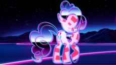
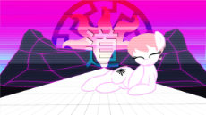
>>73874Just made this wallpaper. Thoughts?
>>74754Awesome!
Wish it were bigger though.
>>74780Better? Dunno about quality tho...
>>74876It looks cool, but (for me) there's too much colors and shit jumping everywhere.
It would be cool to have as a printing on my wall, instead of my pc.
>>75024>colors and shit jumping everywhereSorta did that on purpose since its ponks if I were to make another one, say Twi I'd make it more organized, Rara more flashy but balanced, ect. I'd be down to take a few requests since I'm pretty board atm.
Also fix the size and blurred down the size jump.
>>75028Im curious now then, can you make a rara/applejack one?
Also is this on purpose?
>pic lineart >>75032Sure do you want one with both or two separate ones? If you want specific pics post them.
>>75034Everything on it was colored in didn't really have much of an order to my madness just sorta went with whatever looked right at the time.
>>75035Both of them on the same wallpaper, be creative!
>>75035Ah i meant the wooblyness of the lines actually
>>75037Got it I'll make something nice.
>meant the wooblyness of the lines actually Not sure if that was me or the reference pic I used.
>>75101It's a little busy, the ponies take up too much space and you can't really see what's behind them. It doesn't look like a single coherent image so much as it looks like two unrelated images competing for the viewer's attention (the ponies are one image, the city scene in the background is the other). Composition is very important in this type of imagery, specifically the use of negative space. If there's too many things competing for the eye's attention the image looks cluttered. Also, give some thought to messaging. What are you trying to convey with this image? The text says "Fascism is key" but what does that mean exactly? And how do these images relate to each other in order to convey that message?
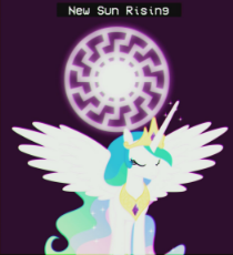
I would also recommend either dropping one of the pones and just focusing on one character, or reducing the size of each and placing them at opposite ends of the image in order to balance out the weight, and maybe have something subtle in the center like a black sun or a swastika for the viewer to notice.
I'd also recommend using a normal image of the pony or ponies rather than these busy cutout style images. Either that or get rid of the city backdrop and go with something more muted for the background, probably a soft gradient that compliments the colors of the pony images. Cutout type images like this are tricky because they are basically using negative space in reverse, where the attention is focused on the space where the pony should be and the loud colors serve as a background. The vivid colors and busy patterns make the ponies look vivacious and animated, whereas vaporwave art is usually very calm and still, so I kind of think these images are not a good choice for this type of art, but by all means play around and see what you come up with.
t. graphic design autist
>>75195So, if you were working on that image, what might you think would be better?
>deliberate goad >>75197>/3/ fag is that you?Nah, I'm not much for graphic design.
My suggestion would be to shrink the size of the foreground elements (Not the city) and spread them out more.
Also not big on vaporwave, so meh. I've been ignoring this thread.
>>75198>not big on vaporwaveIt can either be done every well or very poorly dependent on the balance of the pic. Some of them are very clever and nice to look at others are shit. Like most things from the chans its either crap or a diamond.
Also any suggestions for
>>75028?
>>75197Don't think so. I've done quite a few of the images in this thread though,
>>74008 >>74009 >>74011 are mine, and the image OP used to start the thread is actually the first one I ever did for /mlpol/.
>>75196I'd probably get rid of the two pones to start with and probably choose one of the two characters to focus on, probably Rarity since she likes big cities and would probably appreciate A E S T H E T I C S. I'd try to find one where she looks pensive or contemplative. Not sure where I'd place her exactly because I need to see how things actually look before I commit to anything, however my immediate instinct would probably be to make her small and probably off to the side a little, but near the sun, facing as if she's looking towards it. Ideally an image that could be positioned to make it look as if Rarity is "standing" at the bottom of the skyline looking up at the sun. I'd probably put something in the center of the sun, maybe a swastika or black sun as I mentioned. Then I'd screw around with colors and blending because that's basically what vaporwave edits are all about :)
I would also probably try to tweak the slogan a bit, I'm not wild about "fascism is key" but I'm not sure what would work better off the top of my head.
Also, posting the /pol/ guide to creating fashwave images. It's a pretty good read and has some useful tips, I'd recommend going through it for anyone interested in making some of these.
https://docs.google.com/document/d/1DIeovVhwprNb9z4x9Pxiyr84nhouf3mxz3uzDOlARdo/edit#I'm also thinking of writing my own guide as an expansion of this one, that would expand on the concepts and include discussion on the integration of pones into the aesthetic.
>>75648Nice, I like it. We need more Leslie Fair vaporwaves IMO.
https://youtu.be/Lf9ss1HogAw [Embed]https://youtu.be/iBsZJkXxWU4 [Embed] (I wish this one had a different title but I like the sound)
>>74008/mlpol/ will never die as long as it lives on in your heart.
>>73874All that I have is this Puma.
>>80242My heart has been slowly but surely destroyed
>>80246Then you need more ponies.
Fresh Leslie Fair aesthetic
>>80442Damn you gotta show us how to do this anon. I really want to be able to make this type of work.
>Not posting the glorious sun god
For shame
>>83592On that note, here's something I made recently
rescue bump. I fully intend to make more of these in the near future.
>>88667Some OC to go with your bump. I'd love to see more work.
This is a something.
Yes.
i really dont know what to do
>>88913This is good, you have a good instinct for this. I encourage you to do more. For this one I would recommend adding scan lines over the whole image and changing the font of the text to something more vaporwave.
Give the official /pol/ guide a quick read for a list of good fonts to use:
https://docs.google.com/document/d/1DIeovVhwprNb9z4x9Pxiyr84nhouf3mxz3uzDOlARdo/edit# >>88913Moar please with celestia she my waifu
>>88673Also, these are very nice. Added to my pony desktop folder.
>>89061Thanks, not so good at making it look as blured though which would have been ideal.
>>89058Also it looks great.
>>89058Awesome! Here's something for the thread.
>>89046Thanks anon!
I lost the psd for that one but i think its good as it is, i put some scan lines on this one, whacha think?
>>89103It'd make for a good Mitsuko pic
if we had any vectors of her at all.. >>89107I don't get how her hair works, how's this?
>>89111That looks awesome!
For future reference, I think her mane is in-part based off of a Samurai's top-knot (although it just looks like a ponytail on her).
>>89111Very nice, pretty good. Her mane is in a ponytail. He got the look alright.
>>89107I always wanted to fix this image because it had left over artifacts.
>>89103>>89111looks good, again you have good instincts for this type of aesthetic and I hope you keep making them. I was going to say it needs a pony but then you went ahead and added one :^)
Heres a new one...I put too much effort into making the galaxy and i run out of time.
I feel like it lacks something to make it more vaporwave-like, what can i add?
>>89347It needs more pink and static
>>89347>>89349>It needs more pink and staticpretty much this. I would put a vapor-colored gradient layer over the galaxy and play with blending options, then maybe add some more video effects.
>2 month old thread still up
I feel guilty for being one of the people who regularly DON'T post on here and instead post on 4/pol/ like a retard.
I'm sorry.
>>89365
>trying to put a name on an anon
This is why we need to remove flags
>>89365
Sadly no.
I'm the anon who made the mlpol discord video however.
>>89369That's the one
I hope I never feel compelled to remake it, because trying to make it in fucking Blender was gruelling.
>>893701 You can use blender?
2 Just wondering why you didn't use this version of the song?
[YouTube] Super Ponybeat — Discord [The Original!] by Eurobeat Brony![]() [Embed]
[Embed]Still one of the top videos we have of /mlpol/ content.
>>89371Yes, you can use blender to make movies. I didn't know of any other good video editors back then. Also, the one I'm using right now (Da Vinci Resolve) is buggy as fuck and it's probably going to ruin the sound on my new project; hopefully readding it in with another editor will work though, since it's not that complicated. The frame issues are a different story though.
I used the same version that was used in the /pol/ discord one, since it was a reference to be remembered. There's still parts I left in because I just didn't know how to edit them well enough and they fit in, like the jewish matzo stuff. I think it's 80% remade though.
The sound, however, I left untouched. I wanted to see if I could get a better version, but it just didn't have the same ring to it and I think the timings really differed and I'm really bad at remixing sound so it would've sounded bad.
Also, wew, thanks.
>>89373No problem anon, I've tried out blender but I'm much better at 3D modeling then anything else. Still great video overall and the fact that you used blender to make it is impressive. I'd like to see a mix between the /pol/ and /mlp/ version of the song in but as it is now its still great.
Also speaking of /mlpol/ videos anyone have the rainbowdash bash leftist scum one? I remember a webcam version of it was posted but I need a link for it so I don't lose it.
I swear this started out as a serious image...
>>89474That is a great image anon, it's funny and looks awesome!
>>89474Whats not serious about wanting to come inside rain Rainbow Dash.
>>91529Looks great anon keep up the good work.
Alright, that's enough for now.
Christmas has come early! You have a clear talent for producing such beautiful work.
Not mine, but it was too good not to post.
We F E S T I V E
You guys can mess around with this drawing of Leslie and see what aesthetic you can make with it if you want
>>93918Nice
>>92300Nice job Anon it looks great.
>>92303A classic.
Always nice to see it.
Excellent thread. Thanks for sharing
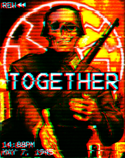
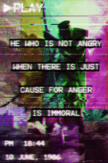
>>94417>>94429June 10, 1986 is a day after the challenger disaster, nothing else seems to have happened. Maybe their birthday.
Can't explain 18:44, seems like a dyslexic fuckup.
Attempting to bring over a few from a recent 4/pol/ thread.
Does anyone here collect images that are more "inspirational" and less aggressive/militaristic/WW2 related?
>>97239I tend to prefer the inspirational ones myself. It's kind of what I try to do when incorporating ponies into the fashwave aesthetic, by using the cartoonish cuteness to suggest warmth and hope for a better future. Or something.
>>74008 (2nd image)
>>74009 (3rd image)
>>80239Probably my personal favorites of my attempts to accomplish this.
>>97239>2picThat gives me feels.
I need to make this kind of stuff now.
>>92303Could you post that Pinkie Pie edit?
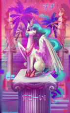
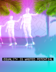
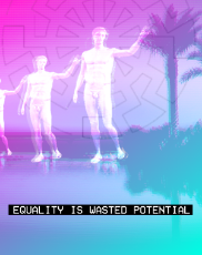
I couldn't decide if I liked the palm fronds in the upper corners or not so here's both versions
>>98711Less is more, 2 pic is better I would say, the sonenrad stands out which is good.
>>98712I'm inclined to agree now that I look at them side by side.
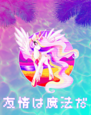
Also I decided I still wanted to use the palm fronds for something, so...here's this.
>>98721I can totally see this printed on a bootleg Chinese toy.
Those are some nice effects, did you made them yourself?
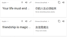
>>98748It is Chinese and says "Your life must end," which is an expression for "Kill yourself."
>>98739'pixelize' effect in Gimp
>>98748'Friendship is Magic' >>98750>>98803>>98721If I had to guess what the text translates to, it is most likely
friendship is magic but unless someone here know how to speak Chinese, we can't be 100% certain.
One thing we can confirm though is that it doesn't translate to kys.
>>98839It's actually Japanese, not Chinese, although the characters are similar (if I understand it correctly Japanese kanji are derived from Chinese characters). Type
friendship is magic into Google translate and it should show you the same text as in the image, at least that's how I got the text.
Xurious just released a fashwave music video by BlackViking for one of his top songs. It does not disappoint.
https://www.youtube.com/watch?v=El7WU2EW_nQ [Embed]Bump because thread is getting dangerously close to the bottom of the catalog. Also, found this on /mlp/ and thought it belonged here.






















































 Ex: Type :littlepip: to add Littlepip
  Ex: Type :eqg-rarity: to add EqG Rarity