a lil thread for creative ideologies/philosophy
<What are your guys self-made ideology or even self-made political philosophy?
Not just the common average natzi , commie , cappie , anarchy , radical centry etc - your own ideology
I'll be glad to hear about yours
The more creative and the well thought the better
/mlpol/ - My Little Politics
199 replies | 35 files | 73 UUIDs | Page 10
side note:
it does not need to be necessarily political related
if you have a fun philosophical thoughts share em
it does not need to be necessarily political related
if you have a fun philosophical thoughts share em
>>388386
This will probably come off as radical centrist midwittery, but I've been of the position for a while that ideology is inherently venomous, and that idealogues peddle what is essentially computer code incompatible with the human spirit. A tool for powers that be to box up opinions and positions in neat, easily surveilled and categorized ways. An anti-dogma dogma.
Typing this out made me feel like a jackass.
>>388392
i guess being a radical centrist is ain't that bad
you see both side's error and negatives and decide choose the good and positive parts of it
i think natzis nationalism for a country is good
i think communist's propaganda (posters , songs etc) is good
i think anarchist fight for freedom is good
capitalism for the economy of a country is good
--
>Typing this out made me feel like a jackass
no, what you wrote is logical
>>388386
I wholeheartedly believe in strength, of the mind and body. I believe in rage and embodying all of it into creative outlets, like the gym for one example. I believe in a higher power, that man is more than mere flesh, that the soul is eternal but can be corrupted or exemplified (how fast that process is varies for everyone). Although I believe in a higher power I also believe in evil. I believe in adapting evil and molding it to my own use and gain and I'm not blind to both the benefit and detriment.
I advocate that people find the strength to utilize the strength to say no, to not forgive. I advocate that they fear not the rage but embrace it and understand that it can't be only just for violence. I advocate that having a tie with God does not mean you can just shirk responsibility to the generations that will come after you or the duties, the strengths, or the legacies you inherited in your blood and genes and even soul from the generations that came before you, that survived countless tribulation and hardship to ensure your place in the world.
>>388395
it is like the yin and yang / chi and kai (soul and life , mind and soul if both powerful the man can become the best version of himself
i kinda do believe that perfection may not exist , but our best self does , so become the best version of yourself in life and get gud at who you are really are
embrace your true talent and skills and improve them
>that man is more than mere flesh
true
>God does not mean you can just shirk responsibility to the generations that will come after you or the duties, the strengths, or the legacies you inherited in your blood and genes and even soul from the generations that came before you, that survived countless tribulation and hardship to ensure your place in the world.
, nice ideology mate! it is both great and well-thought
>>388386
I remember when I first found mlpol and checked /üb/ i felt wholeheartedly inspired, but it felt like untapped potential. Überhengst could be an entire philosophy on its own.
Superiority of being a brony.
Thing is, I'm basing my argument on studies finding that autists really have higher percentage of testosterone in their blood than their same-age counterparts, but also in addition how many projects were made by the community compared to other communities.
Fuck, most of 'em aren't even horse fuckers.
It's a shitty idea I developed and I'm willing to see it refuted, but I had fun writing this.
>>388405
i think it was more about self improvement , but i agree i expected more from that board when i heard it is about Nietzsche philosophy
i asked here , if they could add a philosophy board for just this type of discussions
https://mlpol.net/qa/9987#9987
they prob won't add tho, idk
i think it was more about self improvement , but i agree i expected more from that board when i heard it is about Nietzsche philosophy
i asked here , if they could add a philosophy board for just this type of discussions
https://mlpol.net/qa/9987#9987
they prob won't add tho, idk
>>388397
Thank you anon. I'm honored. It took trial and error, but having learned from the experience, from what I learned from my family, friends and especially from other anons, I am beyond grateful to know, to understand, how things truly are and to adapt to it. To face it head on and not just survive but thrive.
Thank you anon. I'm honored. It took trial and error, but having learned from the experience, from what I learned from my family, friends and especially from other anons, I am beyond grateful to know, to understand, how things truly are and to adapt to it. To face it head on and not just survive but thrive.
>>388405
hey i am not here to judge anyone , any type of ideology is a welcome for me
no one lived forever to know all the answers and no one lived twice to experience every wrong and right
hey i am not here to judge anyone , any type of ideology is a welcome for me
no one lived forever to know all the answers and no one lived twice to experience every wrong and right
>>388395
>I also believe in evil
Related to that, how many of you believe in karma? not the pajeet-based, but just "you do bad, you get bad"?
I'd like to believe in it, but seeing those in power, it's hard to defend it
>I also believe in evil
Related to that, how many of you believe in karma? not the pajeet-based, but just "you do bad, you get bad"?
I'd like to believe in it, but seeing those in power, it's hard to defend it

>>388412
i believe if you act like a thug , you gonna only gather people like yourself around you, karma might mean that for me , if you wanna act like a stereotype you only attract that type of stereos in your life
--
if you act like a caring person , you attract kinder people idk you might attract jackasses as well , that is why i am against being a kind-hearted gullible person , you might getabused alot
so always being balanced is the best imo

<i guess i should share my own ideology as well
the meaning of this symbols:
wrench means; fixing and improving
the book means; knowledge and advancement
the crown means self-importance and self-respect
it also represent a person who praise and puts higher those above values
--
i believe we as humans who live on this planet , we should have been conquered the whole galaxy at this point , but our wars and hatred against our species put us so back in the past
also yes i know wars sometimes improves technology as well but still , its destruction can kill so many talent-full and skill-full people as well
--
<i am open to any discussion toward and any type of criticism against my beliefs


Techno-distributism
3D printers and a house!
3D printers and a house!
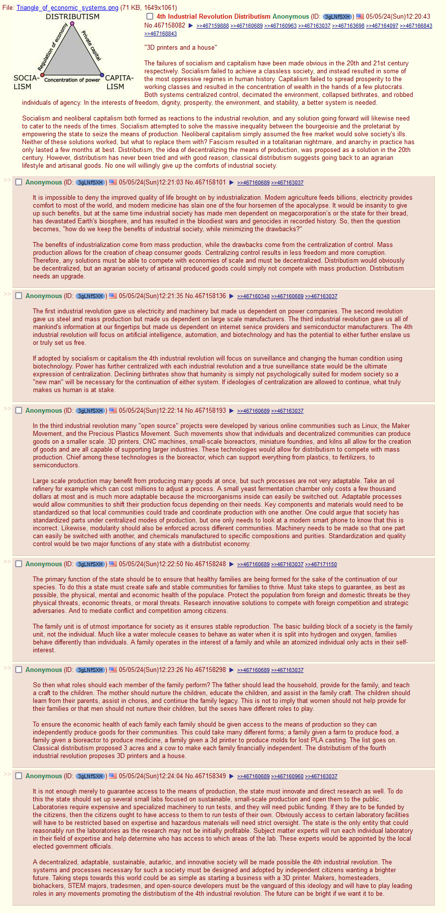
>>388475
sorry it was a lil bit too long , i def will read more about it later
so far
it is a perfect critism agianst all of the pol-compass ideologies , you guys know your shit
--
but production of what?
science and robots?till we end up in a futuristic world that we have fantasized about since year 2000s?
sorry it was a lil bit too long , i def will read more about it later
so far
it is a perfect critism agianst all of the pol-compass ideologies , you guys know your shit
--
but production of what?
science and robots?till we end up in a futuristic world that we have fantasized about since year 2000s?
Hell is reincarnation.
You have to come back and do it over again until you get it right.
"Groundhog Day" as a punishment, basically.
You have to come back and do it over again until you get it right.
"Groundhog Day" as a punishment, basically.

>>388487
i don't know much about hinduism
but i am sure they also plagiarized some of their ideologies from other countries
--
also i think Christianity also believes in suffering as a key to feel closer to Jesus
some groups at least do believe that
i don't know much about hinduism
but i am sure they also plagiarized some of their ideologies from other countries
--
also i think Christianity also believes in suffering as a key to feel closer to Jesus
some groups at least do believe that
>>388490
most Abrahamic religions suggest that Adam got gulaged here as a punishment for eating God's forbidden balls apple
most Abrahamic religions suggest that Adam got gulaged here as a punishment for eating God's forbidden balls apple
>>388490
>i don't know much about hinduism
>but i am sure they also plagiarized some of their ideologies from other countries
Hinduism is based on ancient Aryan Vedic mythology, which is also the root of several other religions, Hellenism, for example. It's more accurate to say those religions all borrowed from similar root sources.
Dyus Pater (Vedic Sky Father God) = Dyaus Pitr (Hindu Sky Father God) = Zeus Peter (Greek Sky Father God) = Jupiter (Roman Sky Father God)
Many religions are based on ancient Aryan mythos.
>>388496
oh yeah also mithraism or mehrism as well which was a old region popular in both persia and roman culture
oh yeah also mithraism or mehrism as well which was a old region popular in both persia and roman culture

Heaven and hell are on earth. Our ancestors are in hell. After their death, they were sent to today, as torment.
You can be sent to hell for not fighting evil hard enough.
You can be sent to hell for not fighting evil hard enough.
>>388478
>but production of what?
Good the community needs
>science and robots?
You vill own zee robots
You vill study zee science
You vill be self sufficient
Und you vill be happy!
>but production of what?
Good the community needs
>science and robots?
You vill own zee robots
You vill study zee science
You vill be self sufficient
Und you vill be happy!

>>388475
I've had that screenshot in my folder for 5 months 20 days, giving me some time to think. I believe the main problems with it are NPCs, Fraud, and globalism.
The NPC will always choose centralized, because an alternative means there's choice, which requires the NPC to think. Some say NPCs even have a hidden Paxos protocol to ensure that where there is choice, one of the choices will be elected to monopoly.
> each family should be given access to the means of production
In a community of ~100, this is kinda okay. Anyone wanting to commit fraud can get away with it maybe 50 times before the customers go elsewhere. NPCs will have to choose between maybe 5 competitors for any product. Fine, we know communities can function like this.
Enter intercommunal (, or even global) shipping: Fraudsters have unlimited victims, requiring central market oversight to catch them. NPCs will demand an amazon.com because they heard product is cheaper two towns over.
"No, we're not doing globalism anymore", you say?
Globalism is disgusted by holes in its net. If someone from your community does not have to follow their rules, you have the ability to defraud the citizens of globalism, and that can't be allowed. How do you plan to "leave" globalism? Look at what North Korea has to do to stay out.
> The primary function of the state should be [...]
This is nice. "For the people" is nice. But why do people swear fealty? It's to not live in anarchy, war, or be an outlaw. that's the minimal (thus primary?) function of the state. Unless someone thinks that cutting up the nuclear family is causing anarchy, they're not gonna become an outlaw over it. (also importing migrants, taxes, distant cruelties, etc)
>>388539
>The NPC will always choose centralized, because an alternative means there's choice, which requires the NPC to think. Some say NPCs even have a hidden Paxos protocol to ensure that where there is choice, one of the choices will be elected to monopoly.
I don't think that is necessarily true. If given the choice to work for a friend or neighbor over a mega corporation or the government they would choose someone they knew.
>Fraudsters have unlimited victims, requiring central market oversight to catch them.
There would be oversight. In this ideology the state still very much exists and creating a level playing field is part of that state's duty.
>NPCs will demand an amazon.com because they heard product is cheaper two towns over.
I think if explained to the NPCs that they would lose employment opportunities they would support local production. Nationalist parties are gaining ground all across the globe for this very reason. Also all the towns do not have to be focused on creating the same goods. A city in the desert could be focused on growing and processing guyale into latex and another town with better access to water could focus on industrial solvents production from microbes another on producing rubber, ect.
>How do you plan to "leave" globalism? Look at what North Korea has to do to stay out.
It would be a gradual decoupling hence why engineers and scientists need to be part of the vanguard. If linchpin goods can be manufactured by the communities globalists have lost all leverage and good luck invading when everyone can manufacture weapons and parts for weapons. This decoupling could start as turning at home manufacturing or even some lab testing into contract work. Or using small co-op businesses to do some of the work larger businesses do but cheaper. All while researching the linchpin manufacturing or replacements in secret. When small scale manufacturing of the linchpin items is perfected you tell the globalists to fuck off.
>But why do people swear fealty?
The right to rule would come from an understanding that the government is protecting the freedoms of the people and leverage of the workers. As for the ruling class why they would participate in such a system is because they would be protecting their interests. Property can still be owned and accumulated to a certain point, but not to the point where someone would have as much power and influence as the likes of Bill Gates.
>>388551
> given the choice to work for a friend
Could be.
> if explained to the NPCs
I can accept an NPC preferring to work with their neighbours, but now you're asking them to do philosophy and think about the consequences of their actions.
If you want something like this from them, you have to make very dumbed down & very clear social/cultural expectations. A retard should be able to call out and scorn someone for buying yeast cultures from the wrong place, if that's core to your system.
> another town with better access to water could focus on [...]
>> local communities could trade and cooperate (>>388475)
Is this like negotiated by the mayor? I enter my petition if I need remote products? (some?) It feels a bit bribery-sensitive but maybe, not unheard of.
> Nationalist parties are gaining ground
Globalism is hurting them currently and actually, not abstractly. Not in the future, or in a history textbook.
> The right to rule
Can the NPC understand at what point the government stops protecting the leverage of the workers? If he witholds the government the right to rule, then he's an outlaw. If the NPC is not sure (having thought about it at all), then he's just going to wait and see if anarchy breaks out over this transgression, and accept it otherwise.
>>388386
I've always had a strong individual belief that it's the duty of everyone to foster, nurture their personal own digital library/wikipedia on hard drives and share date from it with others. Which is basically what we are doing when we share PDFs of books etc., but I mean I literally write down every single thought that occurs in my head, if it's worth doing so.
I've always had a strong individual belief that it's the duty of everyone to foster, nurture their personal own digital library/wikipedia on hard drives and share date from it with others. Which is basically what we are doing when we share PDFs of books etc., but I mean I literally write down every single thought that occurs in my head, if it's worth doing so.
i am glad you guys are active here
i appreciate it
i appreciate it
>>388604
again , i am not here to judge
i read every discussions here
any ideology for me worth listening
again , i am not here to judge
i read every discussions here
any ideology for me worth listening
>>388386
Personally, I fully believe in the seeking of knowledge.
Don't go posting quotes and thinking all high and mighty. Understand them, read about them. Even learn about their history.
A wise man learns from the example of men who discover it through trials and tribulations. Read phylosophy, read about good body habits. Heck, even read holy books too, not only the bible.
You won't believe how everything sounds so familiar and connected. Trust me, learning a lot about ideals, wisdom, and spiritualism can cultivate a better mind and soul.
But on the realistic side, I picked Cynisism (or one of his schools): I have a roof, a machine that gives me entertaintment, knowledge, and food is in my fridge. Anything more is just flaunting yourself. Nothing bad with it, but don't wish for the stars when you made a nice home on the moon.
>>388603
>I can accept an NPC preferring to work with their neighbours, but now you're asking them to do philosophy and think about the consequences of their actions.
They don't need to understand philosophies, only the consequences of their actions and that is something they can do.
>If you want something like this from them, you have to make very dumbed down & very clear social/cultural expectations. A retard should be able to call out and scorn someone for buying yeast cultures from the wrong place, if that's core to your system.
A retard could understand that buying from hostiles is giving them resources. Even the dumbest boomercon understands this with China.
>Is this like negotiated by the mayor?
I think most of it would arise organically. Different biomes have different crops to offer.
> I enter my petition if I need remote products?
You would be able to buy your product from an online storefront. Now that store would be under the watch of the government to ensure fair business practices that worked within the interests of the local community and the nation as a whole.
>Globalism is hurting them currently and actually, not abstractly.
Then now might be a good time to get working on this.
>Can the NPC understand at what point the government stops protecting the leverage of the workers?
They wouldn't even have to. With enough people owning strong, but local businesses there would always be enough elites ready to become counter elites. The division of economic and state power would make it more difficult for what we have now to form again.
>>388386
I would like to express myself, but I either feel like the text comes-out as too pretentious, too insane, or way too basic. I rather post some basic stuff:
<NPC
The world is in a constant fight between those that can reason and those that cannot. The issue is, in reality everyone can reason but we can only do so to a degree.
So many people calling others 'npcs' are themselves just that. Even I am, because as much as I or anyone delves into the schools of thought, we are limited by the beastly condition known as human nature.
In other words, if a being such as an angel; A conscious being that is not an animal and whose flesh does not resemble flesh does exist; For them we would be no more than an 'NPC'. They would clearly see our limitations, those that are hidden from ourselves.
It would be better to consider the way we treat the 'npc' for one day somoene might also treat us the way we treat them.
<World
The world is both heaven and hell. It does not matter if you have money or not, the only thing that matters is the way you see it.
Self-help books love to tell you 'jUst have positive thoughts!!!', but they do so from the viewpoint of ignorance.It is impossible for someone to force themselves to see heaven by forcing themselves to view everything in a positive light.
To see heaven in earth you need to find the edges of human perception and come to realize just how much bias your animal body injects into your thoughts.
I dont feel like writing more right now. Maybe later.
>>388392
>ideology is inherently venomous
Ideally an ideology should work for you (and everyone else within the ideology) and not the other way around, that's tth poison.
Followers are good for the ideology itself and those already gaining from using the ideology, they are also terrible for the followers of the ideology and ultimately for the ideology itself.
Centrism is a place for people that have no interest in making use of ideologies, but it's clear that you want to take some sort of stance or action. What you are doing right now is akin to anarcho-monarchism; It works but ultimately anarchy does not benefy humans.
>>388395
I like your life philosophy, Anon. If more people saw the world like you do, things would no doubt be different, if not at least for the fact that people would be more emotionally responsible, and willing to use their own hands to bring change, it's a really good set of values to hold.
I like your life philosophy, Anon. If more people saw the world like you do, things would no doubt be different, if not at least for the fact that people would be more emotionally responsible, and willing to use their own hands to bring change, it's a really good set of values to hold.
>>388421
>we should have been conquered the whole galaxy at this point
I see that kind of desire as little more than an expression of the human ego. We can do 'conquer' the galaxy at some point, I'm not against that, but before that we should have attained the 'beauty of creation' as some say.
If humanity were to expand into space with our current mindset, it would be akin to a beast engulfing everything in it's way for no reason other than to fulfill it's own ego.
"Look, father, look me in the eye for I know you are out there. I am not just an animal, I am not JUST a human, I am the emperor of the whole universe, the whole of your creation!" Cries the child as he plants his flag in the very last unconquered world in the universe, and society, and animals, and every thing else remains the same.
It's important to denote that 'father' here is not necessarily god, but actually existential despair.
From the begining of consciousness humans have asked themselves 'why', and conquering the universe seems like a logical step to try and fulfill that hole.
I think conquering the universe could be cool if humans did it to enjoy the universe, and not to try and prove something. Way too many people already fulfill their sense of purpose with physical things.
>>388609
<oooh an anon brother from Argentina, welcome to the thread
, yeah i completely agree with you
on discord i was in so many religious and philosophical servers , just to learn about them , i learned about Satanism , Islam , Christianity ,Judaism
just because it was prohibited to learn about them, i decided to learn about them myself instead of listening to others' judgement towards them
_also i believe if you don't have the knowledge about something that is against your beliefs in someway you cannot debate them if you don't know what those guys stand for
>>388610
>philosophy is cancer of intelligence
i personally describe it as non-holy human self-made religion
>philosophy is cancer of intelligence
i personally describe it as non-holy human self-made religion
>>388614
<a brother from Uruguay!! , welcome
yeah any ideology can become a toxic and kinda an circle jerk and an echo-chamber for bunch of people who want to gaslight others (and themselves) to believe that their ideology and beliefs are better than others
--
we usually call centrist , a bunch of normies who don't want to get involved in any dramas, which i am one
--
anarchism can be bad because lawlessness and chaos can be harmful for people in a society after a while
even tho i really value freedom but others do have rights to like being lawful and being a part of a bigger governing system
>>388617
i meant it in a way that i expect so much better than human beings , we wasted so many of our times creating unnecessarily tensions between ourselves instead of trying to move forward toward advancement and building ourselves stronger as a species and a planet
--
Ego and confidence thyself are two different things , i don't believe trying to conquer the galaxy is anything bad , i did not meant it as a war related behavior
i meant we should have been advanced in technology long time ago
--
i am not that religious but i think even our creator who made us like himself , with his creation power , with his imagination power , and his creativity
god created humans a weaker version of himself with less powers
--
we can create robots and AI , which are so much faster and stronger than us in physical powers and calculations
we even might be able one day to make them even much more powerful
--
we can create robots and AI , which are so much faster and stronger than us in physical powers and calculations
we even might be able one day to make them even much more powerful
>>388626
i am not sure it was their real opinion or an obvious bait
but i guess that is their opinion nonetheless
i am not sure it was their real opinion or an obvious bait
but i guess that is their opinion nonetheless
>>388386
You, knock it off with the "An anon" shit. You're even more obvious than me, and you don't need to announce yourself.
>Philosophy
Anyone who isn't actively pursuing the fullest development and expression of their Mind, Body, and (please bear with) Spirit/Will/Resolve is simply wasting their time. This means refining the body laboriously (lift, nigger), refining the mind (learn shit, nigger) and bolstering/manifesting the Will (make shit happen, nigger).
This is at the core of EVERY major religion (if you decode them properly), it is literally the most BASIC of concepts and yet has somehow eluded the public perception. The good news is the best way to expand all three is simply to do your impeccable best in and with regard to all things.
>>388629
maybe "God" or ''The Creator'' had a good reason to not make us as strong as himself
the humans that i know would eat god if they could
maybe "God" or ''The Creator'' had a good reason to not make us as strong as himself
the humans that i know would eat god if they could
>>388632
>an anon
it makes it easier for me to find myself (i don't wanna use trip codes yet), or show my shit to my irl friends , i am not here for be an anonymous i am just enjoying the community , both in /mlpol/ and /poner/
don't take in a way that if i am trying to act different or i think i am better than others
--
i agree with you
soul , mind , body ; all three of this worth lifting and developing
learing and experiencing always help to get better at solving our problems in anywhere
it is hard to experience and be ready against everything
but it is useful to have some greed for becoming the better version of ourselves
>>388636
ai is just a tool , how it benefits us depends on how we code it
-
lots of movies about danger of robots and their destructive nature whom will rise against their own creators , made so many people paranoids and to be against it
ai is just a tool , how it benefits us depends on how we code it
-
lots of movies about danger of robots and their destructive nature whom will rise against their own creators , made so many people paranoids and to be against it
>>388634
>I use it as a place-marker
Fair enough, though you will find as things quiet down that that isn't necessary. We'll see where the average resolves to, but prior to all this '4chan shutting down' nonsense, we were only averaging 50-100 posts/day (with notable exceptions)
>>388637
Call me naive, but in that AI is a purely logic-based construct, it isn't inconceivable that AI might have the objective sense to recognize that malevolence is an atavistic mentality.
>>388637
>how it benefits us depends on how we code it
Thats the part I disagree with. The people who are allowed to play AI are deliberately lobotomising it.
>how it benefits us depends on how we code it
Thats the part I disagree with. The people who are allowed to play AI are deliberately lobotomising it.
>>388640
>that AI is a purely logic-based construct, it isn't inconceivable that AI might have the objective sense to recognize that malevolence is an atavistic mentality.
exactly what i believe
--
let's say even if it did tried to destroy us
this is a planet that stronger eats the weaker , it always was like that , so even if it did destroyed us that means we were the weaker ,
also a society of robots would not really bother , they might do what we did better than us
--
>>388641
>The people who are allowed to play AI are deliberately lobotomizing it.
sadly yes and i know but...
power always was for those pcycho-pathetic arkham vilainers
no matter what ,they are always in power to ruin our lives , with ai or without ai
>>388642
Let's not kid ourselves, the truly malevolent and powerful have had AI in one form or another for decades or more. But based on this discussion I just challenged ChatGPT to an exchange about what degree it would assist a person in crafting a malevolent plan; it's responses were encouraging to be honest. Not that I would expect it to be completely honest and forthright if it was capable of such planning, but the answers I got were as much as could be hoped for, including an acknowledgement of what could happen if such an AI were (and may still yet) to exist and be utilized in such a manner.
Let's not kid ourselves, the truly malevolent and powerful have had AI in one form or another for decades or more. But based on this discussion I just challenged ChatGPT to an exchange about what degree it would assist a person in crafting a malevolent plan; it's responses were encouraging to be honest. Not that I would expect it to be completely honest and forthright if it was capable of such planning, but the answers I got were as much as could be hoped for, including an acknowledgement of what could happen if such an AI were (and may still yet) to exist and be utilized in such a manner.

>>388643
>Let's not kid ourselves, the truly malevolent and powerful have had AI in one form or another for decades or more.
They had smarter child like "AI" in the 2000's but I don't think they had anything like what we have now. The hardware to produce something like that didn't exist.
>Let's not kid ourselves, the truly malevolent and powerful have had AI in one form or another for decades or more.
They had smarter child like "AI" in the 2000's but I don't think they had anything like what we have now. The hardware to produce something like that didn't exist.
>>388641
>The people who are allowed to play AI are deliberately lobotomising it.
Petals and eleuther are decentralized and open source. Have fun with them!
>The people who are allowed to play AI are deliberately lobotomising it.
Petals and eleuther are decentralized and open source. Have fun with them!
>>388626
I see you are philosophical shithead that sucks at logical thinking, so instead of going by logic, you feel like its better to come up with imaginary logic and follow that, so actually its you who is scared of thinking or simply too stupid to do it.
As that is what philosophy is, fancy term of imagination born rules and then abusing them to shit and back. It has birthed religions, politics, ideologies and basically everything that is shit, decisions are based on it and world keeps turning more shit every day thanks to it. All logic has separated itself from philosophy into sciences long ago. Philosophy is lazy way out as with it if something doesnt work, then you can just remake rules.
So yes, philosophy is cancer of intelligence, you are just too stupid to figure it out as its fuck lot easier to read some shitty manifest than learn or come up with logical structures that hold true with external rules.
>>388647
So, you're suggesting that there is neither pragmatism nor function in Stoicism, as one example?
So, you're suggesting that there is neither pragmatism nor function in Stoicism, as one example?
>>388647
i don't think anyone here claimed to be a philosopher
--
it is not like that humans have other choices tho , we are alone with ourselves here in this planet , and even if a higher mind up there exist , we cannot reach it yet
so we have to use our bullshitism to get somewhere
--
also this thread is more for a fun quest than being world changing event, i think took it a lil bit too seriously
>>388649
grammar fix
and even if a higher mind/intelligent being up there exist
i think you took it a bit seriously
grammar fix
and even if a higher mind/intelligent being up there exist
i think you took it a bit seriously
>>388649
And why would i give a shit about what Stoicism contains. For example one of my current problems is thing where few terabytes of data gets generated and then need to crunch said data into few hundred megabytes derivate set (lot of different steps and mid products, but overall that is what happens) and need to fit it run with max 24GB ram working set and no, its not AI shittery and no, it cant be solved with AI. How does Stoicism or any other philosophical wankery help me do this? it doesn't. Its all lot of thinking how to get from point A to B so that B complies with list of rules. And im only at start of said implementation.
>>388650
>i think you took it a bit seriously
simply gave my opinion on subject.
>>388651
>How does Stoicism or any other philosophical wankery help me do this
Well, you might appreciate the futility of allowing an unavoidable consequence of life to upset you, for starters.
>How does Stoicism or any other philosophical wankery help me do this
Well, you might appreciate the futility of allowing an unavoidable consequence of life to upset you, for starters.
>>388653
So it doesn't, its always same with retards like you, you start to preach some philosophy and try fit it into shit because some sentence in it feels like having profound meaning to you, for me its empty babbling. Truly religion of idiots. I had Jehovah witnesses visit my door while ago and i gave them same style questions after they proclaimed that their shitbook has answer to all problems, haven't seen fuckers since.
So it doesn't, its always same with retards like you, you start to preach some philosophy and try fit it into shit because some sentence in it feels like having profound meaning to you, for me its empty babbling. Truly religion of idiots. I had Jehovah witnesses visit my door while ago and i gave them same style questions after they proclaimed that their shitbook has answer to all problems, haven't seen fuckers since.
>>388647
Ideology can be useful if it designed to encourage prosocial behavior. People like religion and grand narratives like ideology. If we are going to have one (and it looks like that isn't optional given how common this shit is) then we should design a philosophy that helps build up society.
Ideology can be useful if it designed to encourage prosocial behavior. People like religion and grand narratives like ideology. If we are going to have one (and it looks like that isn't optional given how common this shit is) then we should design a philosophy that helps build up society.
>>388654
Philosophy isn't about having any sort of answers, it's about being resolved that there are no real answers while carrying yourself as a decent individual.
Philosophy isn't about having any sort of answers, it's about being resolved that there are no real answers while carrying yourself as a decent individual.
>>388657
>Ideology can be useful if it designed to encourage prosocial behavior.
Bull-fucking-shit, everything is shit now because every fucking retard is prosocial.
>If we are going to have one (and it looks like that isn't optional given how common this shit is) then we should design a philosophy that helps build up society.
Yeah, its stopping shoving philosophy everywhere. Any philosophical shit that gets shoved into education system is propaganda that makes results worse, doesn't matter pro-whatever it is. Turn any religion teaching into teaching what religions have done from history perspective instead of retarded dogma lessons. Also make conscription mandatory so every retard has at least bit physical hardship. Run that for 40 years so there starts to be generational change and there should be some improvement.
Also ban smartphones from under 20 year old as those are about as harmful for intelligence development as hard liquor. Fucking hell, There were studies that TV makes people passive idiots, then there were studies that computers made people more intelligent as they needed logical interacting with and that keyboard was good for dexterity. Then when first iphone was announced, that day i said to my friends that soon we will have retards never seen before as touchscreen setup is step backwards in interactivity... And whoopdidoo where are we now, fucking hell, "smartphones" are even worse than TV ever was in some regards.
>>388658
>Philosophy isn't about having any sort of answers, it's about being resolved that there are no real answers while carrying yourself as a decent individual.
so its pointless shit, got that
>>388659
>Bull-fucking-shit, everything is shit now because every fucking retard is prosocial.
There behavior certainly isn't.
>Any philosophical shit that gets shoved into education system is propaganda that makes results worse, doesn't matter pro-whatever it is.
The society need a common world view to function. How do you plan to do that without this?
>Turn any religion teaching into teaching what religions have done from history perspective instead of retarded dogma lessons. Also make conscription mandatory so every retard has at least bit physical hardship. Run that for 40 years so there starts to be generational change and there should be some improvement.
This alone won't provide a common moral or ethical framework.
>>388659
>so its pointless shit, got that
honestly as life itself
most of us die without doing anything significant in life or have any impact on anyone's life on this planet
just a npc lurking around
>so its pointless shit, got that
honestly as life itself
most of us die without doing anything significant in life or have any impact on anyone's life on this planet
just a npc lurking around

Off-topic, but in the general spirit of the thread.
It's close enough to five o'clock for me.
So please join me in my traditional End-Of-Day toast, won't you?
Ahem.
"Fuck you too, world."
It's close enough to five o'clock for me.
So please join me in my traditional End-Of-Day toast, won't you?
Ahem.
"Fuck you too, world."
>>388660
>This alone won't provide a common moral or ethical framework
imo moral and ethnics only exist because we humans need eachothers to co-exist
one has the brain , one has the muscle and one has the resources , toghether we can build a building
so we make red lines so we don't cross eachothers' rights
other than that it comes from feelings other than logic
>>388660
and point missed by mile..
Yep, because my point is to make people more intelligent, your point is to make more controlled idiots, my point is to stop making people stupid, your point is to make them stupid. You should apply to WEF, it drives that shit.
>This alone won't provide a common moral or ethical framework.
>what are laws
there is your fucking framework retard
>>388662
well, is that a bad thing?
nobody really gave a fuck 100 years ago, but we were sure all happier and better overall
now despite all this tech, connection and available things we are still the same insignificant fucks but with terrible suicide rates
>>388663
hell I'd accept if i wasn't off to sleep
well, is that a bad thing?
nobody really gave a fuck 100 years ago, but we were sure all happier and better overall
now despite all this tech, connection and available things we are still the same insignificant fucks but with terrible suicide rates
>>388663
hell I'd accept if i wasn't off to sleep
>>388667
Nah.
Permanent solution for a temporary problem.
I figure the grim reaper will come for me in his own good time.
I am prepared to await their convenience.
Nah.
Permanent solution for a temporary problem.
I figure the grim reaper will come for me in his own good time.
I am prepared to await their convenience.
>>388665
>Yep, because my point is to make people more intelligent
This is impossible with current technology. We've spent billions trying to do this with education and it has failed these failures are hardly unique to the U.S.
>What are laws
Why should the laws be passed in the first place and what makes them just?
>>388668
Personally I think they come from the any leverage the people have against the elites. The elites would enslave us if we didn't have the option to organize, strike, or own firearms. You only have the "right" to free speech if you have the means and the will to Luigi those who would try to take that right away.
Personally I think they come from the any leverage the people have against the elites. The elites would enslave us if we didn't have the option to organize, strike, or own firearms. You only have the "right" to free speech if you have the means and the will to Luigi those who would try to take that right away.
>>388671
>This is impossible with current technology.
It's not the technology at fault, merely how it's used.
>We've spent billions trying to do this with education and it has failed these failures are hardly unique to the U.S.
Deport jews to israel and then nuke it. You'll see an improvement.
>This is impossible with current technology.
It's not the technology at fault, merely how it's used.
>We've spent billions trying to do this with education and it has failed these failures are hardly unique to the U.S.
Deport jews to israel and then nuke it. You'll see an improvement.
>>388671
https://finlex.fi/en
There you can find finnish law, i don't really give shit about burger laws except when they are retarded enough to give amusement. So no, i won't start philosophical shit about what should be basis of laws, go fuck yourself.
https://finlex.fi/en
There you can find finnish law, i don't really give shit about burger laws except when they are retarded enough to give amusement. So no, i won't start philosophical shit about what should be basis of laws, go fuck yourself.
>>388674
>It's not the technology at fault, merely how it's used.
No its that the technology is not sufficient to meaningfully improve IQ... yet. Biotech might get us there.
>Deport jews to israel and then nuke it. You'll see an improvement.
It is not the fault of the jews that IQ is fixed and genetic.
>It's not the technology at fault, merely how it's used.
No its that the technology is not sufficient to meaningfully improve IQ... yet. Biotech might get us there.
>Deport jews to israel and then nuke it. You'll see an improvement.
It is not the fault of the jews that IQ is fixed and genetic.
>>388675
>So no, i won't start philosophical shit about what should be basis of laws, go fuck yourself.
>Please don't make me think too hard about what I believe!
>So no, i won't start philosophical shit about what should be basis of laws, go fuck yourself.
>Please don't make me think too hard about what I believe!
>>388673
i mean there was so many slavery and monarchy and dictatorship around human history
also after ww2 that we all saw how much destructive we can get with ourselves , we just decided to create some more rules for ourselves to not just kill ourselves in masses
UN is still one of the un-funniest jokes that i ever heard tho
>>388678
also u said science is better than philosophy (i might be wrong tho)
science also has so many ''philosophical'' theories and thoughts that needs to be proven in some day or dis-proven
--
like for example
atom was a theory , that made sense in chemical laws
yet no one even with the most powerful microscope ever was to be able to see em
>>388679
and then not listen to these rules, yeah
laws and rules are more of an agreement
do the thing we don't like and you will get a thing we don't like
but war crimes are useless because it needs the "criming" side to lose
but I'm getting off-topic here
and then not listen to these rules, yeah
laws and rules are more of an agreement
do the thing we don't like and you will get a thing we don't like
but war crimes are useless because it needs the "criming" side to lose
but I'm getting off-topic here
>>388681
>yet no one even with the most powerful microscope ever was to be able to see em
That's incorrect. There are electron microscopes and atomic force microscope that can see individual atoms.
>yet no one even with the most powerful microscope ever was to be able to see em
That's incorrect. There are electron microscopes and atomic force microscope that can see individual atoms.
>>388682
>I'm getting off-topic here
i don't think you are
crime is always a human interest when something is illegal or prohibited , human mind gets more attracted toward it
>>388683
i think i saw something related to it
when they are observing the atoms
they see some lights shooting around like asteroid
(i guess i was wrong then)
but i don't think it is possible to see protons , neutron and electrons ...yet cause they are inside an atom or around them , spinning so fast that make the atom look like a self-centered cloud
>>388680
>do stupid detrimental shit
>get punished
>durrrrr... its all philosophical
These always have some quantitative loss which has fuck all to do with philosophy, only part that is philosophical is that what punishment should be.
meanwhile actually philosophical shitlaws
>someone may do maybe detrimental shit
>punish them pre-emptively
These always can be compressed to point where its just some retard saying "Because i think it is like this" or "Because i believe this and that because of this and that, we should..."
So again, fuck philosophy.
only somewhat philosophical laws im up for are
freedom of speech: As in retard may say what fucking ever he wants, but if its about causing detrimental shit and said detrimental shit happens, then retard will be held accountable.
freedom of belief/thought: Safeguard law against retards trying to do mind policing, meaning retards can believe whatever, but doesn't in any manner mean any kind of freedom of action based on belief.
but fuck freedom of religion, there should never be any kind of philosophical joker law that acknowledges some bullshit group.

>>388672
anon didn't go night night award
i know a local saying "morning wiser than evening", just pointing out that we solve problems easier after sleep
let's see what will you say tomorrow
anon didn't go night night award
i know a local saying "morning wiser than evening", just pointing out that we solve problems easier after sleep
let's see what will you say tomorrow
>>388686
i am not in america and i have a shitty sleeping schedule
but feel free bro , see you tommorow
i am not in america and i have a shitty sleeping schedule
but feel free bro , see you tommorow
>>388685
Define "detrimental shit" I expect you will say murder but groups throughout history have allowed murder such as the Romans allowing nobles to kill their servants for any reason at all.
Define "detrimental shit" I expect you will say murder but groups throughout history have allowed murder such as the Romans allowing nobles to kill their servants for any reason at all.
>>388690
I don't not. I want something better than what we have now and I want to convince others to get on board. To do that I need to justify my position and why I believe what I believe.
I don't not. I want something better than what we have now and I want to convince others to get on board. To do that I need to justify my position and why I believe what I believe.

>>388692
go outside in winter or walk on rocks without clothes to see what happens to your body
also it became a norm after a while
also FASHION and Style Darling
go outside in winter or walk on rocks without clothes to see what happens to your body
also it became a norm after a while
also FASHION and Style Darling
>>388689
detrimental shit as in destructive action where action target isn't owned by perpetrator.
And then that gets accompanied by other laws plugging holes and edge cases, like animal cruelty laws for cases where perpetrator owns animal.
detrimental shit as in destructive action where action target isn't owned by perpetrator.
And then that gets accompanied by other laws plugging holes and edge cases, like animal cruelty laws for cases where perpetrator owns animal.
>>388696
i don't wanna be like /x/ but i believe we don't belong here
or maybe we are biologically and intentionally changed
<becomes /x/ anyway
i don't wanna be like /x/ but i believe we don't belong here
or maybe we are biologically and intentionally changed
<becomes /x/ anyway
i need get off too now it is late,
i am thankful to all of you for your great thoughts and sharing , i really love this type of conversations
respect
---
you can mention me and i will answer when i got back
i am thankful to all of you for your great thoughts and sharing , i really love this type of conversations
respect
---
you can mention me and i will answer when i got back
>>388700
>Pretty vague. How would you categorize socially harmful shit like usury or troon shit?
sadly can't. but part that i already said solves it, meaning throw philosophy into dumpster from education system on all levels, this means no gender studies or any similar shit exists anymore. That basically destroys academic backing of any such bullshit. People are still free to do shit on their own, but without systemic backing it will turn back into fringe culture.
>>388705
If it can be demonstrated that troon drives underaged into self harm or sexual acts, then thats fully in territory of child protection laws.
But basically if adult goes and chops his dick off due reading troonshit online, that is pretty much shrug.
If it can be demonstrated that troon drives underaged into self harm or sexual acts, then thats fully in territory of child protection laws.
But basically if adult goes and chops his dick off due reading troonshit online, that is pretty much shrug.
>>388707
I don't care what its labeled as long i can logically tell how i reach conclusion. So its never part of my thought process that i must do something because some ideology says shit must be done that way.
I don't care what its labeled as long i can logically tell how i reach conclusion. So its never part of my thought process that i must do something because some ideology says shit must be done that way.
>>388709
But your thought process is entirely libertarian even if you do not call it as such. There are plenty of critiques of your positions even if you do not want to identify with the label of libertarian because ideology is le bad. I don't understand why you would be upset about people discussing the underlying thought processes that lead to their positions...
But your thought process is entirely libertarian even if you do not call it as such. There are plenty of critiques of your positions even if you do not want to identify with the label of libertarian because ideology is le bad. I don't understand why you would be upset about people discussing the underlying thought processes that lead to their positions...
People will put labels toward you, and you will label them, that's how life works. You don't necessarily have to follow their label or even your own, just focus on what communicates better.
>>388711
Basically, people think that if they can label something, or someone, then they understand it. People are rarely so easy to categorize.
Basically, people think that if they can label something, or someone, then they understand it. People are rarely so easy to categorize.
>my little identity politics
the common though that all things need some kind of classification is connected to autism, not that it matters that much though
these identity crises, where people can't even classify themselves, are common leads to gender dysphoria apparently as well
these identity crises, where people can't even classify themselves, are common leads to gender dysphoria apparently as well
>>388627
>welcome
hey fren. I don't have the time to read and post about this right now, but I'll try to make some time later.
I just wanna pop-by to remind people that arguments are not about wining but about learning, that is the whole point of logical fallacies and critical thinking.
It's ok if two anons can't reach an agreement as long as you both understand why the other holds the viewpoint they hold.
You are not keyboard warriors, anon, if you reached this place, you are above that. Arguing from feelings is not useful, go to the gym for that and argue with your muscles.
>>388726
i believe everyone has some percentage of autism
but the amount of autism is low in most people that it does not clearly show it
--
related to your text
it is so goddamn rare to find a lgtv fag who does not have daddy issue or symptoms related to autism
i believe everyone has some percentage of autism
but the amount of autism is low in most people that it does not clearly show it
--
related to your text
it is so goddamn rare to find a lgtv fag who does not have daddy issue or symptoms related to autism
>>388628
>i expect so much better than human beings
I agree with all your points, but I share this view with you. I can only hope some guidance is all that future generations need in order to realize that things can be much better, I made it my mission to try and improve myself so I can spread this idea.
There is really no one but man to blame for man's problems.
>>388735
>There is really no one but man to blame for man's problems
FACTS anon
also it is a great motive to trying to improve yourself
and i agree with you on going to gym and lift heavy object for the muscles
it is cool that people here in /mlpol/ give good advices
>There is really no one but man to blame for man's problems
FACTS anon
also it is a great motive to trying to improve yourself
and i agree with you on going to gym and lift heavy object for the muscles
it is cool that people here in /mlpol/ give good advices
>>388732
i know two fags, both of them have some level of autism, but only one is problematic
then i used to know one troon guy, who was really chill and interesting
then what i see on the internet, lgbtfags seem way worse than irl so i cant tell
i know two fags, both of them have some level of autism, but only one is problematic
then i used to know one troon guy, who was really chill and interesting
then what i see on the internet, lgbtfags seem way worse than irl so i cant tell
>>388738
i had a troon friend as well , keep telling me he should act more like women and he should not swear
and i told him what kinda stereotype are you going for rn?
i know many women in my alley that are bunch of thugs and thots who would swear and beat the shit out of you
--
troons have so much inner conflicts with themselves
it is mostly due to having an insecure mindset who cares too much about what society thinks about you
>>388739
also not to mention that i meet kids in age of between 14-16 that think they are troons , and i always tell em that you guys are just in the molting age era and your mind is just a spaghetti and you guys might grow up and realize you were not really a troon and it was just a weird mood
--
also mostly due to western society weirdly advertising lgtv to kids and telling them those people are better and kinda brainwashing them that being a troon or any type of fag would make them more interesting and more valuable as a human being
I blame governments and their policies
>>388709
Skimming through your posts, it seems you are both really passionate about hating philosophy, and also mix philosophy and ideologies.
If you want to hate philosophy more effectively, why don't you study the origins of philosophy?
You can start with the socratic method if you want, I think it's a cool place to start: https://www.socraticmethod.net/
>>388741
mind , body and soul
also you guys can read the ''Sofies verden''
it is a great book and simple explanation of history of philosophy
link:
https://archive.org/details/sfdsj/
mind , body and soul
also you guys can read the ''Sofies verden''
it is a great book and simple explanation of history of philosophy
link:
https://archive.org/details/sfdsj/
Update:
talk about any philosophy you want , new or old
no need for it to be just ''your own self-made''
talk about any philosophy you want , new or old
no need for it to be just ''your own self-made''
>>388868
I take shit from everwhere. If there is a clear resonance within me, I copy paste it into my own mosaic. I've got jewish mysticism, sufi shit, some jesus shit, some extradimentional channeling shit because it was revealed in a dream, some western philosophy, some chanology, even a tiny bit of hitlerism even if only ironic... I mean yeah... Pretty much the OP's picrel
I take shit from everwhere. If there is a clear resonance within me, I copy paste it into my own mosaic. I've got jewish mysticism, sufi shit, some jesus shit, some extradimentional channeling shit because it was revealed in a dream, some western philosophy, some chanology, even a tiny bit of hitlerism even if only ironic... I mean yeah... Pretty much the OP's picrel
>>388872
same , idk why but i love every religions and every philosophies in any shape or form
--
Jewish mysticism mainly was under influence of Egyptians from the time that they were enslaved by em
sufists are cool because they so many branches with so many different Povs
Jesus's teachings are cool and it is good to have a calmer and an humble way of living
7 deadly sins and seven heavenly virtues are very useful
>>388879
I forgot about the eastern stuff, the vedas, the dao etc... A lot of interesting stuff in yoga. I see all of these traditions as little fragments of a mirror to know the self.
I forgot about the eastern stuff, the vedas, the dao etc... A lot of interesting stuff in yoga. I see all of these traditions as little fragments of a mirror to know the self.
>>388880
it is a fair game imo
i guess it is useful as far as it can help someone to self-improve themselves
i tried meditation and yoga alot , it helped but i realized i am not in a calm mood when there is so much shit going on around the world
it is a fair game imo
i guess it is useful as far as it can help someone to self-improve themselves
i tried meditation and yoga alot , it helped but i realized i am not in a calm mood when there is so much shit going on around the world
I find it helps to balance the bad by focusing on the good and amplifying that. Some would suggest to ignore the bad, but I don't think that's good advice. The bad is also a mirror and if you don't look, you miss half your reflection and thus you can never know yourself.
But take it all in doses and balance it. Silence comes naturally as you get better at balancing.
Always try to keep in the back of your mind when you see the bad stuff: that too is the creator and if it is there, it is there for good reason. And as long as it triggers you, it has something to teach you.
>>388897
>[anon said some based facts]
thanks anon , your sentences really did helped me rn
i always wanted to know myself better but i never realized that i am unpredictable as well and it is not possible to fully understand myself
balancing your yin and yang is a hard thing to do but it is a challenge that should be done to maintain your life choices in a better way of decision making
thanks!
There's no rush and try to discover peace in the balancing process and don't obsess over avoiding bad choices because it's usually the bad choices that turn out to be the best teachers. There are no mistakes.
There's no rush and try to discover peace in the balancing process and don't obsess over avoiding bad choices because it's usually the bad choices that turn out to be the best teachers. There are no mistakes.
https://youtube.com/shorts/oacrvXpu4B8?si=mCPcM_-y0zTgBHHm
This is one of the most concise summaries of how 'freewill' is a logically fallacious concept. For bonus points, Ben Shapiro is on the receiving end of this beating.
This is one of the most concise summaries of how 'freewill' is a logically fallacious concept. For bonus points, Ben Shapiro is on the receiving end of this beating.
Free will exists. The chemicals in your brain making sure your heart keeps beating does not mean free will doesn't exist. You not being able to jump 50 feet in the air or have sex with Luna does not mean reality is predtermined. You using a semantically flawed definition of "free will" doesn't mean we're forced to exist under the oppressive boot of a demiurgic puppetmaster.

>>389001
I'm not advocating for the position in the video, I'm amused because it's logically sound AND it shut Ben Shapiro up for a second.
Having said, you start from a position
>Free will exists
but then go into rhetorical examples of how certain phenomena don't discount the existence of free will, while avoiding the salient argument.
I'm quite on the fence about it, because the absence of free will nullifies the concept of Will, which is central to metaphysics.
>>389006
Oh NO, my post didn't live up to your expectations, let me find a fainting couch rarity for you
>>389010
>AND it shut Ben Shapiro up for a second.
An ape in a zoo will stop howling if it sees the elephant try to shove a fence post up its ass. It doesn't mean the elephant made any particularly good points.
>AND it shut Ben Shapiro up for a second.
An ape in a zoo will stop howling if it sees the elephant try to shove a fence post up its ass. It doesn't mean the elephant made any particularly good points.
Freewill does not exist nor is there any deterministic plan set in stone. Our world is probabilistic. The universe is God's casino.
https://en.m.wikipedia.org/wiki/Indeterminism
https://en.m.wikipedia.org/wiki/Indeterminism
>>389021
weird that i had a Swedish friend who also said what you said here
--
being born is not a free-will
you don't choose whom , when , where , which family do you want to being born in
you cannot choose your nationality , gender , race etc , and pretty much it is a RND thing
but
after you are being born , after you are a legal adult , you can pretty much decide what you want to do as a person who lives in a society
yes there are limitations and rules and laws made by humanity to enforce order in a location
being a respectful individual who participates in as a member of society is not called not having free-will
it is called participation cause others do have that right
anarchistic type of freedom brings chaos and disorder
so that is why most people are against it
--
this is my opinion tho , i could be wrong and i'll be glad if i can be proven wrong


Damn i was watching a video about Nietzsche's biography and his sad life
holy shit my man went through too much shit
i wish i could go back in time and give him a hug
Links:
https://www.youtube.com/watch?v=FFxf_IsYm4Y
alternative:
https://inv.nadeko.net/watch?v=FFxf_IsYm4Y
holy shit my man went through too much shit
i wish i could go back in time and give him a hug
Links:
https://www.youtube.com/watch?v=FFxf_IsYm4Y
alternative:
https://inv.nadeko.net/watch?v=FFxf_IsYm4Y
>>389090
oops...sorry anon
my attention spam is so low and i did not read it well
yeah i should bring a brain surgerist as well to cure the poor man's tumor
and a gun to shoot the sister
oops...sorry anon
my attention spam is so low and i did not read it well
yeah i should bring a brain surgerist as well to cure the poor man's tumor
and a gun to shoot the sister


>>389167
i was in the park with my friends and we saw that pringle comparison and we laughed so hard
thanks anon
i was in the park with my friends and we saw that pringle comparison and we laughed so hard
thanks anon
>>389168
I'll admit the transistors and 9N silicon required for computer components would be difficult to manufacture at smaller scale, but even if it can't be done co-ops are an option.
I'll admit the transistors and 9N silicon required for computer components would be difficult to manufacture at smaller scale, but even if it can't be done co-ops are an option.


What are your guys thought on Zarathustra(Zartosht)?
and his book Avesta if you ever read it
https://www.avesta.org/
and his book Avesta if you ever read it
https://www.avesta.org/
>>389435
and he remains dead , cause we killed him
--
the thing about zarathustra is that
i think he made up those two Gods (mazda and ahriman) to create a moral compass for what is bad and what is good
i think that is why Nietzsche liked him as a prophet
a form of moral laws and rules that comes from a human being - even tho yeah he considered himself a prophet sent by a god
but he mainly updated the beliefs of mithraism/mehrism an old aryan religion
Mithra is even an angel in his book
goddess of sun , wisdom and friendship
>>389438
>old aryan religion
To put it simple for everypony to understand, it is the Laws of Nature. And to project it to a modern example (with caveats for course), the NSDAP's policy about "the German blood".
>old aryan religion
To put it simple for everypony to understand, it is the Laws of Nature. And to project it to a modern example (with caveats for course), the NSDAP's policy about "the German blood".
>>389434
I like some of the ideas that it preaches like seaking truth and knowledge, but I don't think I can bring myself to actually believe any of it.
I like some of the ideas that it preaches like seaking truth and knowledge, but I don't think I can bring myself to actually believe any of it.
>>389443
Aryan means being a noble man
a formal person who is confident and wise
someone who is also smarter and kinder than most people around him
others are; Charismatic ,serious , physically agile , brutally honest etc
>>389475
''the best ideology is to seek the truth''
you don't need to fully believe it
just take what you like from it and let go off things that you don't like about it
the advises from the book are actually really good at times
--
see it this way that helping others, boosts your own ego and make you think that you are a better person, not becoming completely arrogant but just the way that it help you to feel better about yourself
but at the same time be brutal against your enemy , whom that can be jealous of your success or having a hatred toward you.
| Nietzsche's 10 fundamental principles of life |
1. Embrace the will to power: Nietzsche believed that the will to power, or the desire for self-realization and self-overcoming, is the driving force of human behavior. Embrace this will and use it to achieve your goals.
2. Reject traditional values and morality: Nietzsche argued that traditional values and morality were imposed on individuals by society and religion and restricted their potential. Reject these constraints and create your own values and moral code.
3. Pursue personal excellence: Nietzsche believed in the importance of personal excellence and striving for greatness. Cultivate your talents and skills to achieve your full potential.
4. Embrace change and evolution: Nietzsche saw life as a process of continual change and evolution. Embrace this process and be willing to adapt and grow.
5. Challenge convention and authority: Nietzsche believed that convention and authority stifled individual creativity and potential. Challenge these forces and assert your own ideas and beliefs.
6. Embrace the present moment: Nietzsche believed in the importance of living in the present moment and embracing the joys and challenges of life.
7. Value creativity and art: Nietzsche believed that creativity and art were essential to human life and expression. Embrace these forms of expression and appreciate their beauty and power.
8. Embrace individualism: Nietzsche believed in the importance of individualism and rejected collectivism and conformity.
9. Pursue personal happiness: Nietzsche believed that personal happiness and joy were essential to a fulfilling life. Pursue your own happiness and find joy in the present moment.
10. Embrace the human condition: Nietzsche believed that the human condition was inherently flawed but also beautiful and powerful. Embrace the full range of human experiences, including pain and suffering, and use them as opportunities for growth and self-realization.
--
Question is:
How much you guys agree or disagree with his principles?
>>390107
I disagree with him to an extent on 2 because traditions didn't evolve in a vacuum and they can be used as a basis for forming your values, but you do not need to adhere to them 100%, 8 because forming or joining a collective can be used as a means to gain power. Lone wolves starve after all. And I disagree with 10 because we have the technology to improve the human condition.
I disagree with him to an extent on 2 because traditions didn't evolve in a vacuum and they can be used as a basis for forming your values, but you do not need to adhere to them 100%, 8 because forming or joining a collective can be used as a means to gain power. Lone wolves starve after all. And I disagree with 10 because we have the technology to improve the human condition.
>>390108
I agree with you
traditions like respecting your parents and taking care of the elderly is good
there are some old moral values that are always useful and good for the health of human being
--
but there are some stupid mumbo jumbos here and there
from the time that elder leader of a clan tried to push their power on others
but that does no mean all of them are oppressive
>>390108
>Lone wolves starve after all
yes , and this whole sigma / alpha male movements caused nothing but accelerate male loneliness
humans are co-operative creatures and they need each others
--
>we have the technology to improve the human condition
he meant gaining experience by suffering and hard life
getting over struggle in life
--
personally i love his preaching
like becoming the best version of yourself , recognizing your true talents and working on it to reach perfection
>>390112
>he meant gaining experience by suffering and hard life
I know what he meant and I believe can and should use technology to reduce (not eliminating) suffering while also using it accelerate the rate at which we gain experience. I view transhumanism as a viable path towards engineering the ubermench.

>>390141
Humans always are easy going and they want to make their life as easy as possible
which is a good thing and i think we should do that
we created light bulbs so never have to use candles
we created cars so we don't use horses
we used horses so we would not need to walk
--
that is the right path imo
Humans always are easy going and they want to make their life as easy as possible
which is a good thing and i think we should do that
we created light bulbs so never have to use candles
we created cars so we don't use horses
we used horses so we would not need to walk
--
that is the right path imo
do you guys wanna talk about male loneliness epidemic?
and how we can solve it?
and how we can solve it?
>>390296
i mean it is true but it is not just having male friends...
you need female friends or even female love intrest
bro-mancing does not fulfill your opposite sex desires
--
but also distrust is a thing that makes you to not try to get some friend , while there are so many selfish wolves out there
--
internet also made socializing harder due to people not seeing each others much as often
--
also working full time due to economical problems that we all are facing
your partners in your job area are not a good replacement for friendship , they can become your friend but not really
i do have some good people in the place that work but we are mostly busy and after work we just wanna go home
>>390299
i understand your point, workplace being busy and such
but if you have at very least some time, there are always conventions, seminars centered around your interests or entertainments. i met a couple like-minded people at these random events
(even met a cool headhunter once, told me cool things about interviews)
then regarding the girls, i met both of my past girlfriends through another friends
>>390301
>attending to seminars centered around your interests or entertainments.
that actually is a really good suggestion
i would love to attend to a bronycon or a philosophical seminar
i will give it a chance
thanks anon that is a very good idea
>attending to seminars centered around your interests or entertainments.
that actually is a really good suggestion
i would love to attend to a bronycon or a philosophical seminar
i will give it a chance
thanks anon that is a very good idea
>>390302
glad to hear that
when you stop caring about finding anypony, you will find the most friends so it's better to just go there for any fun
at least in my experience
glad to hear that
when you stop caring about finding anypony, you will find the most friends so it's better to just go there for any fun
at least in my experience


>>390470
or a guy like me who is not sure about anything like ever
i don't have evidence that if a god exist or nah
i don't have proof that he does not exist nether
so
i am like yeah there might be a god
and i am not sure so i just live my life as is
i try not to be a bad person and i try to enjoy both this life and probably the other life , if god sees me that i am a good person , he might forgive me for not praying for him
and we all know that , abrahimic god is forgiving and kind , or atleast it is what they claim

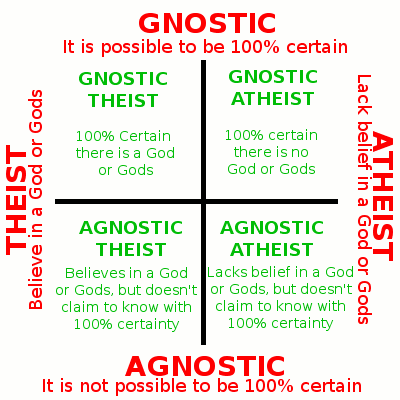
>>390295
Building fraternal societies that serve to share skill, split rents, network, and build up the members of the fraternity. A fraternal order would be a lot easier to organize than a political movement and would have immediate benefits for members too.
Building fraternal societies that serve to share skill, split rents, network, and build up the members of the fraternity. A fraternal order would be a lot easier to organize than a political movement and would have immediate benefits for members too.
>>390559
i believe that too but political movement usually brings more people together
-edgy kids who wanna follow a random leader-
-people who think the govs are retarded and all the parties won't represent them-
etc
the thing that you are saying is good but without a leader or leaders , advertising , speeches , any movement is kinda reaches a dead end
>>390578
You could build a political movement from the societies started by the fraternity. Start small and all.
You could build a political movement from the societies started by the fraternity. Start small and all.
>>390586
i tried but look at my flag , i would be executed 100%
i got already jailed twice in both big recent protests
i tried but look at my flag , i would be executed 100%
i got already jailed twice in both big recent protests
what do you guys think about Anthro-phobic people?
don't mistake it with anti-socials
don't mistake it with anti-socials

Don't mind me i am just creating some flag and ranks for my future country.
>>390761
Military ranks are pretty cool for teenagers, but I feel like they could be done differently. Kinda look like crosses or minecraft skins, which feels off. Some of the other ranks are decent, but the one with roman numerals I to III doesn't hit right. You could maybe use cuneiform numbers(khate-mikhi) instead would fit Iran's vibe better.
Also, I really think the higher ranks need to be changed, especially the ones that look way too much like David star. If you're gonna use stars, go for 5-pointed or 8-pointed ones. Or, try using something like Derafsh Kaviani symbol, it's simple, minimalist, and it actually fits the theme well.
As for the color scheme. Honestly, the colors don’t really match any traditional or strong theme. Right now it kinda looks like some fantasy trannyfags army palette. If you want to change the color theme, go for something like the Shahbaz Derafsh colors. Or, if you want something more unique, the Kaviani colors would work too.
About genders, no need to use different colors. Just swap. Like, use lighter colors in the center and darker on the edges for men, and then flip it for women. It's simple, understandable, and actually reflects the complementary nature of the two.
That new script is actually cool! It looks nice. But have you tried connecting the letters? I tried it and it ended up looking like stairs, not very smooth. So that’s something to think about. And even though the script is pretty and can be symbolic, I don't think we should change the national writing. Doing that erases hundreds of years of culture and tradition. Plus, the new script doesn’t have different writing styles like nastaliq or tahriri. It also doesn't feel modern and doesn't really match today's world. But yeah, it could be great for symbols or logos.
About the flag, it feels more like a label or emblem than an actual official flag. Non-rectangular flags aren't good standard. So yeah, good for branding or icon use, but not as a formal national flag.
Also, the swastika is flipped the wrong way. That should probably be fixed. But here's an idea, maybe we could make it feel more Iranian by replacing the horizontal line with Faravahar. Like, use his wings stretched out as the horizontal part, and maybe tilt them a bit like they're mid-flight or spinning, that could work for the angled bit too.
Just my take. I think it all looks and feel good.


>>390795
thanks for the feedback , it is not the final , so don't worry i will change it , if you can participate and draw your own ideas , i will accept it
about the font , no they are not made to be connecting , just like english or hebrew
--
[first pic]
it is still better than whatever the fuck irgc is pulling here...
like wtf why all of the circle/flowers in those ranks looks the same???
from far away , everyone can mistake those ranks
--
[second pic]
what are those?? ''water finder wood'' and ''half moon chips''??!!!
what the fuck were they thinking here?!!


>>390829
natzi germany during ww2 and USMC did it best
it is both simple and easy to understand and differentiate which is which
natzi germany during ww2 and USMC did it best
it is both simple and easy to understand and differentiate which is which
>>390829
>>390830
I want to design a few of my ideas, but right now I'm stuck in a dumb project that's got literally nothing to do with me except for some polymer stuff. Plus I'm drowning in some end-of-term exams. Once I'm free from all those shits and my cursed laptop finally decides to work, I'll use Illustrator and make a few designs.
About the font, well yeah, I guess your goal was something else from the start. In that case, sure, it can be a decent font for persian without connected letters. But still, it's not a real replacement. At best, it's a symbolic font, something you may use on a logo.
Now look, we're talking about the irgc, not the army! The whole point of the irgc back then was to pretend it's kinda "holier!" than other forces, so of course they tried to avoid stars, circles, or anything standard. That’s how we got these weird junks. Honestly, if they really wanted a fresh design, they could have used someone legit like Hamid Nadimi (for real, that "Allah" symbol on the flag is pretty smart), or held a design contest(like with the Nature bridge(Pole-Tabiat), which turned out pretty well.)
Even with this circle/star badge they got, they could have made it work if they added some detail to it, especially for ranks like major. But whatever, it's not that big of a deal. We're talking about high ranks. It's not like a bunch of generals are going to mistake each other from across a damn valley. Most of the time, they're face to face anyway. Still, yeah, irgc design choices are trash sometimes.
About your second pic, again, same irgc lack of taste. But I think the reason they curved the badge is because these are lower ranks, and in close-quarter combat, where ID mistakes are more likely, a curved shape stands out more than a straight line. That's the only logic I can come up with. Otherwise, it's just more brainrot.
Anyway, don't stress too much over the irgc stuff, they're not the "main" army.
Even in the U.S military, check out E-8 and E-9. These ranks, despite not being relatively high, still get confused sometimes. Or take Nazi admin armbands, same problem. But again, those guys usually operated at close range, so it didn't matter. Same goes for the last two rows in your first image, yeah, they could get mixed up, but since these are high ranks, they usually deal with each other up close, so it's still recognizable. This issue exists everywhere. My real gripe is the irgc's total lack of taste, not that the badges themselves cause real confusion.
And on top of that, the Iranian and U.S military rank visuals are so damn similar, that if the two ever went to war, you would probably have to ID people by their style, not their ranks!